I like that you’ve kept to the original sort of dungeon-y theme, but given it some extra flair. I like the nubbins coming out of top of the walls, and I think it’s clever how you made it so the ceiling lines up with them as well so you know if it’s correct. Additionally I think the pattern on the altar-like area is really neat. It makes what would normally be a basic box a lot more interesting to look at.
I love the painted textures you used. Your pieces work well together to create an interesting space. Maybe consider creating some small objects that could be placed in the alter areas.
I love that you painted your textures. I also feel that it was very clever to make the top of the walls have those indents. It is a great way to organize your building and adds character compared to plain straight walls.
The models and textures look great, and really seem to flow together making it hard to see where each object begins and ends. Adding some other items around the rooms (something like a table) would make it look a lot less empty and would bring each room together.
The texture you used fits your scene very well! However maybe you could adjust the floor texture a little bit to make it looks more different from the wall texture.
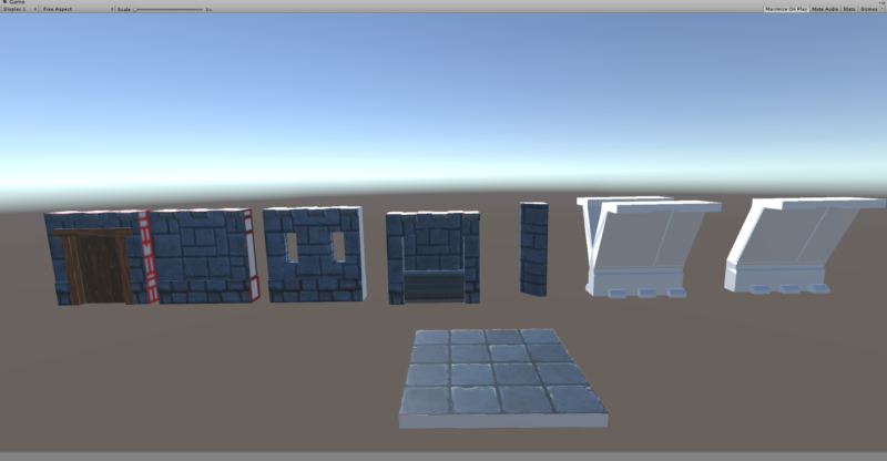

I like that you’ve kept to the original sort of dungeon-y theme, but given it some extra flair. I like the nubbins coming out of top of the walls, and I think it’s clever how you made it so the ceiling lines up with them as well so you know if it’s correct. Additionally I think the pattern on the altar-like area is really neat. It makes what would normally be a basic box a lot more interesting to look at.
I love the painted textures you used. Your pieces work well together to create an interesting space. Maybe consider creating some small objects that could be placed in the alter areas.
I love the details and the windows. Maybe add some more colors so it doesn’t look all grey.
I love that you painted your textures. I also feel that it was very clever to make the top of the walls have those indents. It is a great way to organize your building and adds character compared to plain straight walls.
The models and textures look great, and really seem to flow together making it hard to see where each object begins and ends. Adding some other items around the rooms (something like a table) would make it look a lot less empty and would bring each room together.
The texture you used fits your scene very well! However maybe you could adjust the floor texture a little bit to make it looks more different from the wall texture.
I really liked how all the textures match each other. The way you modeled the walls give them more dimension and make the space look more lively.
Painted textures are freaking amazing, and I love the wall geometry in general. Well Done!