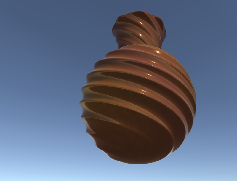
I wanted to create a vase that I can put in my room level, I wanted my vase to look fragile. The vase is made in Maya with some details added in photoshop. It was inspired by some very detailed vase’s that were at the museum.
The vase looks really nice. The swirling pattern is cool, and I think it’s just the right amount of shiny where it is believable as ceramic, which can be hard to achieve. I think it could use a little…more, though. I would suggest maybe doing some etchings or adding a pattern onto it, to make it a bit more visually interesting. I like the color of it, so if you were going to expand on this, maybe doing a patter that works well with that brown-orange you have there. It looks nice!
The swirl effect you achieved on this vase is very nice. I love the colors and amount of shine you used. Currently this pot looks like it could be duplicated and used as a repeated object. To make it seem like more of a stand-out object, I’d suggest adding some engravings, or patterns. Overall, it’s a very visually pleasing piece.
Your color is damn amazing. I want you to work with this style of gradient with more objects, but I know it was just for this one detailed object. My only comment is that you should add some more to it, because while the curve is lovely, I would love extra little engravings on the curves.