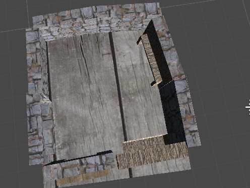
I think the stone texture you got for the walls is pretty neat. It looks like a real castle. I think there are a couple issues with the way that some of your UVs are–the large wood pattern on the floor, for instance, and the way you can sort of see the seams with the indented wooden wall–but the colors of the textures themselves look nice together. Additionally, I like how the set pieces are a little bit wonky, like an actual dilapidated castle. They’re not perfectly snapped together, and that gives them some character.
I like the images that you used for your textures. The colors fit well together and feel like they belong in a castle. Some of the pieces don’t quite tile right now, so try to make these seems less noticeable. Because the pieces are not snapped together, the environment has an interesting feeling. Consider adding some small pieces to bridge the gaps between these pieces in a way that everything snaps while maintaining your current look.
You did an amazing job texturizing your pieces. I love the rock texture. It looks so smooth and real. I also like how big it is, is it were smaller it would remind me of pebbles.
Some of your texture like the stone one you used on most of you walls is unique and looks really good on the walls. The brick is also unique however on the walls you can see the seems in a few places, and changing UV’s a bit would make it look more consistent
The stone image works very well for the walls! It looks real. The wall could be connected better to make the scene more coherent.