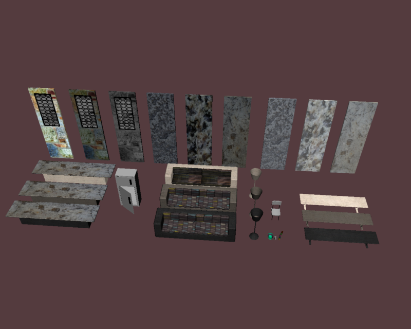
I really like the textures on your chairs. It would have been very simple to go with a basic cloth texture, but the pattern really gives the chairs some personality. Additionally, the circular pattern on the windows looks really neat. Higgins House has cool, patterned windows, so it’s nice that you retained that original flair that the house has. Some of your textures seem a bit high in contrast, so they’re a little bit distracting in the model. Going into adjustments and lowering the contrast could help with that, but feel free to take my advice with a grain of salt. I like that you’ve got a wide array of the same models with different textures. It gives whoever’s using the models a lot more choice for customization.
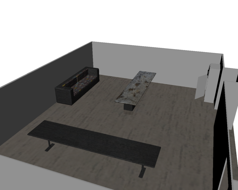
Your smaller objects look nice and everything you’ve created seems to snap together well. I like the colorful textures you have and think that you could make the area look very interesting by mixing some colored walls with less colorful/patterned ones. I think that a mix of bright and dull textures would draw the viewers eye around the area. Right now some of the layouts feel dark to me and I think the use of the brighter pieces would help this.
I like how you gave a lot of your models different textures, so you can fool around with how a scene would look with a similar yet different texture, especially since a lot of your textures have a granite like look to them. In your atlas there is an object which I think is a bowl or toy of some sort, but it seems out of place with your other objects as it it very colorful (turquoise). So adding some other colorful objects or bringing down the color on that object would make it look more in place.
I could definitely see a lot of effort on the window parts and I just love them. They seem to be very realistic. I also love how you did the sofa texture separately.


I really like the textures on your chairs. It would have been very simple to go with a basic cloth texture, but the pattern really gives the chairs some personality. Additionally, the circular pattern on the windows looks really neat. Higgins House has cool, patterned windows, so it’s nice that you retained that original flair that the house has. Some of your textures seem a bit high in contrast, so they’re a little bit distracting in the model. Going into adjustments and lowering the contrast could help with that, but feel free to take my advice with a grain of salt. I like that you’ve got a wide array of the same models with different textures. It gives whoever’s using the models a lot more choice for customization.
Your smaller objects look nice and everything you’ve created seems to snap together well. I like the colorful textures you have and think that you could make the area look very interesting by mixing some colored walls with less colorful/patterned ones. I think that a mix of bright and dull textures would draw the viewers eye around the area. Right now some of the layouts feel dark to me and I think the use of the brighter pieces would help this.
I like how you gave a lot of your models different textures, so you can fool around with how a scene would look with a similar yet different texture, especially since a lot of your textures have a granite like look to them. In your atlas there is an object which I think is a bowl or toy of some sort, but it seems out of place with your other objects as it it very colorful (turquoise). So adding some other colorful objects or bringing down the color on that object would make it look more in place.
I could definitely see a lot of effort on the window parts and I just love them. They seem to be very realistic. I also love how you did the sofa texture separately.