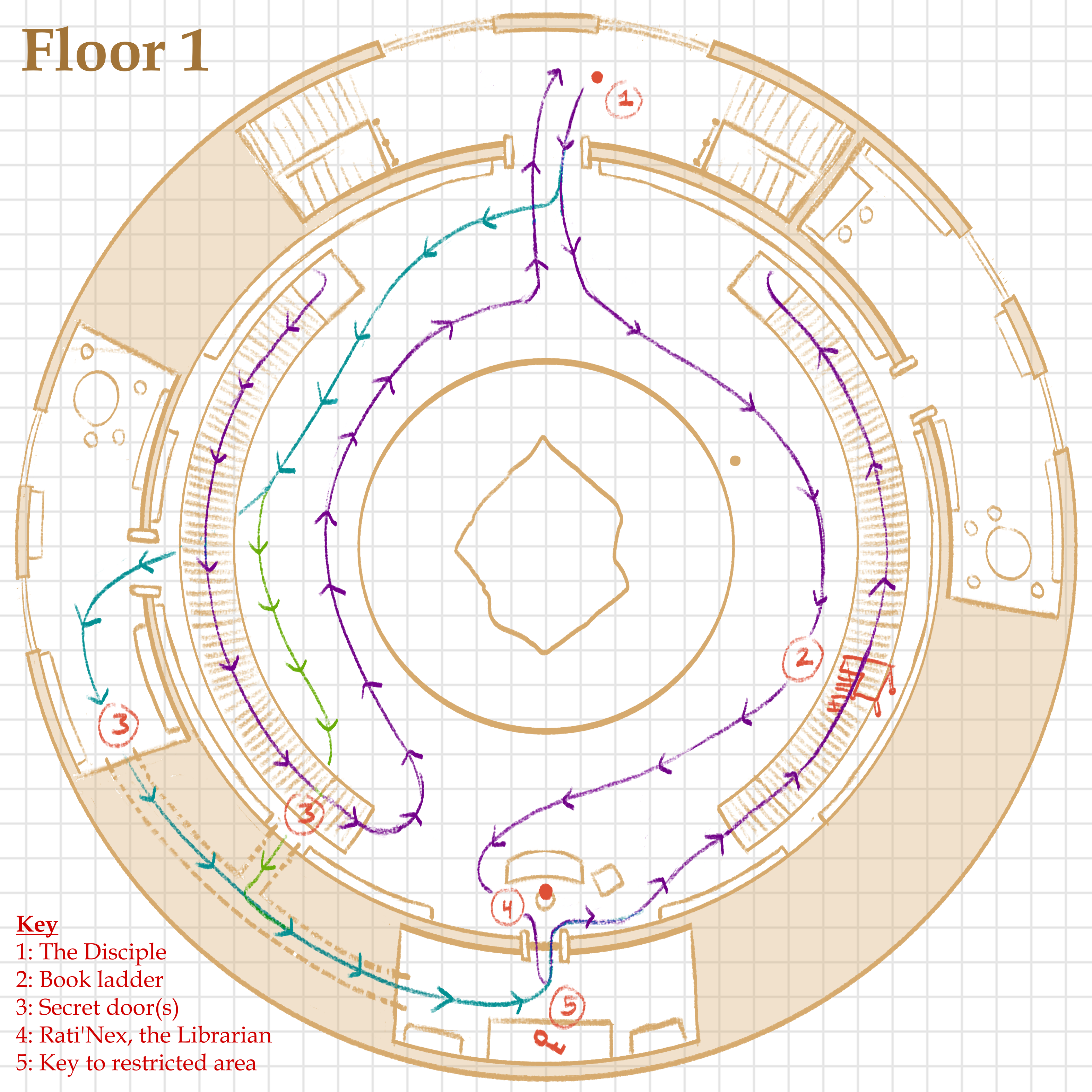
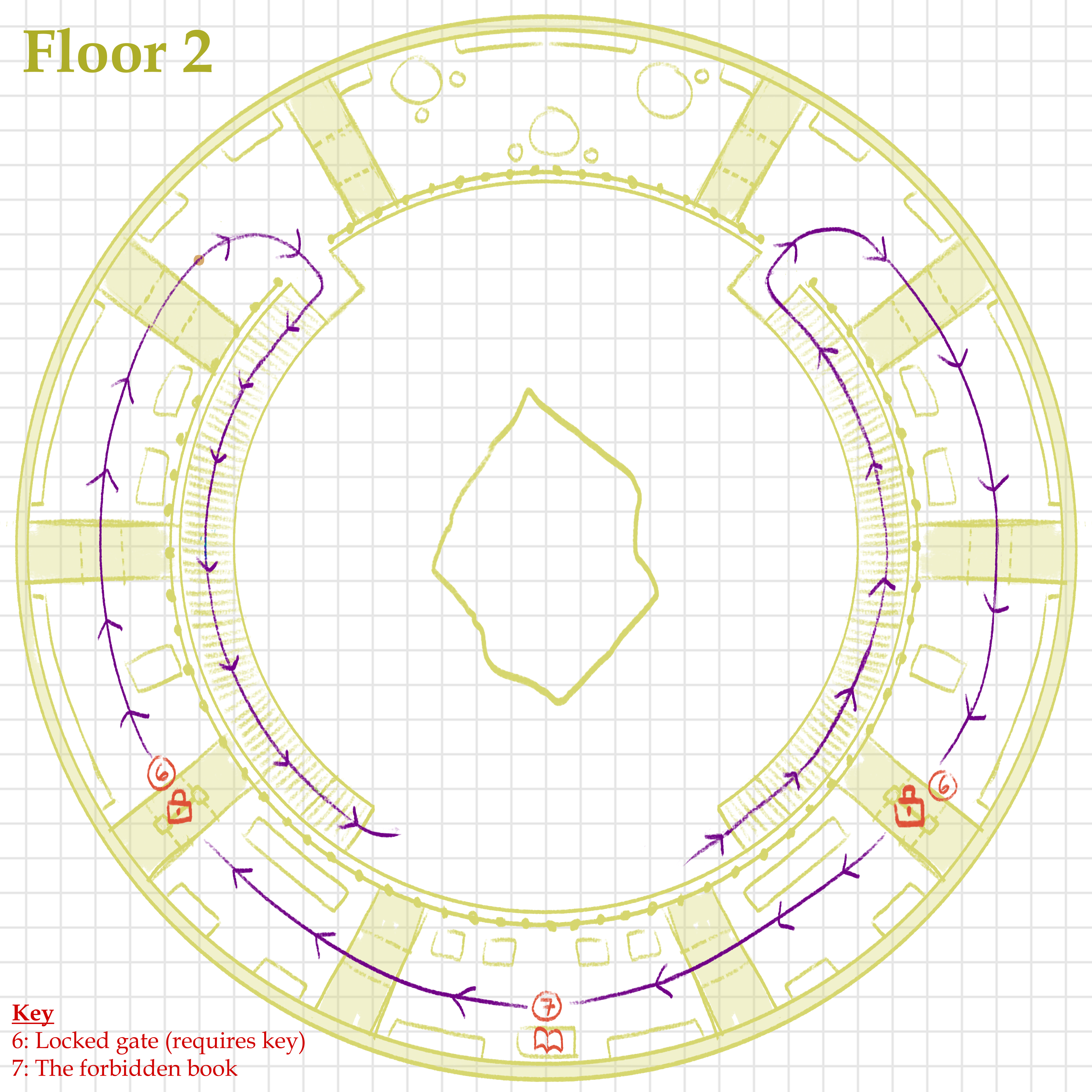
When designing my level layout, these were my initial floor-plans. The level flow is meant to take you in a rough circuit around the room, moving from the front to the back, up the stairs, and back again, touring the player through the majority of the level. Some side rooms have no gameplay utility and are merely fun places to explore, with the key items placed strategically to encourage exploration (for example, the book ladder is placed further to the back of the room, encouraging the player to peek into one of the side rooms before interacting with it).
When I brought the floor plan from Maya into Unity, however, I noticed some issues with scale from the player’s view.
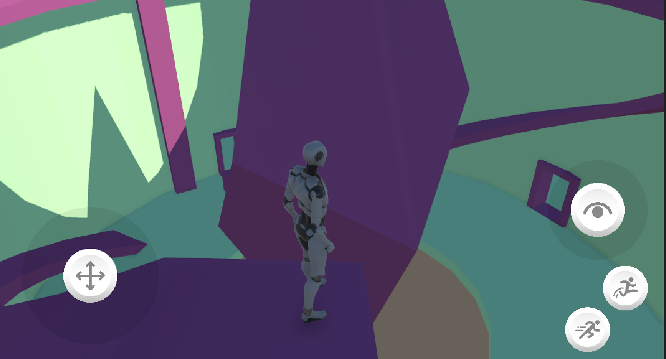
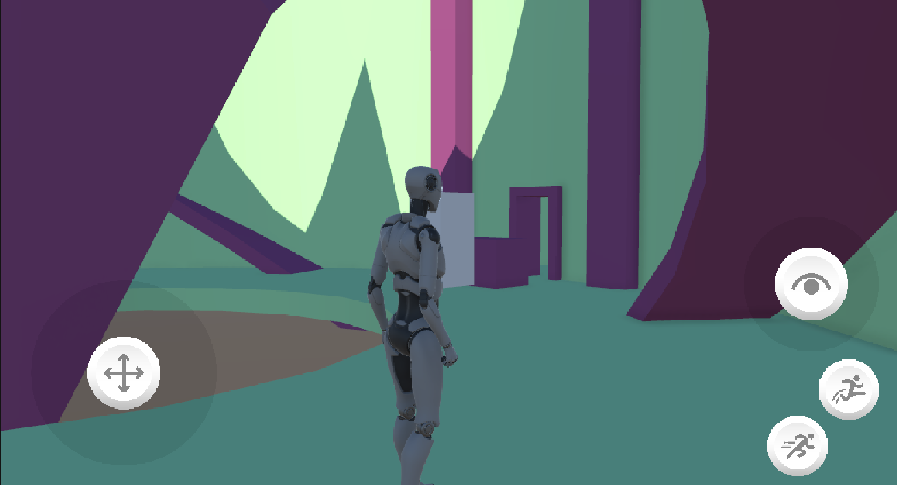
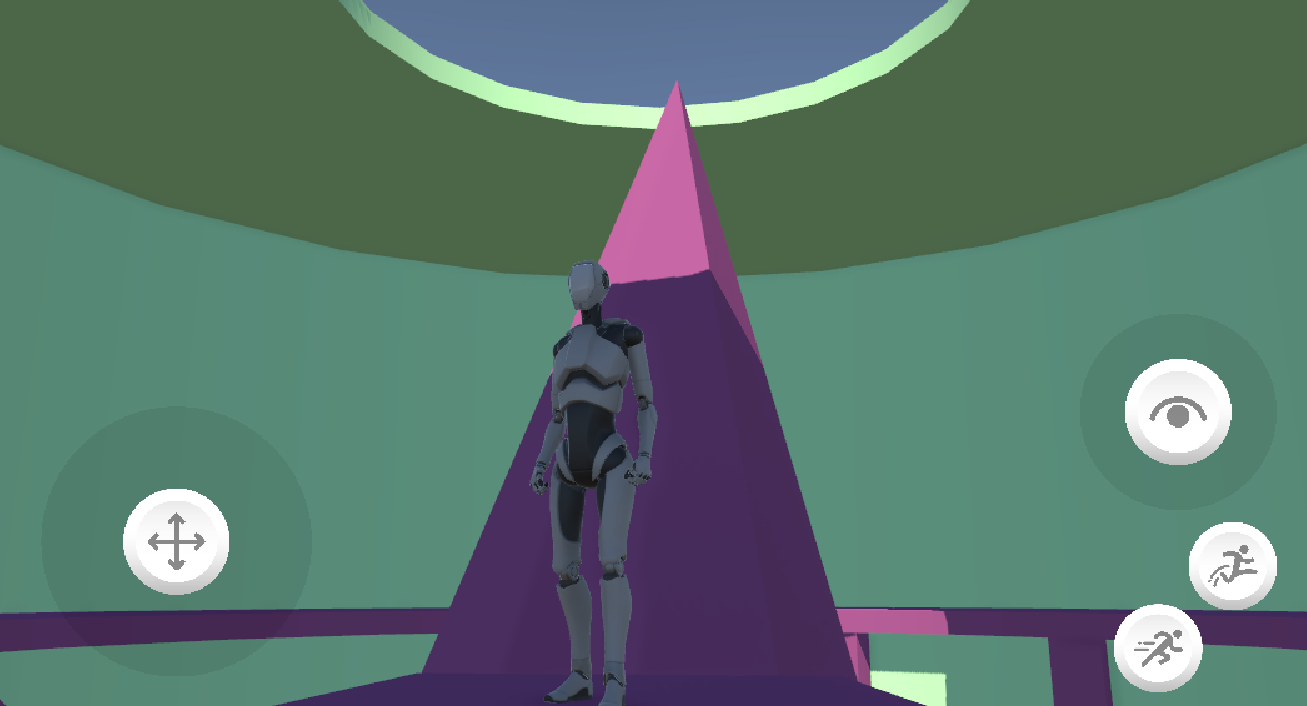
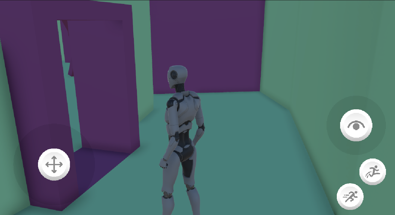
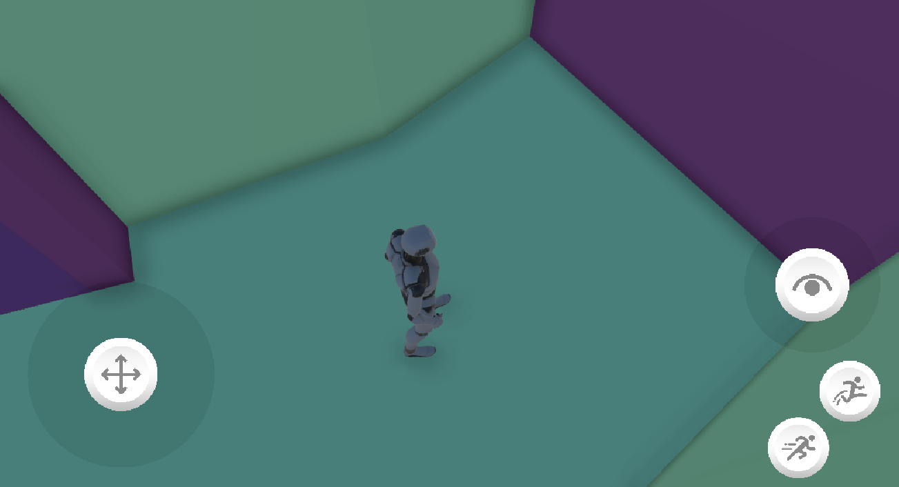
While the height of the room feels decently grand, the diameter of the room itself feels rather small, ending up especially cramped when dealing with the 3rd person camera angle. Merely doubling the size of the asset, while fixing some of these problems, causes others.
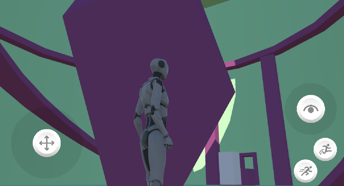
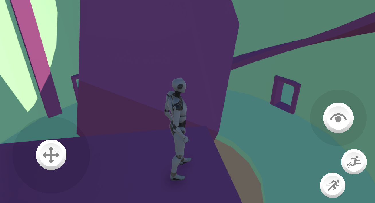
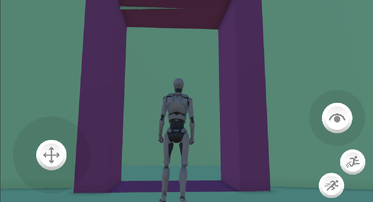
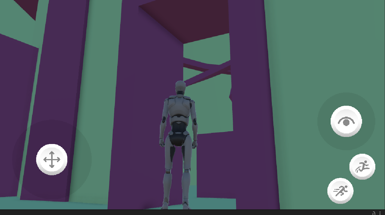
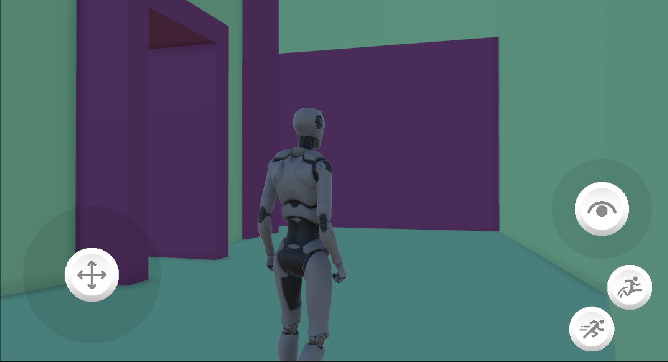
The doorways and the crystal (along with the gap in the floor it lives in) end up quite over-scaled. I do, however, like the increase in wall height. When I go on a second pass, I will likely expand the room to at least double it’s current size while keeping these over-scaled elements at their original size in order to more accurately convey the library’s sense of space.