The snail rider has warm tones like their environment. I debated giving the mouse or shell a more lively color to avoid monotony but ultimately decided against it since the scene lacks materials to complement that. I tend toward natural colors because I think they’re soothing.
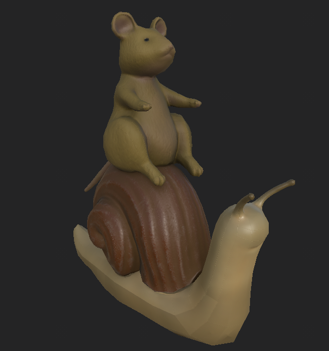
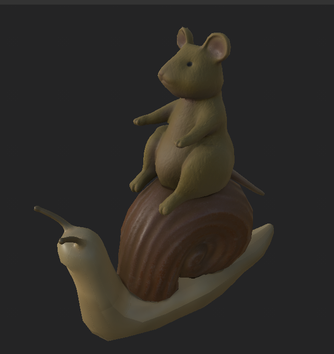
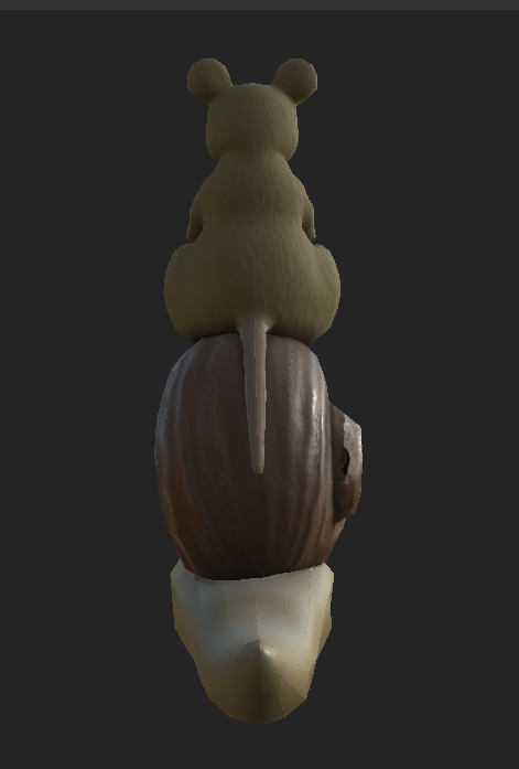
I love your characters, they are so cute! I really like how you can see the textures for each of the characters, for example, the mouse looks like he has fur while the snail is shiny.
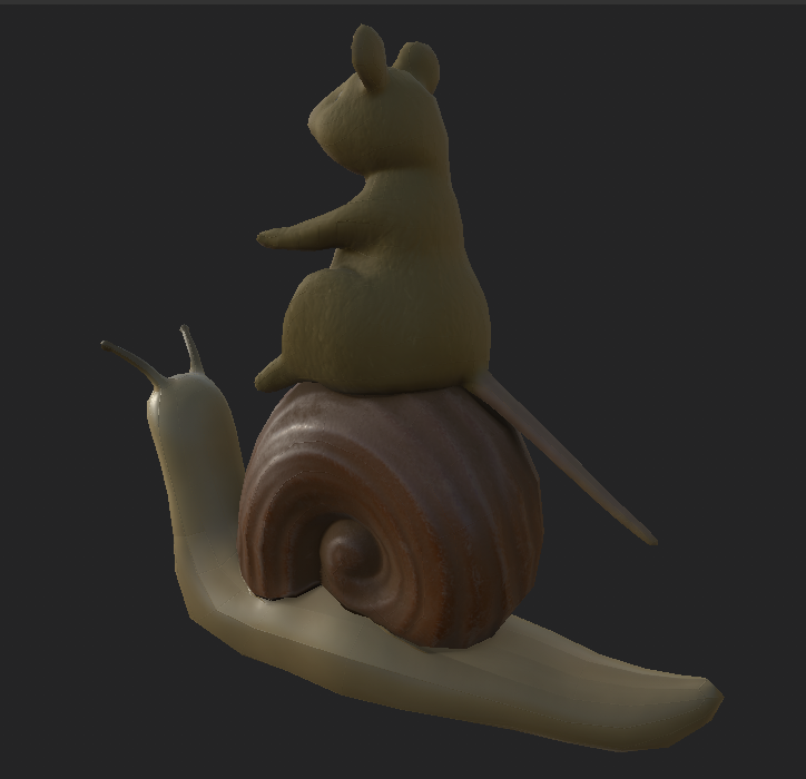
I loved your original concept sketch of these characters! I also think you did a great job bringing your sketch to life. I would suggest having a bit more of a dynamic pose for the mouse but I’m really impressed with the delicate fur texture and shell texture. I think the reflected light helps show the shell texture well.
I agree, the mouse looks super stiff here haha. I intend to animate him swaying a little while riding on the snail and, if I can get reins working, moving his arms left and right for turning. Hopefully he’ll look less zombie-like after that!
The subtly and nuance of the mouse’s fur and the snail’s shell are very good! This might have been the artistic intent, but maybe have the mouse and snail be slightly different colors so they can be more distinguishable from one another.
I agree with the decision to keep the colors down to earth, but I would make the skins of the mouse and the snail more distinct in hue. The furry texture on the mouse really helps though, and I particularly like the slight color differences between the belly and the sides.
Also the shell is great. I have nothing specific to say about it but I still felt the need to praise it somehow.