I think everything looks unified. Mostly because everything is only a couple colors and they seem to share a smooth quality. To me this feels like one world, simple but well designed geometry.
Opinion: I think you paid attention to detail of your textures. I think your brick walls seem slightly plain in texture/color and my eye kept going to them (corner pieces). I think because of your brick’s purity I kept getting distracted by the lighter value but this may change with lighting.
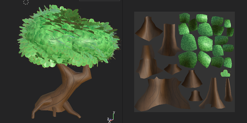
I am pleased by your tree. The style of your leaves looks fuzzy.
Statement of Meaning: Unique! No one else in our class is doing a dungeon project so yours is unique.
Answer to the Artist Question: I think that your textures have a unified look.
Opinion: I really love the detail in the pieces you have made!
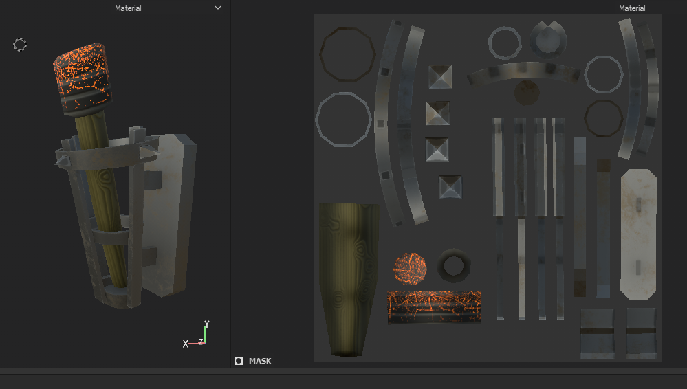
I think everything looks unified. Mostly because everything is only a couple colors and they seem to share a smooth quality. To me this feels like one world, simple but well designed geometry.
Opinion: I think you paid attention to detail of your textures. I think your brick walls seem slightly plain in texture/color and my eye kept going to them (corner pieces). I think because of your brick’s purity I kept getting distracted by the lighter value but this may change with lighting.
I am pleased by your tree. The style of your leaves looks fuzzy.
Statement of Meaning: Unique! No one else in our class is doing a dungeon project so yours is unique.
Answer to the Artist Question: I think that your textures have a unified look.
Opinion: I really love the detail in the pieces you have made!
Everything looks very cohesive!
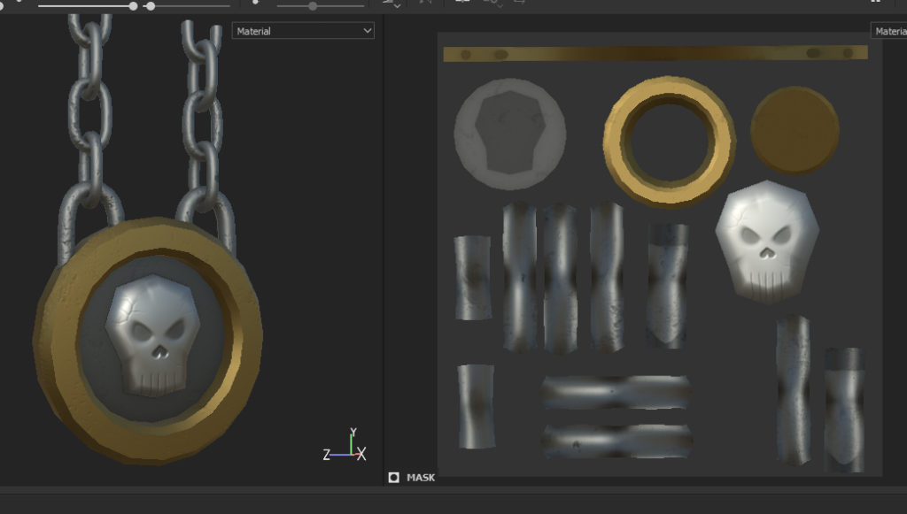
Opinion: If the skull emblem’s gold ring had some more wear/age on them, it’d really sell that dungeon feel.