I’ve been somewhat M.I.A. for a few assignments. Mainly because the way I’ve been handling the environment required me to go through a few iterations, which required me to go back and redo a bunch of elements and assets. Obviously, this sets me back a bit— however, I do it so that I can get the best quality that represents what I’m able to do. So get ready for a long wall of text and images!
So let’s start with the basics:
Level Design
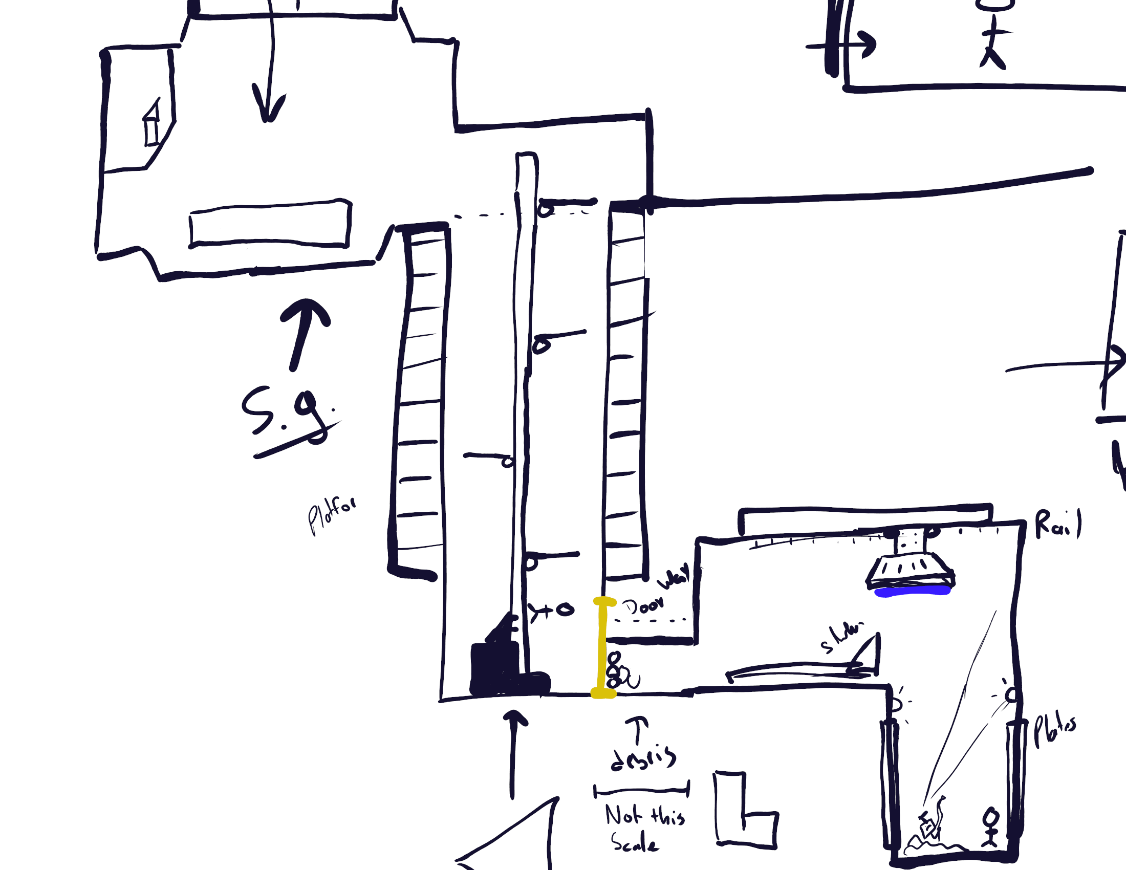
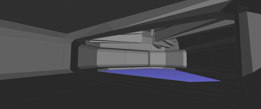
The above image was seen in my last post; however, this time around I cropped it to focus on the important elements: the actual level. Originally, the level was built in one whole piece— big mistake! Doing it one piece was terrible as it didn’t allow me to iterate on the actual level from playtesting results which is quite important for an MQP project. Had it just been a more artistic level, then it would have been fine.
So the solution to this was to go ahead and make it modular! But guess what, that actually makes the level design fall in-line with this class a whole lot better. Originally, I was going to make internal assets modular: things like random computer systems, pipes and cables— that sort of deal. Now, the level is modular; albeit still having some rigid elements.
For this, I decided to break up this level into five segments. Each segment allows for a level of modularity. For example, the vertical segment in the middle of the level (Segment III) is no longer just a giant system. Now, it’s each floor as a separate module. This gives me control to decide how tall the vertical segment is. Another benefit of this is that I can decide a lot more directly things such as the little cubbies (which will be explained a bit better later on in this post), door ways, entries and exits, as well as modular internal bits like I originally planned for.
I essentially doubled the amount of work for myself! Hurray!
The Segments
Now the five segments are not properly grid based modular components. That’s what I mean by a “rigid modular structure”. You can’t build any level you want by just dropping in a floor, a wall, and a ceiling— they’re still fairly structured. Nevertheless, the elements are modular in some nature. So let’s go more into the actual components. As of right now, there are four of the five components finished. The fifth is in development right now, and probably will be ready for the midterm’s playable space (fingers crossed).
Despite only being four of the five segments, these segments are still modular. You could build a whole facility… well not really, but you could. So they’re modular by that definition, and I’m okay with it.
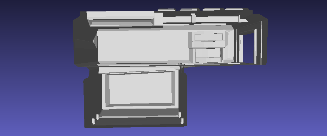
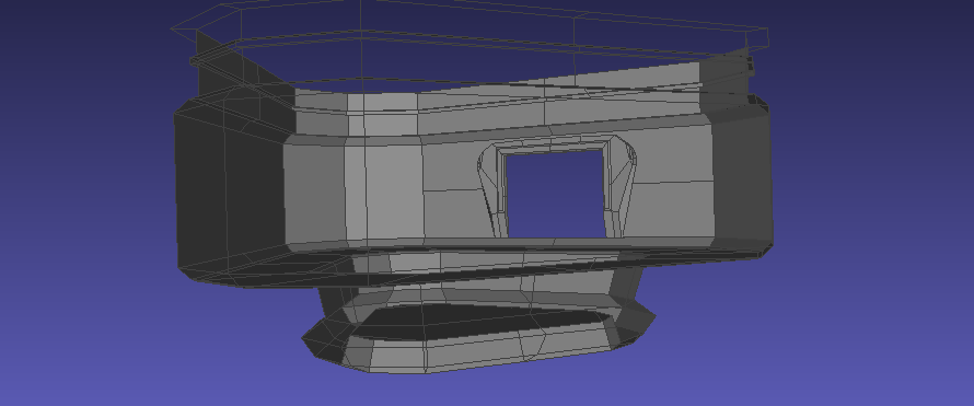
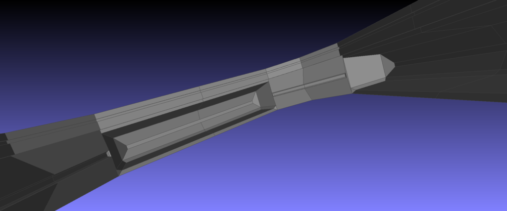
The UVs
UV mapping these was a pain, that’s for sure. Large interior spaces is something I’m new to, and having to do these interiors was difficult. I made it easier on myself by making the actual geometry fairly simple, but that’s still saying something for the amount of work was to come. Here’s the UV’s for each of the four current segments.
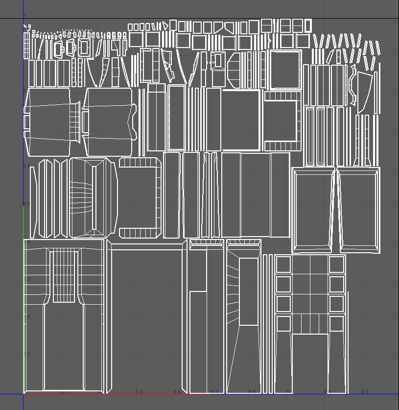
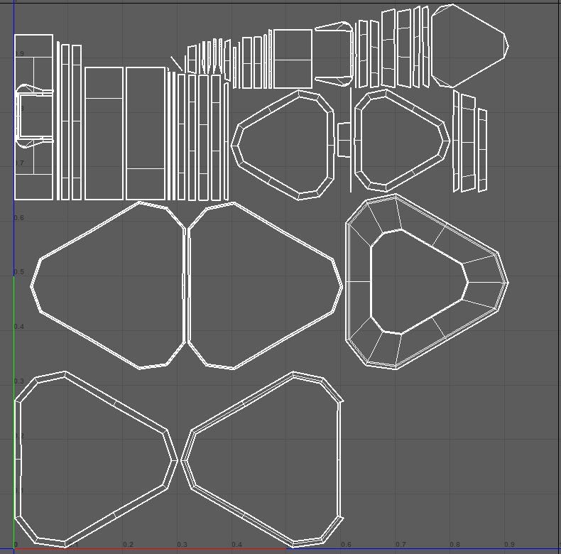
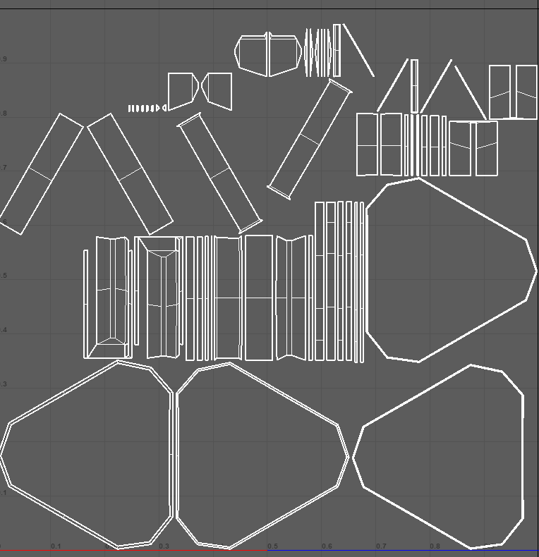
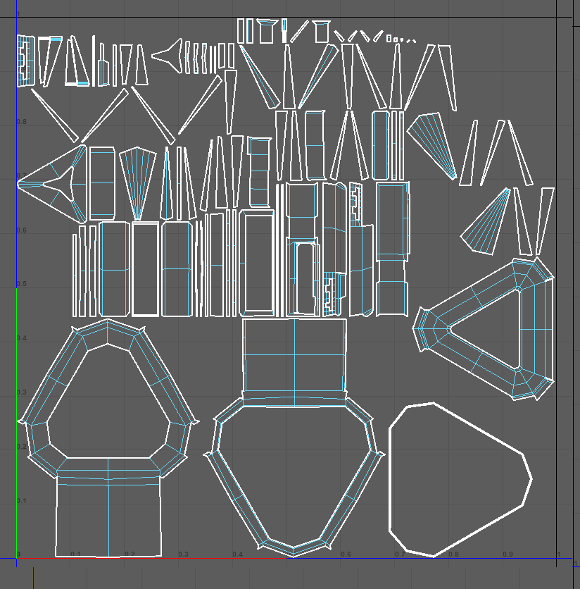
One thing I’ve noticed that’s a bit problematic is the UV map efficiency. The large triangular sections take up a hefty amount of space on the actual texture map, and is definitively not the way I should be handling it. If I were to go back and redo these, I would probably make it so that the walls, floors, and ceilings were all separated from the actual UV. Not for modularity, but for taking up more UV space. However, as for now, the texture work is being done in 8k in order to make up for the wasted space. Perhaps in the future I’ll go back and fix them, but until then, they’re fine for now.
Texturing
As for the texture process, I continue with my personal pipeline. First, I identify the colors. I often find that through choosing color combinations first before actually thinking of materials, you will be able to come up with the materials after the fact and have something that looks more visually appealing (even at the cost of “realism”).
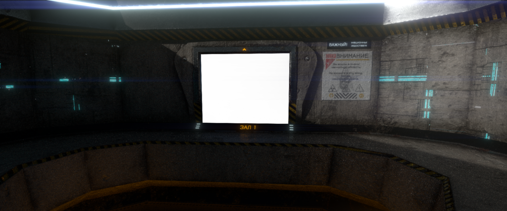
In this case, I took basic complimentary colors (red/green, orange/blue) and build off from there. Since the facility is built within the Sovietpunk aesthetic, I chose for more hardier materials— materials like concrete and polished metals. However, to give it that more futuristic feeling, I added a greeble effect to all the concrete surfaces to make it look a bit more interesting. It’s super easy to make anything made of concrete or cement look boring, so the greeble effect really helps make it a bit more visually appealing, but also add a bit more lighting and emissive work to the walls (considering the fact this facility is dark).
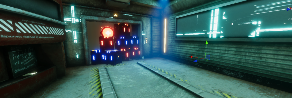
Here’s a few examples of what I mean of the current texture work I have done thus far:
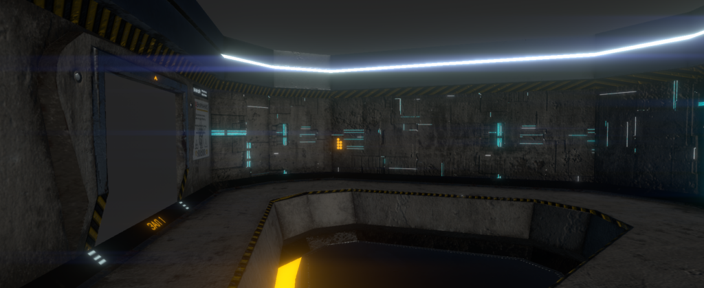
The next step is working on solidifying some sort of lighting scheme. That’s usually the hardest part, simply because I have to bake all the lights in order to make the scene a bit more visually interesting, but more importantly exciting.
Obviously, not final (what’s-so-ever), but here’s some preliminary teaser lighting. I’m currently working on volumetric, hence the incredibly out-of-place blue tinted spotlight, but nevertheless, the concept is there.
For my artist questions, I want to ask a few questions:
Firstly, as for the actual spaces, what do you think about them? I’m worried that the geometry may be a bit under-complex, and might be a bit too flat.
Next, what do you think about the visual aesthetic of my texture work? Does it scream “Sovietpunk”, or does it feel like something else? What do you think I could do to better improve the visual story-telling that is my aesthetic.
Lastly, I want to ask about the actual texture work. What do you think I could do better to improve the fidelity of the textures? I’m worried that because of my UV mapping inefficiency, I may have shot myself in the foot and made it so the walls aren’t as crisp as they could be.
I impressed with the modeling and texturing I see on your post. I’ll be honest, I don’t play many video games at all so I will answer your questions best I can (but I cannot judge texture quality that great).
To me, your space seems extremely believable. Just glancing at your screenshots, I cannot tell you had any UV mapping difficulties. As for storytelling, I think maybe posters or specific props will help with that. Maybe there’s a few cracks here or there to imply previous battles/attacks.
I see a lot of splotchy bits of color/value and I’m getting some type of metal material vibe, but it’s not screaming any specific story at me. I’m not bothered by the simplicity of the geometry (but again I don’t play video games much, just make art).
I do think any scratches there are too subtle for me to notice. Maybe have a few intentional bits of damage or items that are scattered throughout (not uniformly, but intentionally). As it stands now, the space does feel slightly generic, maybe a bit of clothing or helmet of a worker/character is left hanging on a wall hook. Maybe one area of texture is just completely singed or covered in rust to indicate a legit accident that happened.
I’m still confused on soviet punk, not going to lie. The lights remind me of Star Trek Movies.
So I believe your space is real, but I don’t really know the specifics of the place or it’s purpose. Not sure if it’s a workstation or storage unit, or ship controls.
I went off on a tangent, this post was a combination of opinions, statement of meaning, and answering your question.
Do you have props in mind?
After actually reading your post through, I see you meant to texture cement. I’m getting more of a metal vibe but maybe that’s just from the lines in the walls. I do like your color scheme of lights though.
Statement of Meaning: Your project is very eye catching.
Answer to the Artist Question: I do not think the geometry looks flat and I like the spaces. Your pieces definitely look punk to me, I am not super familiar with soviet punk but your pieces definitely look punk at least. I think the walls look really awesome right now so I am not sure on how you can improve them using your UV mapping.
Opinion: I am really impressed with the work you have done!
Your space is amazing and the lighting captures the atmosphere perfectly! It’s very immersive.
I see what you mean by flat geometry from your Segment II walls, but the texture detail breaks it up well. If you have the time, storage crates and more posters and signs could add lots of variety. Your scene already looks Sovietpunky but adding more Russian via those posters and signs would further drive it home.
I honestly think your texture mapping skills are refined and everything has good surface detail. One small opinion is that the poster looks quite thick and much less worn than its surroundings. If aged is the goal, I think it could benefit from some dirt, fading, and torn pieces.
I dig the lighting in the scene.
Answers: For the scenes, you have rendered and showcased, the geometry works, especially for these more open hallways/areas. For the soviet-punk aesthetic, maybe have some of the signs be more front and center, the environmental clues are there, but a bit too subtle. The textures look dark and grimy. Unsure if that is the intent, but I think it is suitable for the mood this environment evokes.