Hey,
Here are my modular pieces textured. As you can see, they are still in substance. I’ve had a few problems getting it to work in unity so for now I’ll show my textures in substance.
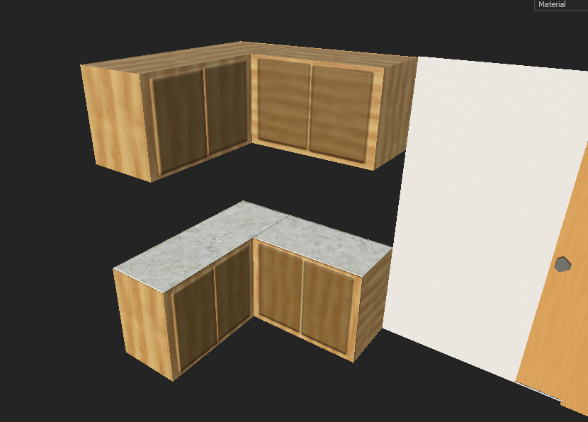
For context on the cabinets, I gave the lower cabinets a marbled top, that’s meant to seem more like the contact paper countertops that students often have, rather than real marble. This is meant to show with the lack of thickness.
I had a lot of fun making a brick texture in substance alchemist. I don’t think the tiling is perfect, but I think its pretty good for a first time brick maker!

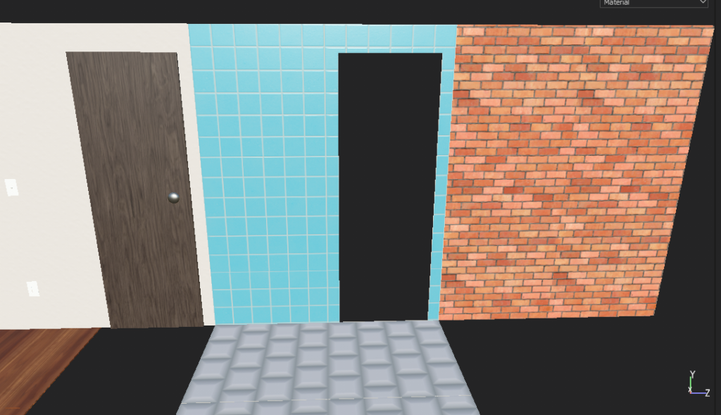
I wanted to ask what you guys think of the colors that I chose below, keeping in mind that the blue tiled walls and white tiled floors will be in the bathroom.
I tried to make the furniture have a warm hue in the main room, and a more cool hue in the bathroom. How do you guys think I did at picking these colors, and would you prefer other colors, perhaps for the walls or closet door, or window frame.
Let me know what you think!
Statement of Meaning: Memorable, a lot of people are going for the fantasy games in our class so having a more real game is memorable.
Answer to the Artist Question: I like the colors, maybe if you want more you could add more pastels.
A Neutral Question: My question based on the cake we saw in class, what colors were you thinking for the cake?
Opinion: I think you project looks comfy!
I like the wall color, and I think the blue and orange accents are nice. I would suggest limiting the colors of your cabinets (the tans and browns). I think less colors there would be less distracting as other objects seem to have only 2 colors maximum. I would also suggest more contrast in values on your cabinet shelving/doors, this might help distinguish the cabinet door. I would also possibly suggest a slightly darker floor just in terms of value so the player is clear on planes. I would also suggest a slightly darker value on the window frame, because it seems very similar to the wall’s value which makes is slightly hard to read.
I am pleased with the details in your game, the story, and the modeling, it reminds me of playsets of houses I played with when I was younger. I always loved organizing all the detailed objects.
Best of luck with your project
I like how the brick texture looks.
Opinion: The continual wood tiling on the cabinet door makes it lose some depth when viewed from the front. If there was some more shadow around the perimeter of the door it could make it pop a bit more.