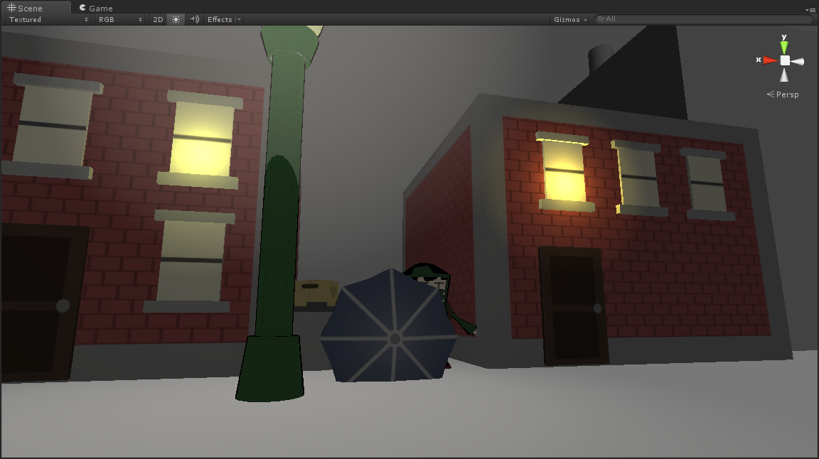
Loving the textures and shaders (Super Box Co is perfect). The doors are a little too perfect, so you might want to add some noise to their texture or angle their doorframes a little or something.
Play with lighting a bit more and this’ll be looking really, really great.
A lot of your objects look really clean and nicely polished. I think it could work really well if you raised your buildings a little, added a concrete base and gave them steps. Adding a doorframe around the doors could make the buildings look a little more urban if that’s what you’re going for.
I also think you did a great job with the main character and the texturing on the boxes and the trashcan. Maybe you could add some loose newspapers on the ground, or maybe a couple benches.
I really like the style of this level, and I’m really interested to see what this will look like once you add the rain effects and skybox.
The only thing I could suggest is that it could use a little more clutter.
You are really good at this kind of cartoon style. One thing I would suggest to enhance this style is to give the character and game object an outline. To make it more clear, you can check out this game on ps vita, called “gravity rush”. I think it has the same style as yours.
This cartoon style looks real good. I was wondering, when you had some of the windows with the lighting which looks good, how did you do some of the windows?
I really like where this is going. I am always a fan of the games that set a certain mood and stick with it. In class you mentioned Animal Crossing, and I think your vision for the game is spot on.
I’m really liking the look of the buildings that you have shown here. How many different buildings are you planning on creating? Will you be able to enter any of the buildings to come (such as the train station)?


Loving the textures and shaders (Super Box Co is perfect). The doors are a little too perfect, so you might want to add some noise to their texture or angle their doorframes a little or something.
Play with lighting a bit more and this’ll be looking really, really great.
A lot of your objects look really clean and nicely polished. I think it could work really well if you raised your buildings a little, added a concrete base and gave them steps. Adding a doorframe around the doors could make the buildings look a little more urban if that’s what you’re going for.
http://i.telegraph.co.uk/multimedia/archive/02493/brooklyn-heigths_2493261b.jpg
I also think you did a great job with the main character and the texturing on the boxes and the trashcan. Maybe you could add some loose newspapers on the ground, or maybe a couple benches.
I really like the style of this level, and I’m really interested to see what this will look like once you add the rain effects and skybox.
The only thing I could suggest is that it could use a little more clutter.
You are really good at this kind of cartoon style. One thing I would suggest to enhance this style is to give the character and game object an outline. To make it more clear, you can check out this game on ps vita, called “gravity rush”. I think it has the same style as yours.
This cartoon style looks real good. I was wondering, when you had some of the windows with the lighting which looks good, how did you do some of the windows?
I really like where this is going. I am always a fan of the games that set a certain mood and stick with it. In class you mentioned Animal Crossing, and I think your vision for the game is spot on.
I’m really liking the look of the buildings that you have shown here. How many different buildings are you planning on creating? Will you be able to enter any of the buildings to come (such as the train station)?