LUCEA SPINELLI – Light Artist

Lucea Spinelli is a New York-based photographer who was born in Italy in 1987.  Both of her parents were commercial photographers and had been taking photos ever since she was young. However, she didn’t go to school to study photography, but for philosophy and politics instead.  Yet, this influenced her artwork and says her studies gave her, “a language to understand the different realms of our perception, and question the objective nature of reality.” Spinelli likes to capture things that wouldn’t appear in reality but would appear in only someone’s imagination. She often refers to the light as “spirit portals” and creates images influenced by early “spirit photographers,” such as William Mumler and William Hope.8L4A5847_2.jpg

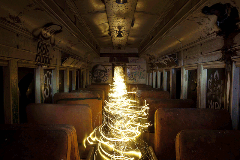
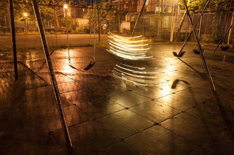
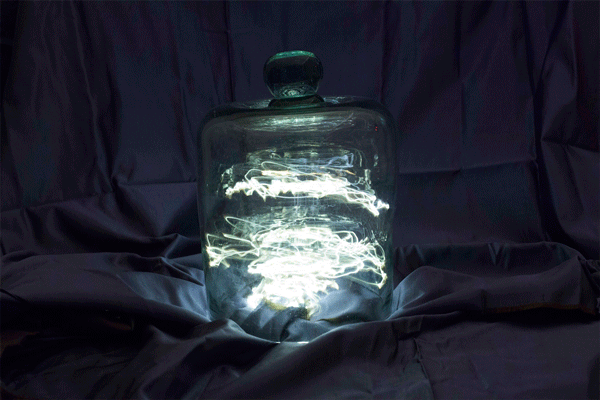
To capture these magical images, Spinelli uses the technique of long exposure photography. By leaving the shutter open on a camera, it captures any movement of light over a long period of time, making any source of light act as a paintbrush. She got this idea by taking a photo by mistake of her going up her stairs with the shutter open and captured all the light trailing behind her. She said the light looked like they were walking up the stairs on their own and loved the idea of bringing light to life.

LSHotelStitch_finalRi_14.jpg
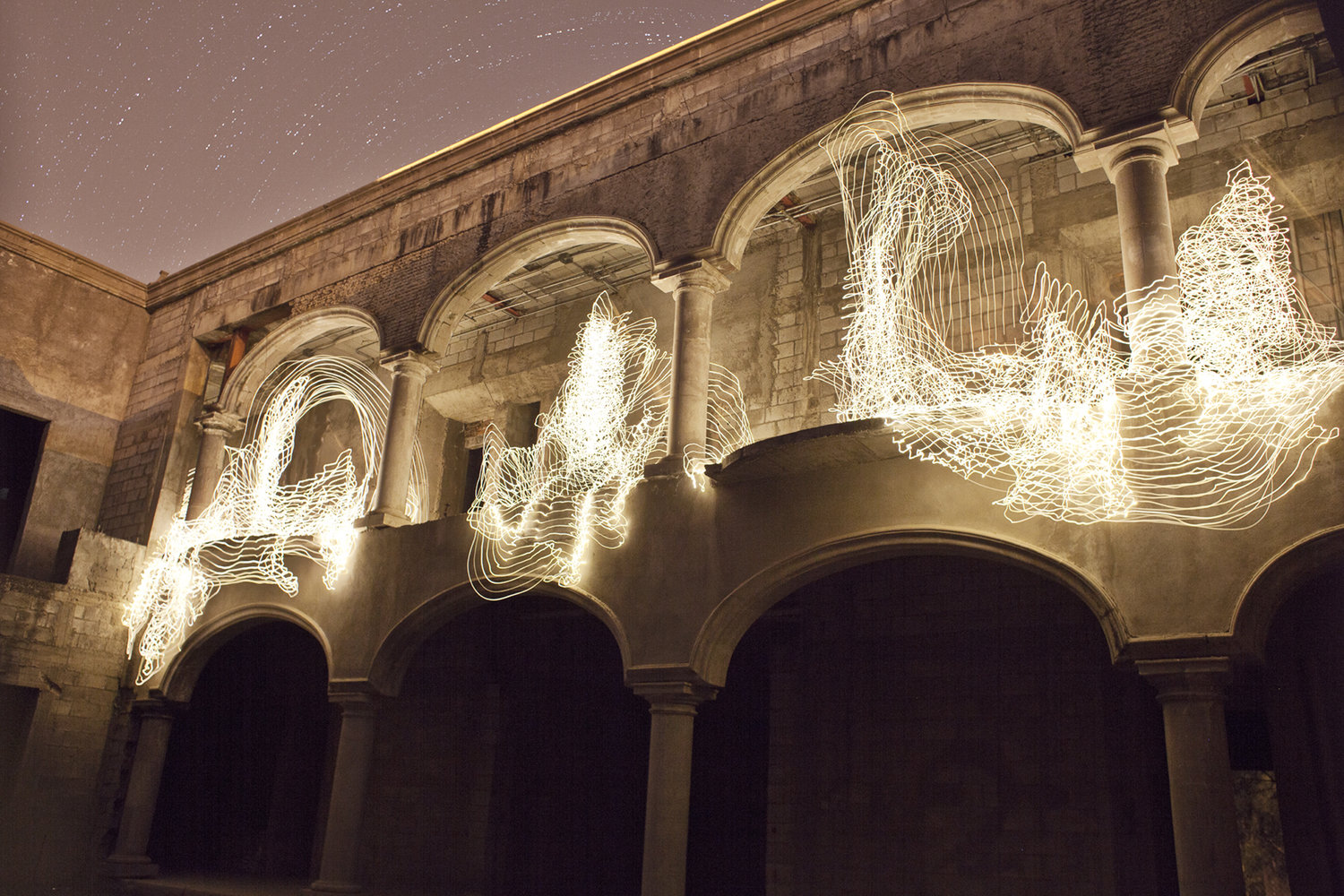
She used many sources of light for her photos such as battery powered fairy lights, pen lights, submersible lights, flashlights, and mirrors. But the most important part of creating her pieces is the background lighting. There needs to be dim ambient light, such as the moon or a streetlight, to illuminate the surroundings. Because these photos were made in such dim lighting, it was very difficult for her to see what she was doing. It required a lot of rhythmic movement and precise planning of each gesture that needed to be made to get the image she wanted.

Photosgraphé

Spinelli created a series of images that combined photography, moving art, and philosophy. The name Photosgraphé comes from the Greek word “light drawing,” yet she not only wanted just one drawing but an animation to give the light a mind of its own. Furthermore, she explains in an interview with Architectural Digest that she creates these animations because it “brings her accidents to life”. In one singular light photo, there could be a mistake, making the artist having to retake the whole photo. Yet with Spinelli’s animations, it allows her mistakes to be intergraded in her work and create such mystical animations.

Isle 800w.gif

Swinger-800.gif

Jellyfish.gif

BellJar.gif

Stephen Knapp

Stephen Knapp is an American artist who works primarily in lightpaintings. Born in Worcester, MA in 1947, he had a background in photography before discovering large-scale installations while studying in Japan in the 1980’s. Afer working with photo-ceramic murals and etching images onto metals and glass for architectural works, Knapp found lightpainting in the late 1990’s.

Knapp working on a piece

Knapp uses special glass treated with layers of metallic coatings that act as a selective prism to cast shards of colored light from a single white light source. Knapp’s installations typically occur on concrete walls, and the glass shards are affixed at specific angles to manipulate the light and create an abstract piece.

“First Symphony”

Knapp’s work at Ball St., entitled “First Symphony”, is one of his more elaborate works. The name helps describe how he feels about his light art: that the shape, color, and space that he incorporates should work together much like harmony, melody, and timing for a musician. He often describes his pieces as “Symphonies of Light”.

Here is a video clip showing Stephen debuting this piece and talking about his inspiration: https://youtu.be/0wYbwVpiG9o?t=90

Notice how the light sources don’t interfere with each other, and the primary shards of light work outward to fill the entire canvas.

“False Prophet”

Another one of his works, “False Prophet”, brings a more somber tone. The greyscale mixed with small instances of muted colors help drive home this mood and keep the appearance of the work true to the original intent. The light all travels in one direction, creating an almost tower or mountain upon which the source sits.

“Risen Blue”

“Risen Blue” brings a more energetic feel, with vibrant blues and yellows criss-crossing across the canvas at sharp angles with unique ending patterns. This piece, with only one light source, does a good job of illustrating how Knapp not only uses translucent glass, but also reflective panels to change the direction of the beams.

“Transformation”
“Transformation”

Knapp’s piece “Transformation” is a good example of him using his primarily 2D art style to fill a 3D space. He installs glass panels on the ceiling as well as two cornering walls to walk the light around the entire room. It is particularly impressive how he got the same color bands of light to line up at the corner, making it seem like the light was stretching around it.

“Fade into Black”

Finally, Knapp would also fix his light sources onto raised panels to create a frame of shadow on the outer half of the work. This shadow would provide depth to the piece, as well as making the primary section stand out. On this work, entitled “Fade into Black”, he uses a number of different panels that all end quickly to create the appearance that the lightpainting is melting into the black background.

Chul-Hyun Ahn

Chul-Hyun Ahn or 안철현 is a light artist from South Korea who is known for manipulating perspective with light and mirrors to create portals of infinite space.

Ahn is from Busan, South Korea, which is a coastal city marked on the map above. He went to Seoul to attend Chugye University for the Arts where he received a B.F.A. After college he moved to the U.S. to attend the Maryland Institute College of Art to get an M.F.A. Ahn is currently 47 years old and living in Baltimore, Maryland.

Space is the root of Ahn’s art even though he is labeled as a light artist. He started on the subject of space when he was a freshman in college. He became frustrated with the limitations that 2D mediums put on exploring space. Ahn got the label of light artist because of his use of light to show off space in his works. The goal of many of his works is to help the viewer by calming them, offering an escape, or helping them find something. Emptiness is a work of Ahn’s shown in the picture above, that he hopes helps viewers find something when looking at it. There is an infinite emptiness between the two lights that is filled with something even if it’s just air as it shows the space between the lights exists.

Ahn currently has multiple ongoing series. One of these is series is called the Forked Series and has at least 39 pieces in it. The pieces in this series are created by having two mirrors behind a light with a one way mirror on top. Changes to light position and the mirrors behind the light creates the multiple pieces in this series, a few of which are shown above. This series highlights some of Ahn’s techniques as it uses reflections to make the light bend in different ways to create an infinity.

Primary tools that Ahn uses to create his works are mirrors and LEDs to create infinite space. He does this by layering the mirrors in a certain way and shining light on them. Details in how the lights bend and what direction the light fades in are used to give a deeper sense of space. To put the pieces all together he uses various types of woods and concrete to hold it in place. Tunnel #7 shown above, is an example of Ahn’s work that uses concrete to hold the lights and mirrors together. He uses elements of repetition and gradients on some pieces to make them look like the outcome of a computer graphic. Using the fact that the amount of each reflection in a mirror get consistently dimmer. Ahn uses a computer program called 3Ds Max to first generate drawing, especially for bigger pieces. He then uses the outcome data to start working with real objects.

Scratching mirrors is another technique that Ahn uses. A series of his called the Mirror Drawing Series uses this technique. This series is done by drawing the design on the back surface of the mirror with a sharp tool. It makes it so light can come through the scratches to make infinite reflections when light is projected from behind the mirror. Pieces are shown above that highlight that this process creates a calming infinite space. Ahn hopes that people could spiritually travel through these calm infinite spaces to escape reality by looking and falling into the calm infinity.

Urbanscreen, Light Artist

Urbanscreen is a creative art company in Bremen, Germany. It was founded in 2005 as a collective of architects, media artists, musicians, cultural scholars, and tech experts from various fields with a focus on cross-genre artistic expression and blending physical and digital media.

Urbanscreen, comprising of several experts in their respective fields, has spoken at various workshops and conferences worldwide. Of note, they were a speaker at OECD for their talk, “Getting Cities Right” which focused on integrating media facades and other digital installments into city design.

Urbanscreen divides their work into three broad categories, the first of which they call Lumentektur. Lumentektur is the projecting of 3D-mapped video onto existing architecture, using virtual lighting and theater to create art.

Buntes Gold is one of their Lumentektur pieces, projected onto Bremen’s house of commerce. Buntes Gold features four dancers performing across the face of the building as it transforms around them. The piece is designed to show the tensions between creativity and economic action. To create Lumentektur, Urbanscreen designs scale models of the face of the building they project onto, turn it into a green screen, and have the actors perform on it. Afterwards, the footage is edited to create the effects desired for the final piece before it is scaled to fit and projected onto the building.

The second broad category is sculpture. Urbanscreen designs installations of objects and projects imagery onto them. In downtown Houston, in the JW Marriott, is Solanum.

Solanum is a series of circular panels, some of which have had parts removed, offset from a blank wall. A projector hangs from the ceiling a few feet away projecting animations onto the piece. Solanum follows the day-night cycle: during the day, the animations are calm and gentle, as though it were sleeping, while at night, the full animation cycle plays to draw in viewers.

Urbanscreen refers to their third category of work as exploration. They take what they have learned since starting Lumentektur and expand upon it to meld together various disciplines. One of the most impressive pieces is called 320º Licht: it is an exhibition which was set up in the Gasometer Oberhausen, a discontinued gas holder in Oberhausen, Germany. 320º Licht is a projection on a 320º arc and 100-meter tall wall, creating approximately 20,000 square meters of projection surface. Urbanscreen used 21 inter-connected projecters to fill the space, and it became one of the world’s largest and most technically sophisticated indoor projections. The piece was designed to be a play between the real and virtual space as the projection turns the walls of the Gasometer into a series of patterns and shapes.

Finally, another impressive work done by Urbanscreen was on display during the 2012 Lighting of the Sails in Sydney, Australia. Sydney will bring in artists to create art on the surface of the opera house, and Urbanscreen created a play of Lumentektur. They took inspiration from the original architect, Jørn Utzon, who wanted to give the building human expression, by creating a work which tried to establish an immediate architectural expression.

Janne Parviainen, Light Painting Artist

For my presentation I got to focus on the artist Janne Parviainen and his fantastic light paintings.

Artist Background

Janne was born in 1980 in Finland, earned his degree in photography and painting in 2003 from the Finnish Hyvinkää Art School, and has been teaching art and freelancing ever since. His works have been featured in several international art exhibitions, magazines, and well-known websites, including National Geographic, The Huffington Post, and Wired.

Catharsis

(This photo was in UNESCO’s Year of Light Exhibition in 2015) Catharsis means to release strong emotions through meditation, which is apt for this image.

Light Painting Methods

Like the photo above, most of Janne’s light art features surreal beings made of pure light, inside of abandoned buildings, drawn backgrounds, or among the dark woods surrounding Janne’s native Helsinki (Finland). When one looks at the images, it is hard to believe that they are produced with only a long exposure camera and some simple LEDs.

Yes, indeed, they are only photos- and not the Photoshopped kind!


The video below shows the process Janne uses to create some of his light painting- note how fast his drawing hand moves. (The best content is from 2:17-3:17 in the video)

Art Themes

Janne’s art usually has a spiritual or abstract theme, which compliments the otherworldly beings that Janne conjures with only light. (The figures themselves are usually either contoured light beings or skeletons). Some of his works also feature the telling of an object or scene’s past with light art, and are set among abandoned buildings in Helsinki and other places of urban decay. Janne also enjoys manipulating perspective in his photos by drawing landscapes surreal enough to match his figures with reflective marker in his studio.

Examples of Janne’s Light Paint Photography:

The Time is NowThis piece centers around the theme of procrastination and contemplation on whether a task is worth the effort


We are all RefugeesThis work is also a political statement (Janne is socialist). Note the use of forced perspective with the reflective drawing Janne made on the floor of his studio.

We Are All Refugees

I Can Still See YouThis has a spiritual theme: The dead are watching us 

I Can Still See You

Roads That Lead To NowhereThis piece brings the rusting van’s wild past to light with light painting

Roads That Lead To Nowhere

In the years to come, Janne will continue to stretch the limits of photography and our imaginations with his work.

Dan Flavin, minimalist light art.

I chose Dan Flavin as minimalists have always appealed to me growing up, particularly musicians like John Cage, Steve Reich, Terry Riley, etc. Flavin’s simplicity was a legitimate statement in the 70’s and 80’s when he came to public attention.

Flavin was from NY, and in the early 50s was studying for priesthood. Many art critics and historians would later attribute some of the qualities of his work to this early religious interest, however, Flavin usually denies attaching any particular meaning to his work.

He later entered the military, the US Air Force, and was trained as an air weather meteorological technician. Through the army, he also got to study art in Korea through the University of Maryland. When he returned to the US in 1956, he attended multiple schools, eventually going to Columbia University for drawing and painting.

He became employed at the Guggenheim in 1959 originally as a mailroom clerk, then a guard, and then transitioned to an elevator operator at the MoMA.

His first significant works were a series called “Diagonals”. He rejected even the concept of a “work”, instead calling them “proposals” or “experiments”. Each diagonal has no further title, just the date it was installed (and sometimes a dedication or subtitle).

He rejected the labels of being called a minimalist (as most minimalists do, in my experience).

The diagonal appears “without mass” and “indeterminate volume”. Critics tend to say they are ephemeral and temporary since the fluorescent bulbs used eventually burn out.

Flavin’s use of reconstructed  bulbs, instead of creating his own materials, falls in line with artists like Duchamp who installed reconstructed objects like a bicycle wheel or a toilet seat. Additionally, it allowed him to focus on other considerations like the surrounding space of the light, which becomes a part of the work itself.

The Diagonal of May 25, 1963 is described as “the diagonal of personal ecstasy”. Its “forty-five degrees above horizontal” position as one of “dynamic equilibrium”.

Light Vs Paint
Part of Flavin’s experimentation is in how light behaves in almost opposite ways to paints and pigments. Blending pigments eventually results in black paint, while blending spectrums of light will eventually produce white light.

The ambient light from the four colors is a white light.

Th primary colors differ as well. Pigments are red, yellow, and blue. Light primaries are red, blue, and green.

Green light is so intense it produces white light. Red light cannot be produced by phosphors, and so the tube is tinted. The red lighting is muted.
These corridor pieces block a hallway, forcing visitors to find another path in the exhibit. You can glimpse the other side of the wall through the open space in the corner.

Space & Architecture
Flavin’s work isn’t just the lighting he installs, it’s the space surrounding it. Putting a light in a corner, or a ceiling, has a deliberate purpose in the audience experiencing the physical space itself, and how the light occupies it.

His late work became larger scale installations, sometimes taking over entire buildings.
This installation in an arcade is one of his last works. The scale of it is pretty insane.

Key Ideas
“It is what it is and it ain’t nothing else”
Flavin denied any particular meaning to his work, however many attach his background to priesthood to his work as representing ideas of religious conversion and spiritual epiphany.

Preconstructed materials
Avoided constructing his own materials, opting for commercially available fluorescent lighting. These lights are “perishable”, have a lifecycle, and thus are ephemeral.

Connection to Op Art: Emphasis on lighting and its effects
Translated this 1950s concept to sculpture.

Environment is part of installation
Flavin’s lighting tends to emphasize the space it occupies. The diffusing light from bulbs into the space is part of the work.

the ephemeral quality of the light itself is arguably completely contradictory to the otherwise industrial character of standard Minimalist materials like steel, aluminum, concrete, plastic, glass, and stone. Thus, Flavin’s legacy is less about his work as a significant Minimalist artist than it is in his ability to look beyond the movement”

Luftwerk Presentation Summary

Everett Johnson

For my presentation, I looked into Luftwerk. Luftwerk is the artistic collaboration of Petra Bachmaier and Sean Gallero. Luftwerk explores light, color, and perception in immersive installations. Focused on the context of a site for each project, Luftwerk applies their own interpretive layer, integrating the physical structure, historical context, and embedded information into each piece. Luftwerk primarily uses geometry and different shades of colors to capture symmetrical and well flowing designs. Luftwerk focuses on the concepts that are introduced in architecture and in the color spectrum. They combine ideas about projection and human interaction in most if not all of their works.

           In my presentation, I focused on four main works of theirs including Spectrum, Luminous Field, Turning Sky, and Color Code. 

           Spectrum is a large-scale, digitized and re-imagined color wheel with 529 painted square panels that cover an entire wall. Once illuminated with animated, colored light, the reception of the colors shift in more than 3,174 tones of red, yellow, and blue.

            Luminous Field is work that is comprised of projections that video-mapped the tiles of the plaza creating a digital mosaic. Inspired by Italian marble floors, the tessellation patterns, the digital mosaic added a new, contemporary layer to the work.

            Turning Sky is an ephemeral lighting station that visualizes local weather and atmospheric conditions on the trail. Patterns of clouds varying in speed coincide with wind data, velocity, and direction, and the ever-changing colors represent temperature.

            Color Code consists of nine paintings applied to the gallery’s walls. The paintings, using the International Morse Code system of dots and dashes to spell out “SOS,” are configured with a variation on complementary color patterns, creating a playful visual excursion.

Thomas Scaplen Intro & Art Portfolio

Hi everyone!

My name is Thomas Scaplen and I am a Junior undergraduate student at WPI studying electrical and computer engineering. As far as my experience with art making I never really worked on any art projects individually before college but was something I wanted to explore. At WPI I have taken courses in digital art, which intrigued me because of my interests in technology. As an ECE major I have had some experience with programming and electronics. In particular I have programming experience in C, java, and python. In addition, I have used an Arduino a couple times before so I have done some programming with that.

Below I have attached an image from one of my most recent projects and a video of a second one. The first one is a 3D character model of Jordan Spieth, who is a professional golfer, and the second one is a short animation of the “Who’s on First?” comedy skit by Abbott and Costello.

The video below is a project I completed at WPI in Animation 1.

Outside of school I enjoy athletics, outdoor games such as Frisbee and Spikeball, and listening to music. In high school I played soccer, golf and baseball. My involvement with sports is where my inspiration for the two projects above came from.

In addition to the art projects I have attached some pictures from ECE projects I have done that involve things like LEDs, LED screen displays, light sensors, and programming that might be useful for this class.

My hope for this class is to combine art, music and electronics to create a fun and entertaining project.


Introduction and Art Portfolio – Brie Fiorentino

Hi!

My name is Brie Fiorentino and I am a sophomore majoring in Biochemistry. I chose this art practicum because I really enjoy creating any form of digital art. I mainly use Adobe Photoshop and Adobe Illustrator to create digital paintings and artwork, but I also enjoy photography, video editing, and animation. I fell in love with art ever since I was in preschool and was always asking, “Can we have art time now?”. My mom even framed some of the things I did when I was only three years old. Back in high school, I didn’t take too many art classes, but did lots of art on my free time, especially for my robotics team. I did a very small amount of programming, electronics and actually building a robot because I was mainly on the team to “make it look pretty”. For example, I designed the team’s logo/ t-shirts and made posters, flags, and banners.


https://drive.google.com/file/d/1WHXGqKyCy6dyEeW1hcZYzNsNSIab8KAq/view?usp=sharing

One of my biggest inspirations for art is my grandfather. He is a phenomenal abstract artist and I have always looked up to him ever since I was little. Recently he has been diagnosed with Alzheimer’s Disease and can no longer create any more artwork. Yet growing up watching him paint and create crazy sculptures, he made abstract art my favorite type of art because no abstract painting is looked at the same, it’s all how an individual sees it.

Another creative art I really enjoy is music and dance. Music is very big in my family and everyone knows how to play an instrument. My dad is a professional guitar player and is a major reason why I love music so much. He taught me how to play the piano and ukulele when I was a kid. I also love to dance. I am on a dance team at WPI (separate from WPI’s dance team The Rockets) and often perform on campus throughout the school year.

Recently I have been creating some double exposures in photoshop and I am very proud of how these turned out. I love the look of watercolor or smoke blended into an image of a face.  

Also, here are some of my favorite pieces I created in my art classes here at WPI

https://drive.google.com/file/d/1KTNWCwQNhKRJpOrvDWTubdv75JdX6D-c/view?usp=sharing

https://drive.google.com/file/d/10mIOjL7U8jLbymDAGHemdjCAGBiiaYJw/view?usp=sharing

https://drive.google.com/file/d/1Xx2abT9-tT-wXU2KMPxseMDTjMgPN4V3/view?usp=sharing

Steven Introduction

Hello everyone! I’m Steven Viola, a junior RBE/CS student. My interest in art first started in high school where I took some classes in graphic design and photography. In these classes I learned many of the basic principles of art as well as how to use Photoshop and take interesting photos. I have a little experience with light painting from this class as you can see below. Light painting is a ton of fun but I’m hoping to branch out into different light art mediums for this class. Since then  I have lost my camera :'( so I am back to taking photos on my phone and borrowing equipment when I can.

When I started at WPI I decided to continue my pursuit of digital art and took courses in 3D modelling, animation and interactive electronic art. These courses definitely expanded my artistic abilities and the interactive electronic art course really changed how I viewed art as it allowed me to incorporate more technical aspects.

On the tech side of things, I have plenty of experience with programming and electronics. I especially enjoy incorporating motion into some of my artwork and using clever programming to achieve some interesting effects. I have pretty extensive experience with Arduino and many of the connected actuators and sensors and I have created many custom circuits for a variety of electronics projects. I am looking forward to incorporating electronic elements into this project, but I also greatly appreciate elegant low tech solutions that seem almost impossible without fancy programming.

Another art form that I really enjoyed was fire spinning. Last summer I worked with a group to learn some of the basics of fire-spinning and I really loved the awe inducing effect caused by combining the danger and mystery of fire with a complex series of movements. Though I did not spend enough time fire spinning to be very good, it was a great experience that I wish I did more often.

Overall, I use art to challenge myself and get out of my comfort zone. As a very technical and functional person at my core I normally focus on very practical projects and how they work rather than the visual impact. For me, art is a way to get away from strict requirements and use the freedom to try new things and experiment to see what is appealing to the senses. These artistic endeavors really push me outside my comfort zone and help me build my creative side.

Below are some of my recent works from WPI classes:

Here is an interactive piece where the robot tries to mimic what you are playing on water glasses.

Here is a model of Saitama from One Punch Man made using Blender

and finally on the very technical side, here is a game me and a partner made for the fall Hackathon where the theme was justice