My personal art practice spans more than 30 years. I like to say that I have never met a craft that I didn’t like, barring flower arranging. Why I didn’t like arranging flowers primarily stems from their impulse to move and do what you don’t want them to do. Which is why it is ironic that I return to that same frustration with this final project. The responsive webpage elements also suffer from an impulse to move and do what you don’t want them to do. 🙂
My portfolio needed an update as I approach more professional opportunities. Also, I had a new application I wanted to share on a variety of screens. And so, I figured I would approach repairs to my website portfolio as a means to learn about responsive web based applications. I fixed the portfolio and made the old design responsive. This is the original design: https://arundeldesign.com/index.html.
My new website is here: new responsive. The home and portfolio or discover more buttons are the only ones that are currently working. I have tested it on my phone and through the tools on Chrome. I would appreciate any feedback you have about the success of the resizing.
Further, I would appreciate feedback on which portfolio site you like best. The left hand image is presented on a 400px wide screen and the one on the right is on a 555px wide screen. Please select the link above if you want to try it on your computer screen.
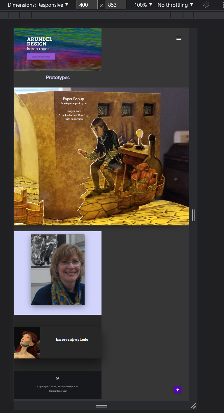
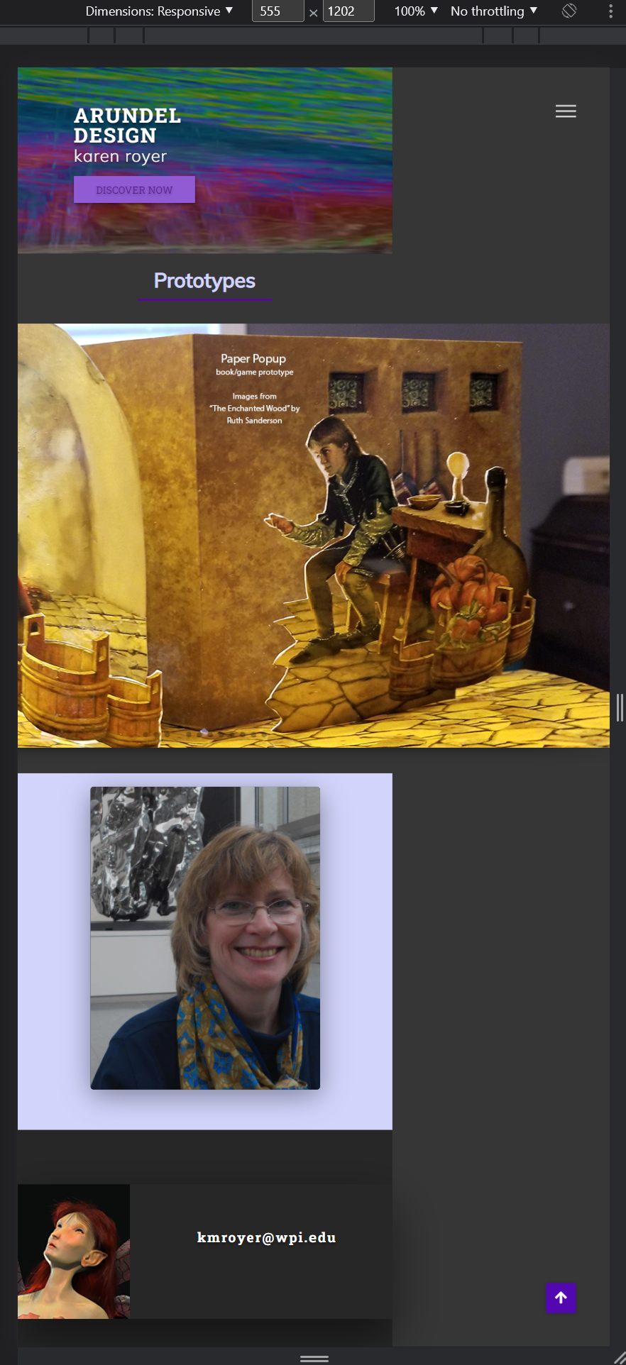
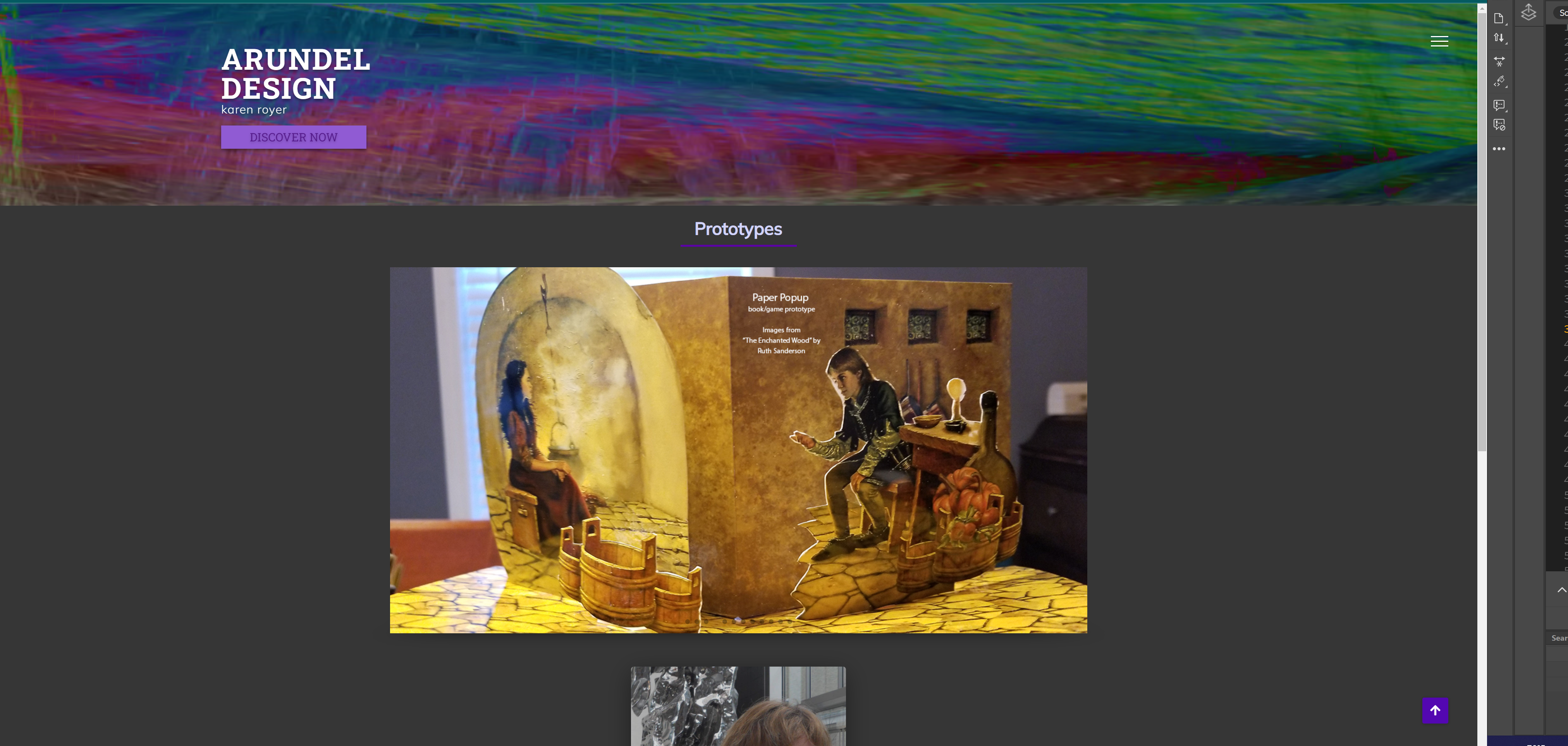


I personally would prefer the new one. It has a lot of things to play with and I love the loading effect of the website.
I think the top menu bar on the old one is more readable and clear than the hamburger button on the new one.