Hi. I’m Tarang. Nice to meet you!
I’m a civil engineering major, and I like drawing. Enjoy this random page. It says a lot about me.
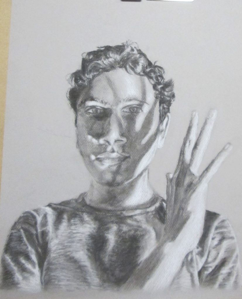
The self-portrait above is from the figure drawing course I took.
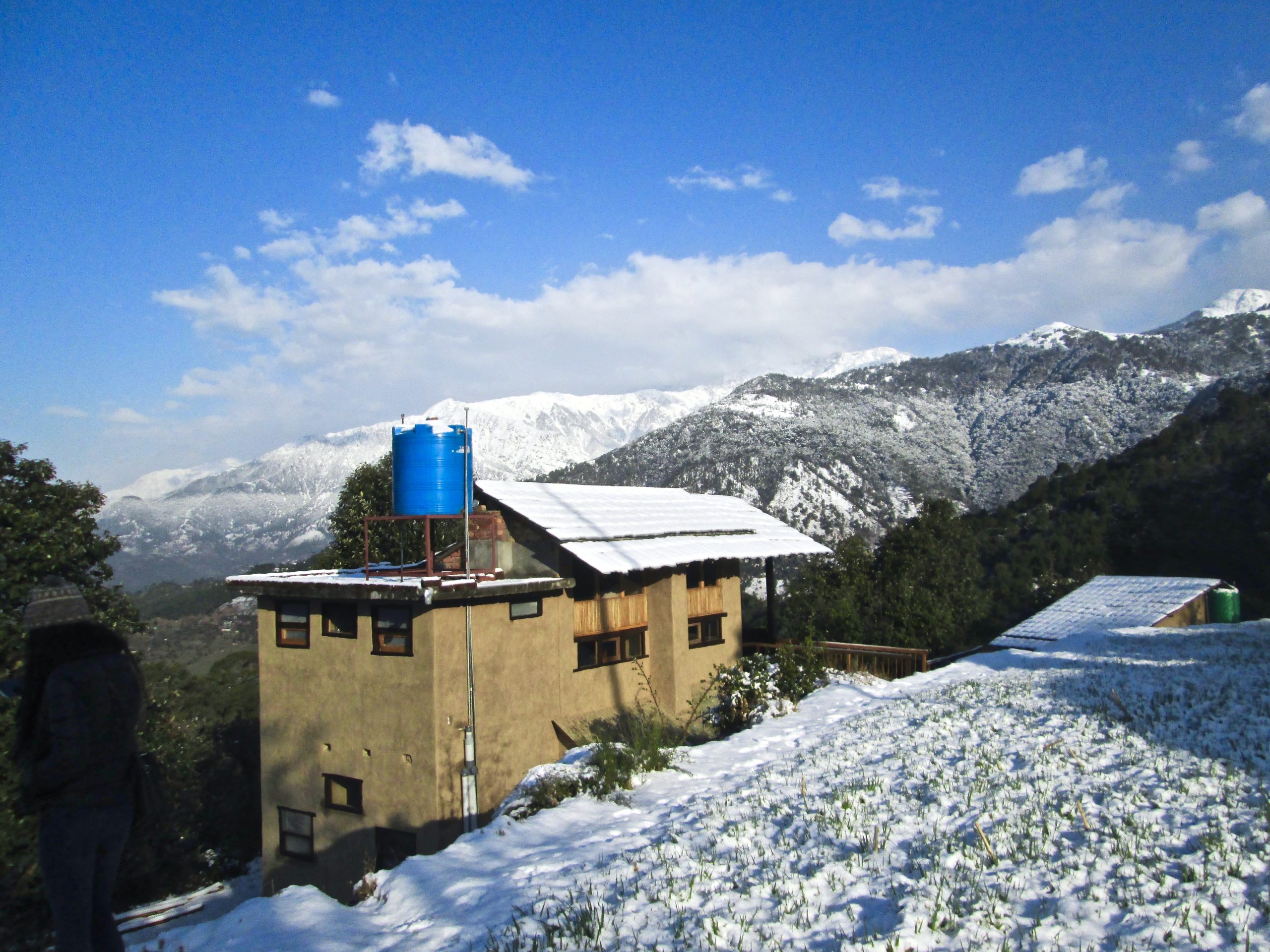
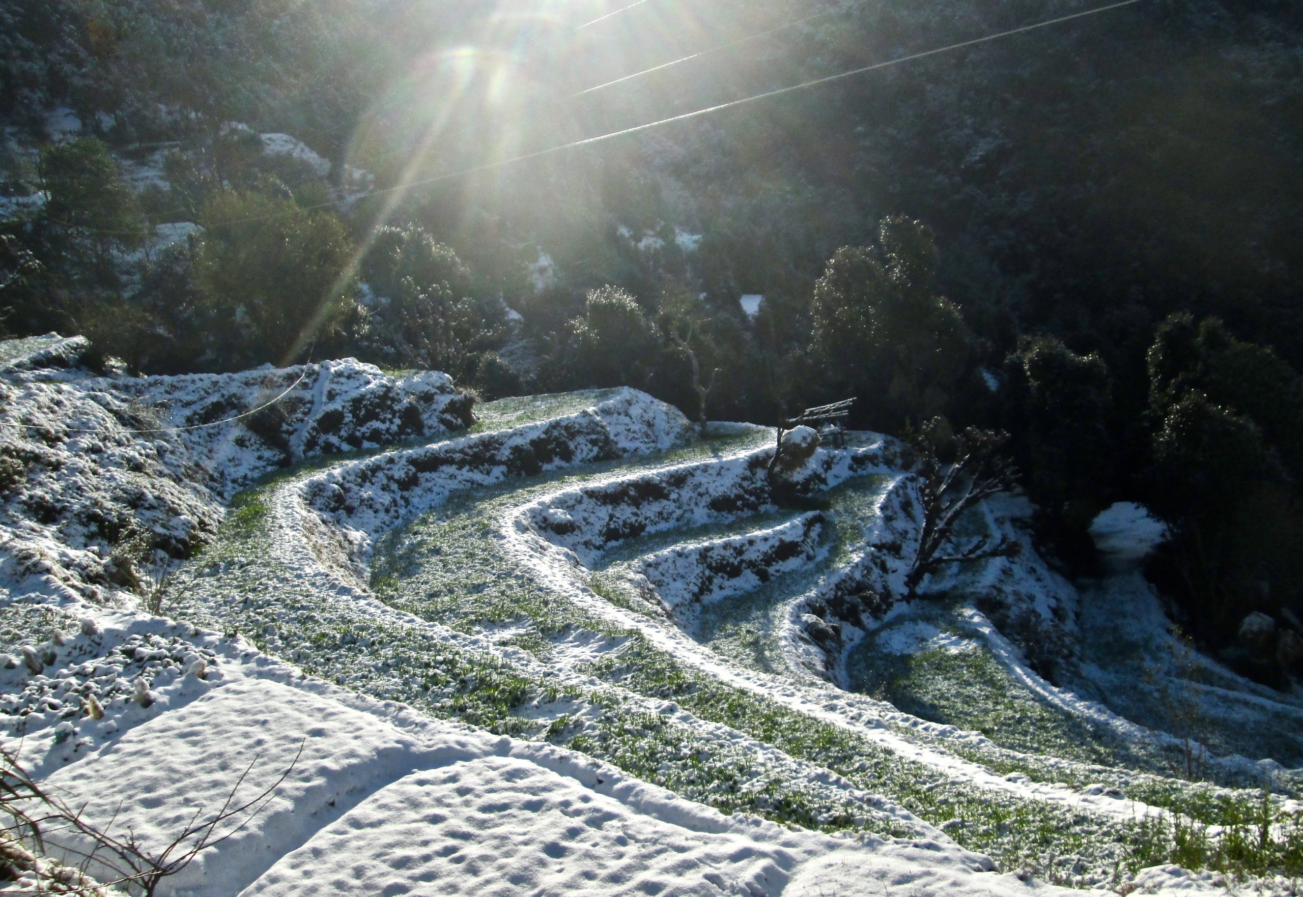
If you’re asking me where I’m from, that’s a tough question. I graduated from high school in India, and was on a gap year before college, where I volunteered in the Himalayas and in Arizona, and biked 500 miles from Portland to Seattle! Adventures are fun, and that describes life between school and college.
Below is an art piece I put up in Worcester — my submission was chosen from a single-line drawing contest:
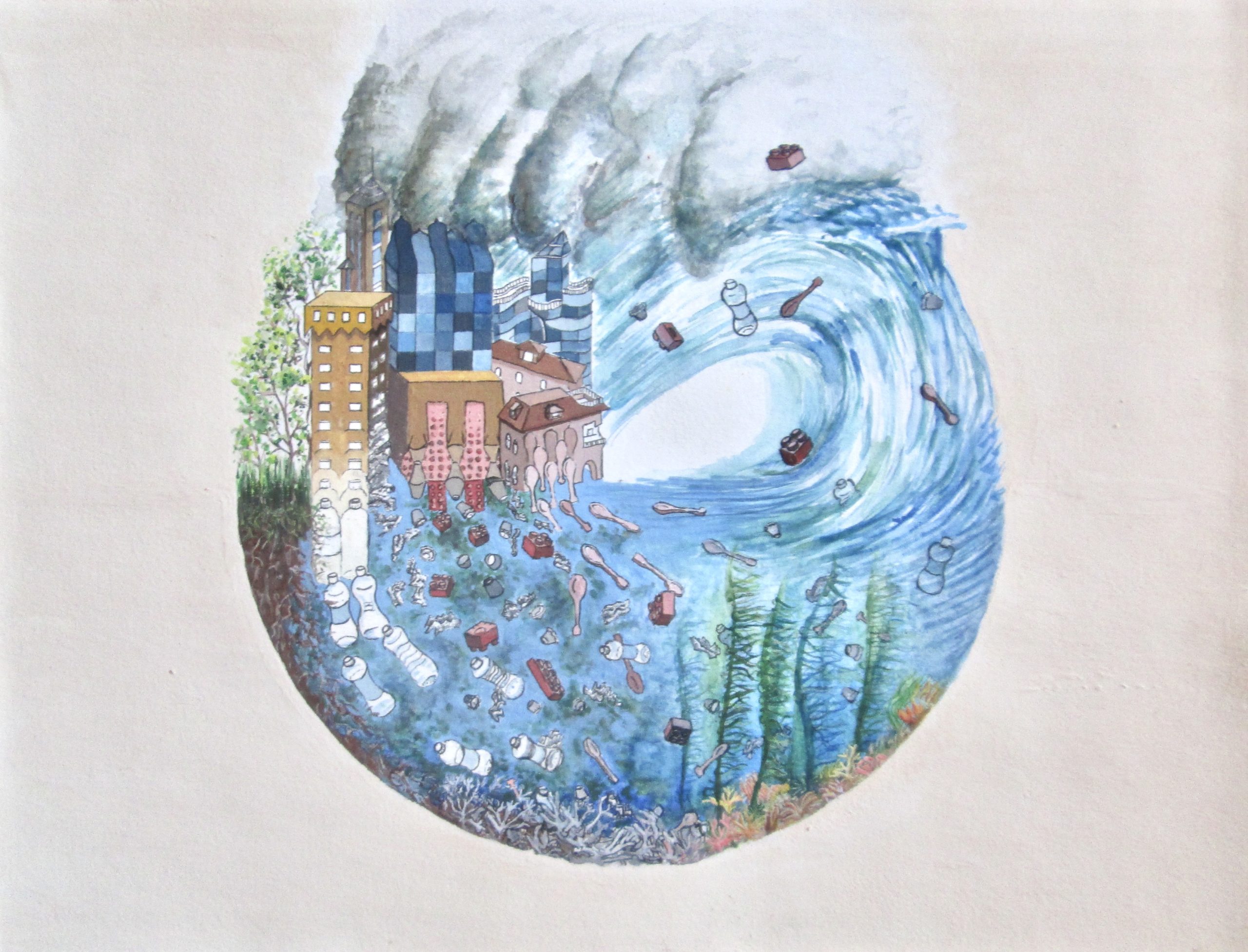
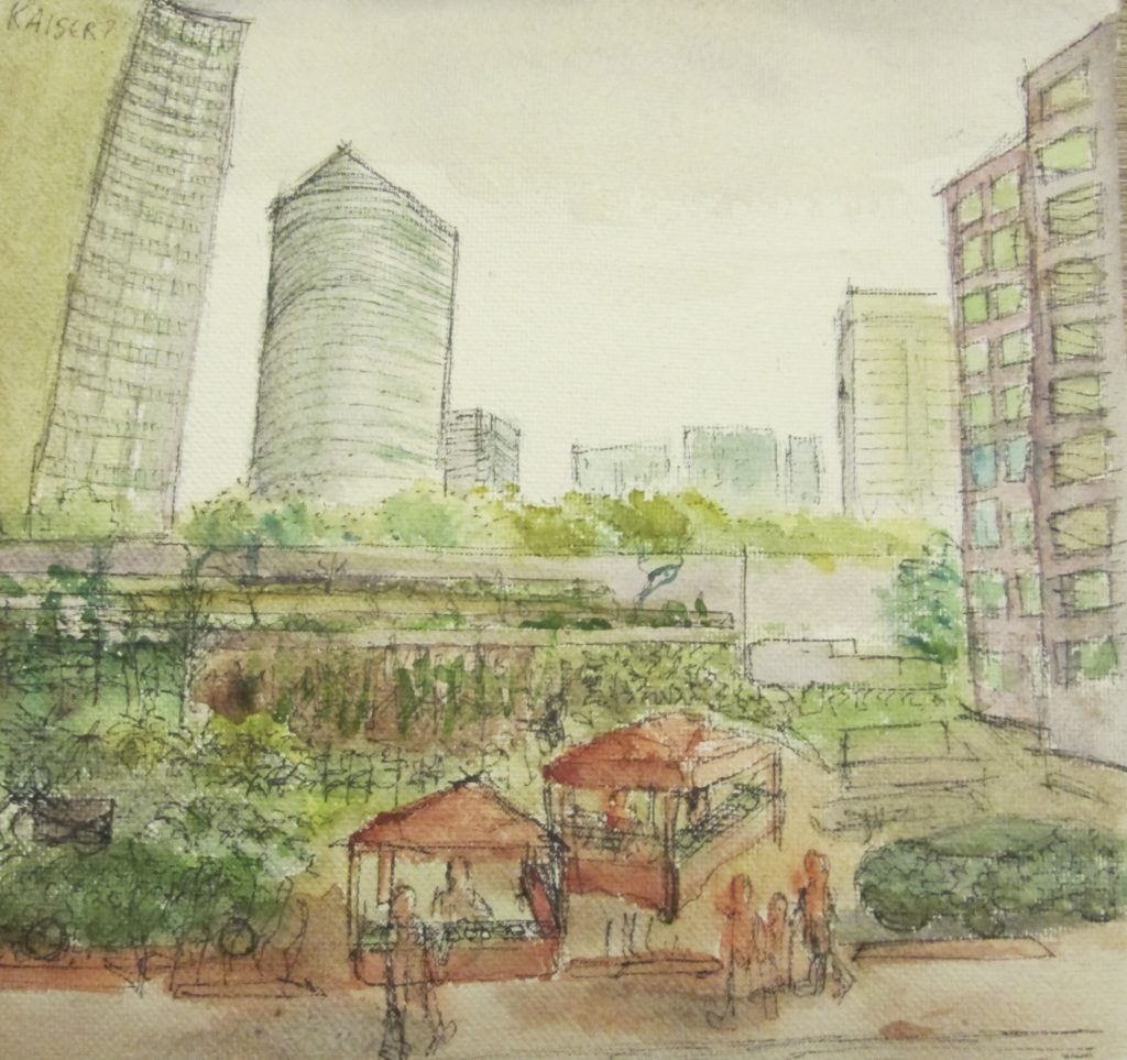
Here’s an older painting of mine from high school:
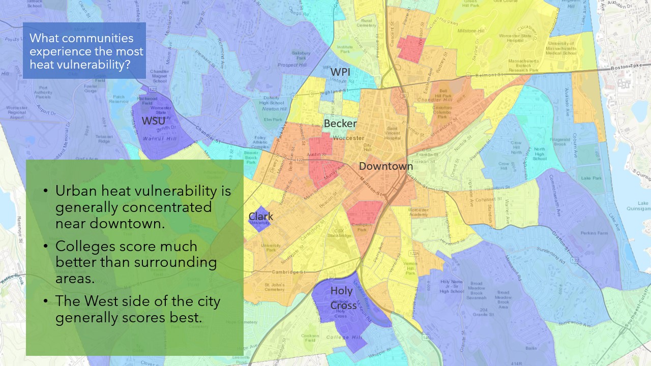
I haven’t done a lot of programming, but I did use some python to create these urban heat island maps.
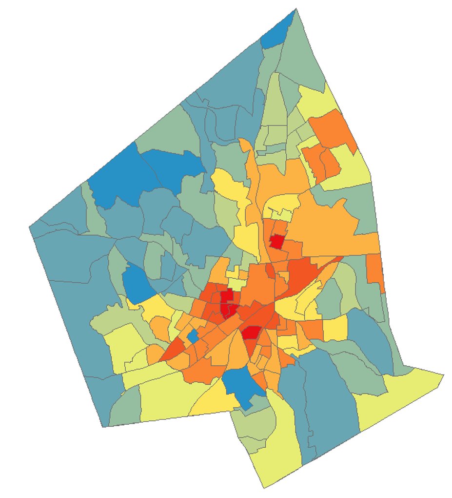
This is a map of high temperatures in the city combined with indicators of who is most vulnerable to high temperatures: elderly, very young people, asthmatic people, low-income people (who might not have cooling appliances), and so on. See more information here.
This project has been going on for a year now, and we’re trying to see what to do given rising summer temperatures and steep city disparities!
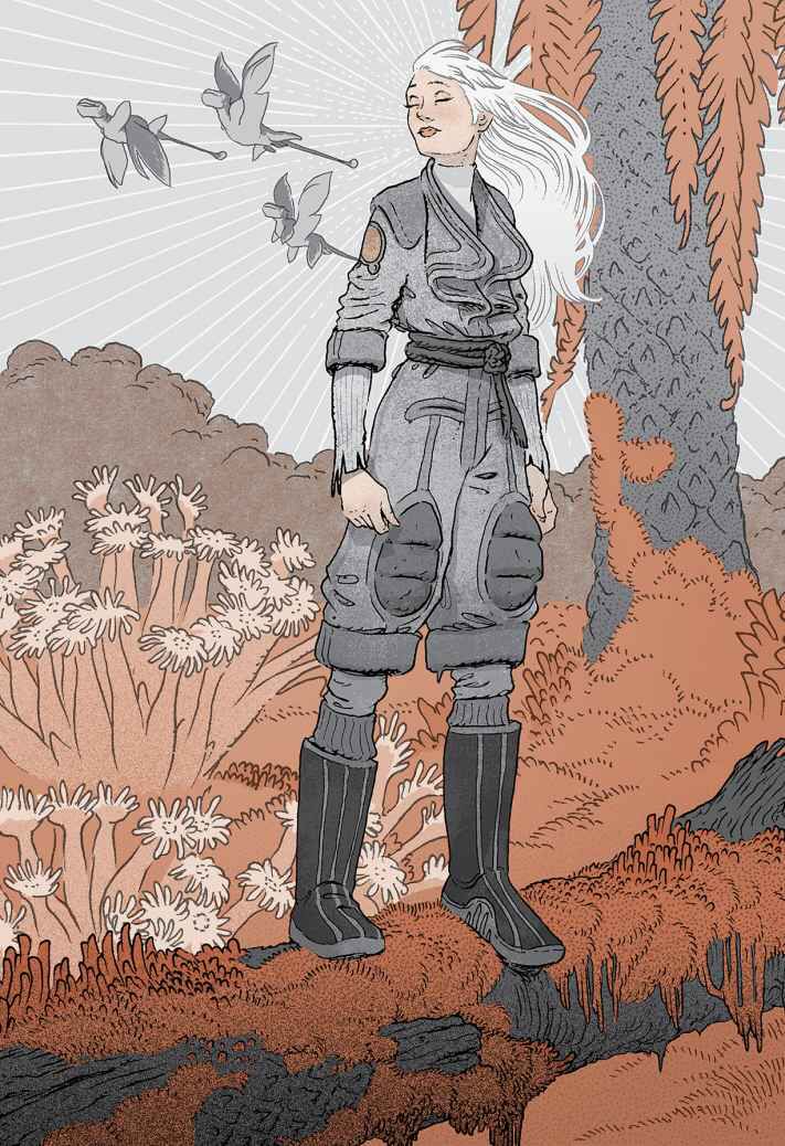
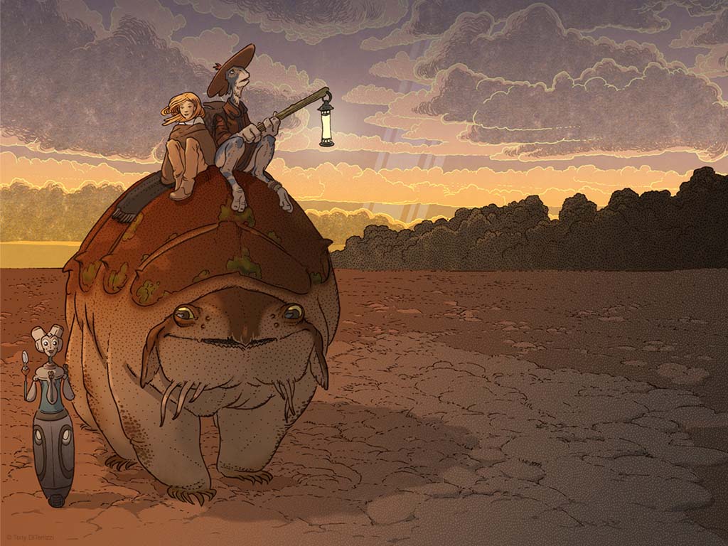
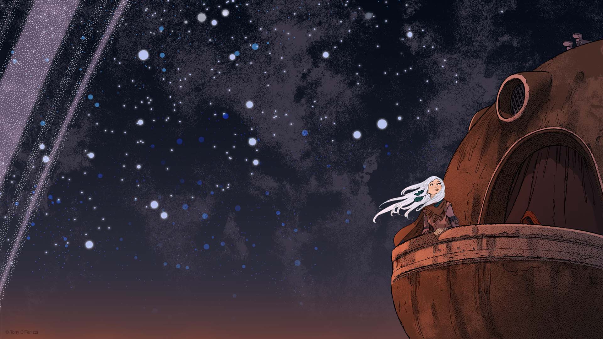
Images from the Wondla trilogy by Tony DiTerlizzi. The books are novels with these illustrations in them, and the images complement the text so well. That’s what happens when an illustrator writes a novel I guess…
I’m interested in urban planning. I see it as the most overlooked yet important way we have to protect our environment, our health and our communities. Art in all forms is key.
A lack of community is deadly (see quotes from Eric Klinenberg below), and art in all forms is crucial to have liveable cities and to build communities.
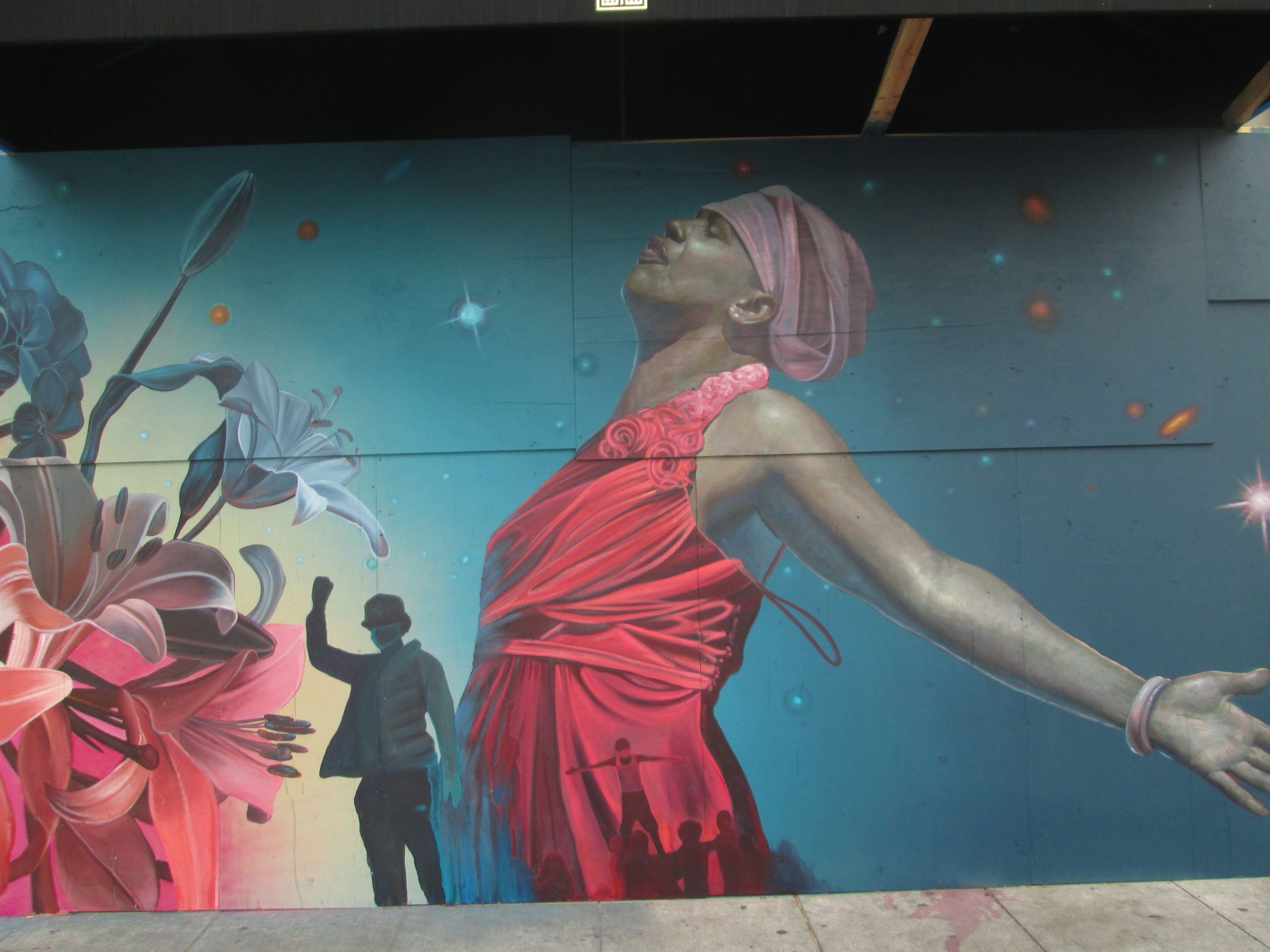
The picture on the right is from June in Oakland, CA. When the restaurants started boarding up with the pandemic and the protests, artists painted the town. Dozens blocks of plywood got transformed into an enormous gallery across downtown. I would love to see this happen again (with the businesses open too).
“Another surprising fact that emerged is that Latinos, who represent about 25 percent of the city population and are disproportionately poor and sick, accounted for only 2 percent of the heat-related deaths. I wrote Heat Wave to make sense of these numbers—to show, for instance, why the Latino Little Village neighborhood had a much lower death rate than African American North Lawndale. Many Chicagoans attributed the disparate death patterns to the ethnic differences among blacks, Latinos, and whites—and local experts made much of the purported Latino “family values.” But there’s a social and spatial context that makes close family ties possible. Chicago’s Latinos tend to live in neighborhoods with high population density, busy commercial life in the streets, and vibrant public spaces. Most of the African American neighborhoods with high heat wave death rates had been abandoned—by employers, stores, and residents—in recent decades. The social ecology of abandonment, dispersion, and decay makes systems of social support exceedingly difficult to sustain.
Of course forces of nature played a major role. But these deaths were not an act of God. The authors of an article in the American Journal of Public Health said that the most sophisticated climate models “failed to detect relationships between the weather and mortality that would explain what happened in July 1995 in Chicago.” Hundreds of Chicago residents died alone, behind locked doors and sealed windows, out of contact with friends, family, and neighbors, unassisted by public agencies or community groups. There’s nothing natural about that.”
Thought-provoking! Your high school painting is amazing, much like your life experience. The precise details and circular composition are incredible. I had to look at it for a bit to understand the message I believe you’re conveying about society’s production and subsequent pollution negatively impacting nature and, therefore, negatively impacting society. Its a great piece of art.
Detailed! Your work and the thought you put into your work is remarkably detailed. I can tell that there is a message behind what you do. The self portrait is full of defining details that brings your face and overall being out from the canvas. Your stance on needed mixture of urban planning and art, was eye opening to me as a Architectural Engineering major.
Thought-Provoking! You draw inspiration from many different areas including the needs of the world around you as well as your own interests and talents. This gives you the ability to look at the world through a unique perspective which you re communicating through your art.
Clever! I really like the temperature maps you created showing the different indicators of who is the most vulnerable to high temperatures. I think this is a very unique representation and model to get something across, and can see this being applied to different digital art installations.
Striking – I love the wave/pollution piece, in my mind it’s like you took the water cycle and the recycling logo/idea and combined them to really emphasize pollution. All with some amazing detail and beautiful composition, with the wave and trash looking like it’s really flowing through your piece, makes it very pleasing to the eye.
Thought-Provoking: Your ability to identify current problems across the globe and use them as inspirations for your art is impressive. With your various pieces, it really does make the viewer think about the various problems that humanity is facing.
detailed – your work has an impressive level of detail, It is evident in from your work that you are passionate about art.
This PROVOKES THOUGHTS from me as well! Art is absolutely a key force in making change, and it’s great to see you are exercising that here. You seem to have a really nice sense of colors, too, between the city plan illustration, your photos, and the generated maps.
Thought provoking! Thinking about urban planning as an art form seems underutilized to me, but you are clearly doing a lot of good work in this area! I found your painting from high school particularly impactful.
Striking! I really like your painting from high school. The message is very strong, and your use of color and composition is very impressive.
Thought-provoking – I really like how your art seems to have a story behind it. Your art is also super impressive and I like the circular painting from high school.