This week, I focused on fleshing out my idea for my painting, as well as cleaning up the letters. I also tweaked the color of blue gels that I’m using, since I realized that my paint color does not match the pure blue gels I have. Right now, I have two blue color gels plus one purple one to filter the light slightly more. I have two red ones to filter the red light.
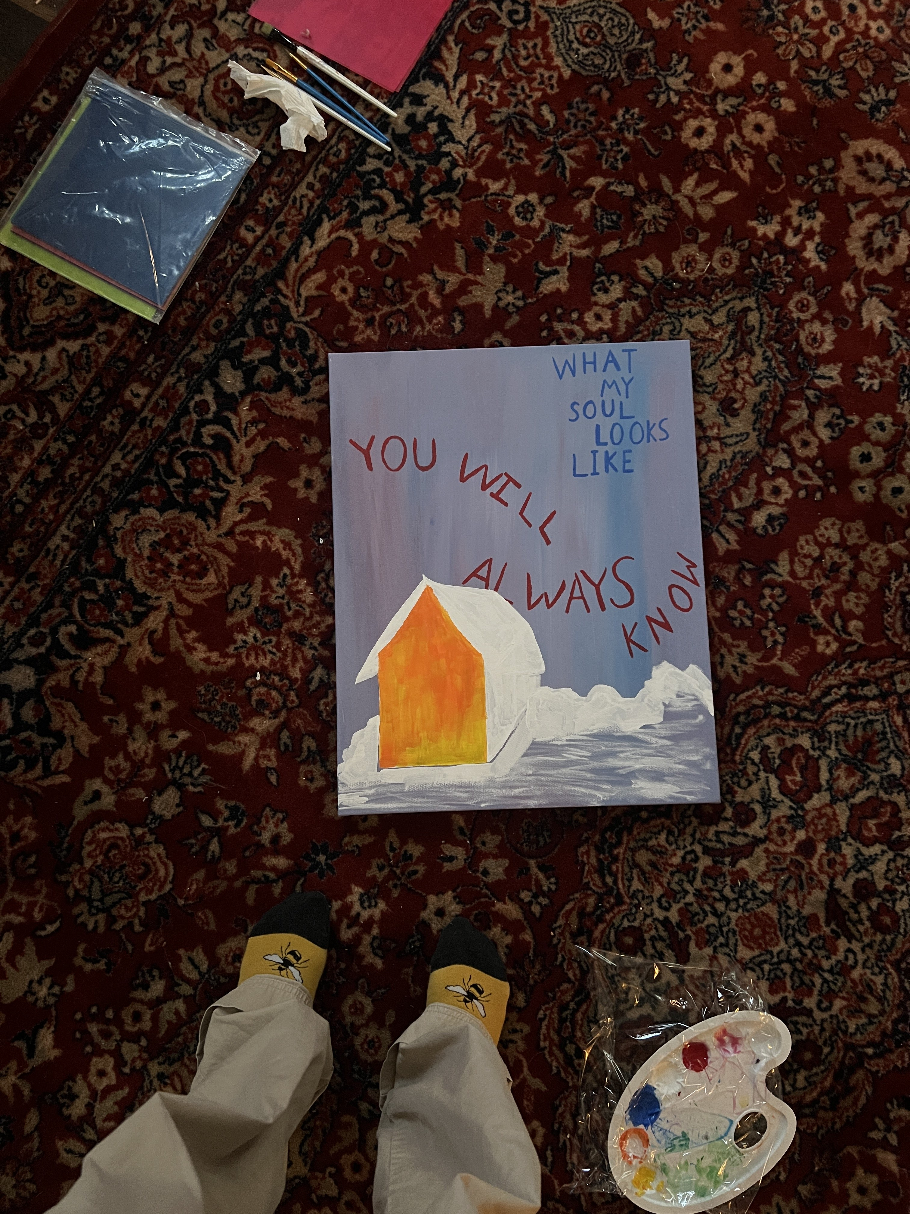
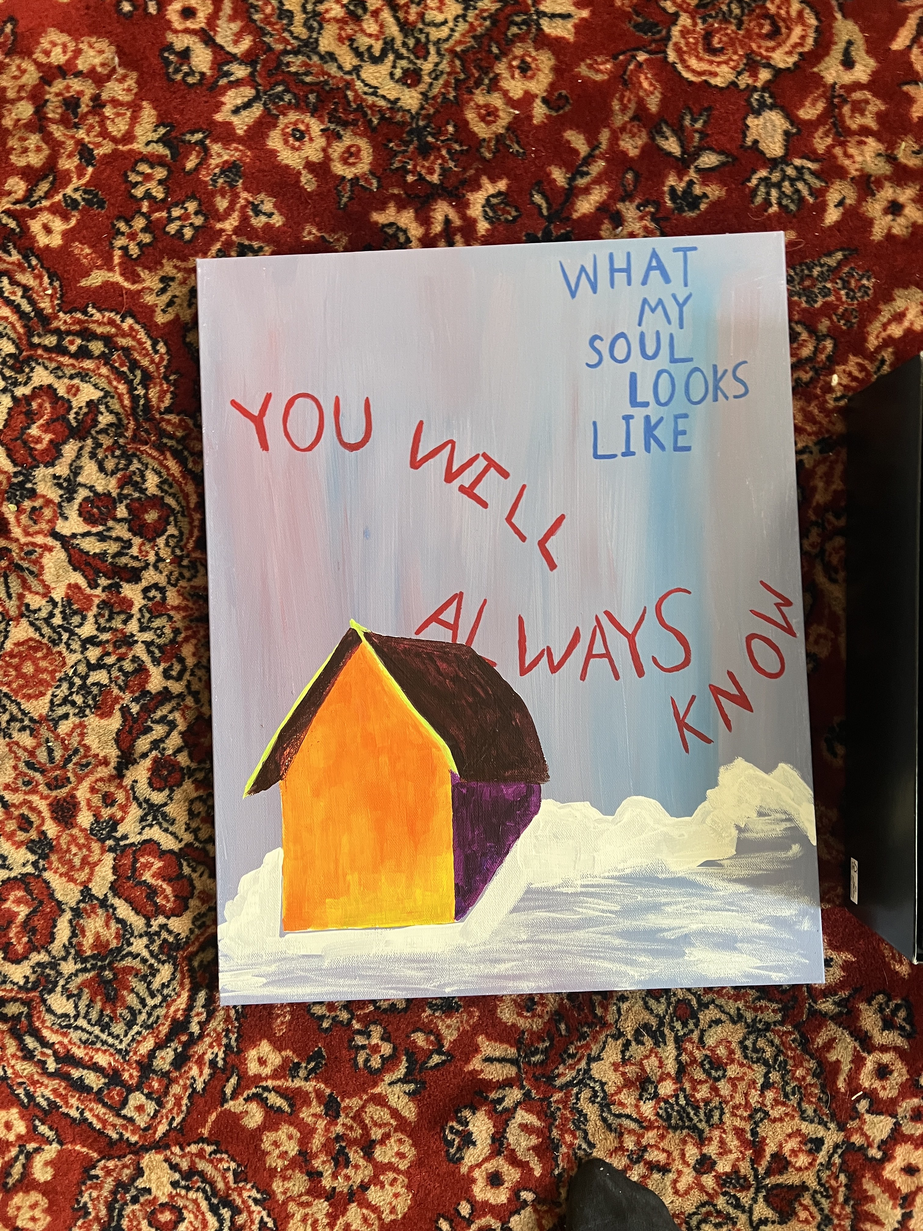
I decided on this idea of a very brightly colored house with dark, contrasting shadows. It took a while to get the perspective exactly right because I made the mistake of not drawing it out first, and instead just painting the white outline directly on the canvas. It will be on fire when filtered with the blue gels, and it will be kind of blue and lonely when filtered with the red gels.
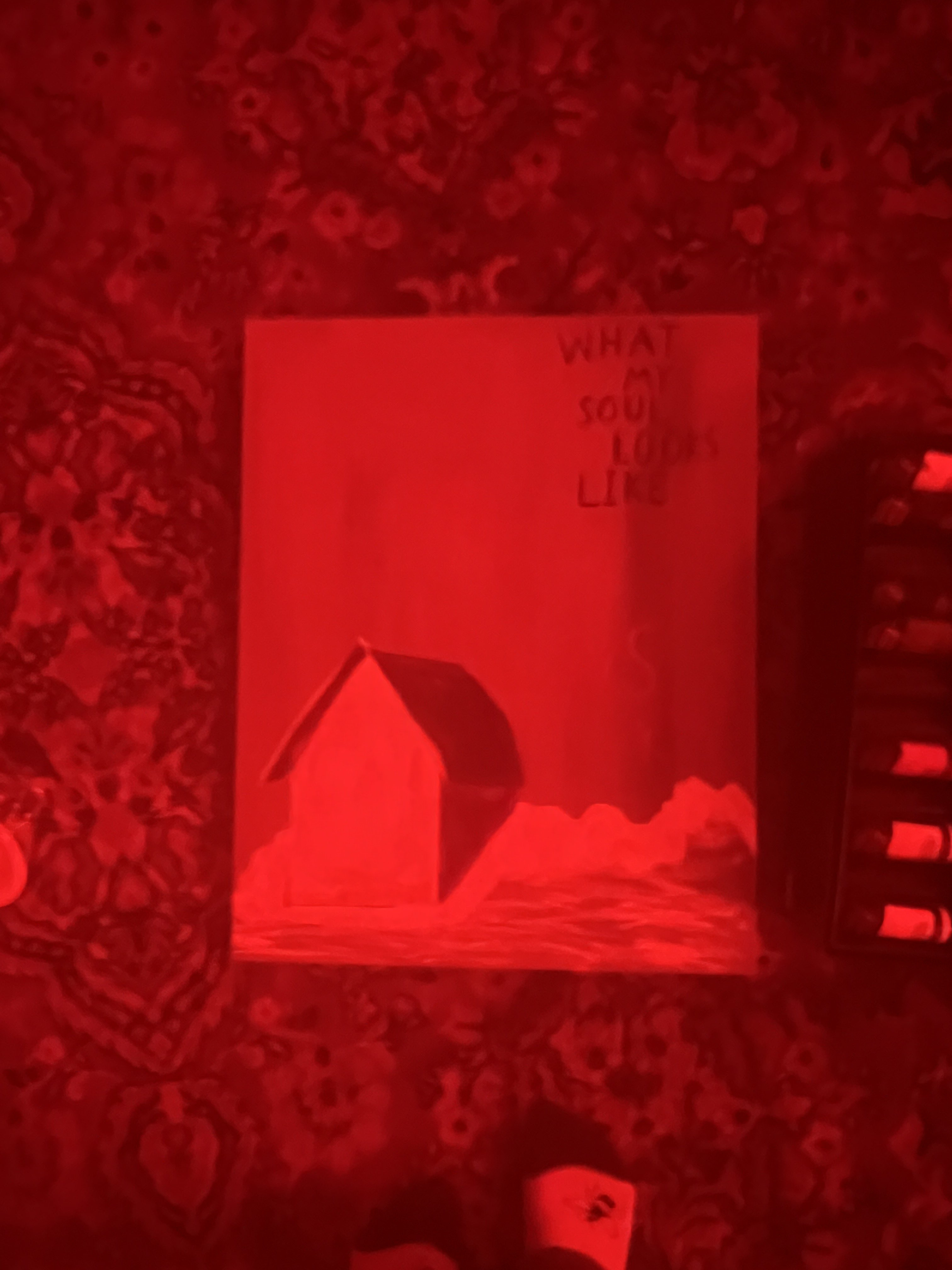
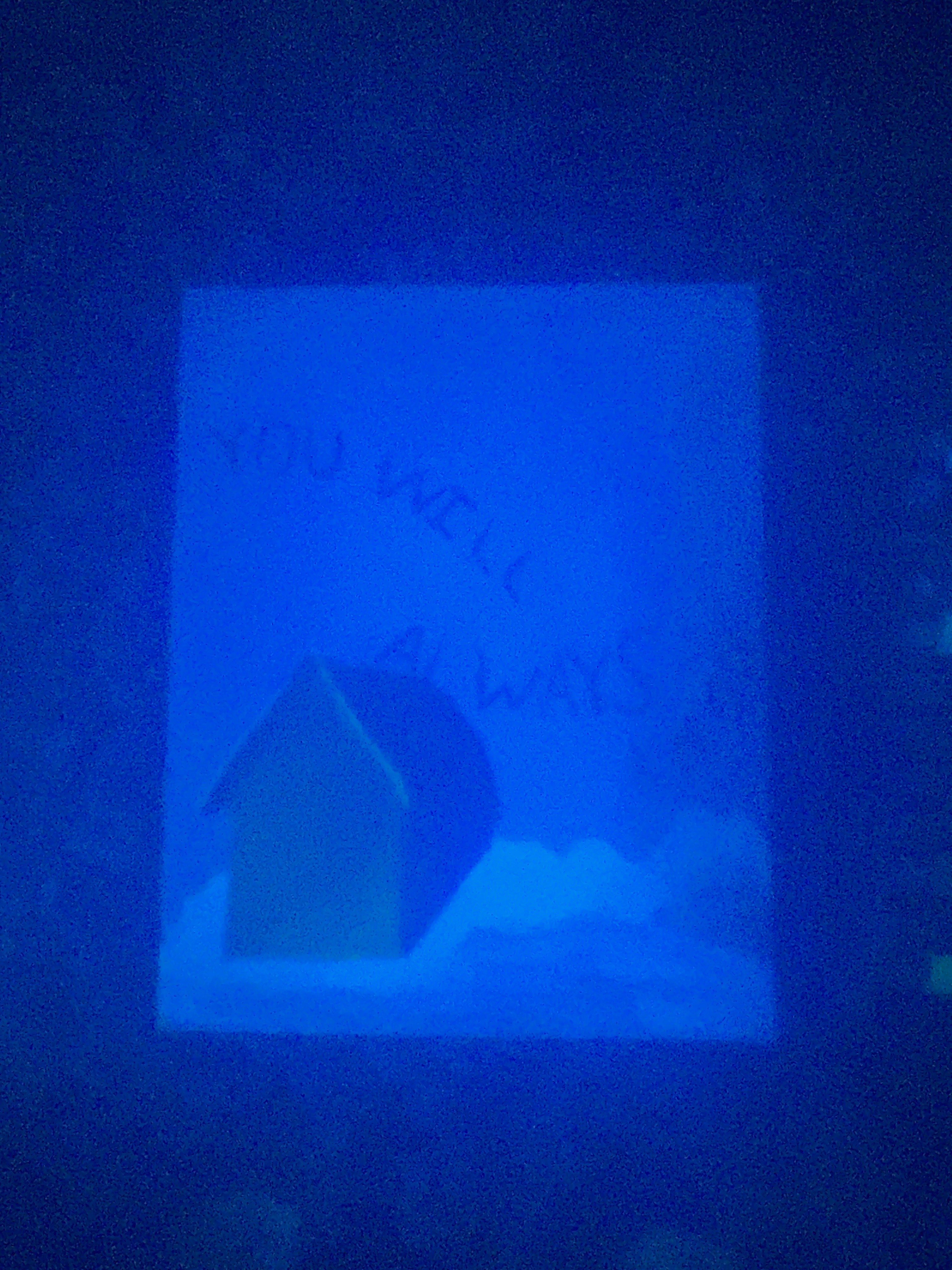
For the next week, I’m focusing on completing the details of the house and landscape, as well as incorporating the fire. Also, I want to try cleaning the gels and see if that helps with the blurriness through the camera. I think for the final documentation, I’ll try using an actual camera (instead of my phone) as well and see if that helps.
I love the fire idea and think it will bring a lot more contrast to the two different images that appear when you use different gels. Do you have a way to hang the painting? I think it will look really nice having at eye level on a wall.
The painting came out so good! Your color matching is on point. I super excited to see the rest of the details come through and I look forward to seeing those details interact with the different gels. I think that being able to prop up the piece and allow observers to move the gels on their own would be fun or to have the gels hanging in a way that as the observer walks around the piece it changes into the other one. Overall I think you can’t go wrong! It looks amazing.