Jim Campbell’s work seems to deal a lot with exploiting similarity and contrast.
Averages

From the Home Movies Series
The point of Pixels is to use averages. Pixels are discrete points, and only by averaging multiple pixels in a given area does our brain make sense of an image. Projectors work the same way, by projecting multiple small discrete light sources. No wonder, Campbell has called the lights used in his pieces “Pixels”. Campbell has stated the desire to remove the defining points of pieces by leaving low resolution images. These pixels are creating a projection with 1/1000th the original resolution. What is actually projected needs to be inferred by movement.
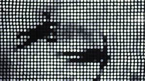
Movement is what remains when resolution is removed, and the averages between frames are what we use to tell what the object is. Above are people swimming
Perspective

Above is Campbell’s piece, from the Exploded View series, hung in San Fransisco’s Museum of Modern Art. It is not coherent yet. Of course, the pixels come together from the right frame to generate an image.
Campbell exploits difference through perspective to make coherent works.

The piece above is literally called “Frames Of Reference”. A nail rotates on a board with a camera. The nail always looks the same relative to the camera, but the background doesn’t stay the same.
A moving average of the frames shows the nail in focus. In the right reference frame, it is the only thing you see.
Empathy

Shock Treatment
Campbell’s early works used computer vision to garner empathy for mental health conditions. The premise of these was to put viewers in the shoes of someone with a mental illness. Shock Treatments erode part of a person, and Campbell wanted to visualize it.
He also has made pieces on Hallucination, where people disapear from a screen, or see themselves on fire.
One of the aspects I see most interesting is the seemingly adversarial nature of these pieces. The artist described them as “genuine”, since they don’t pander to the viewer. One of his pieces shows a small shadow of a buddha which disappears as a viewer approaches it to get a closer look.
The use of “similarity” in these pieces doesn’t have to be explicitly stated, empathy is inherently about finding similarity.
Projections and Topography
My favorite pieces of his are where he uses projections on uneven topography. These create smooth and flowing images that are projected in Three Dimensions.

Vertical pixelated
The pixels are at different levels, making this 2D image different from different frames of reference. It’s visually stunning — in this piece the light is diffracted through prisms that jut out of the wall — but it also uses the concepts explored throughout his works.
He uses topography in a way that the contrast is striking. This is not contrast in color, but in elevation.

For a reason I can’t explain, this is the favorite piece I’ve seen.

Eroding Wave
Presentation — https://docs.google.com/presentation/d/1zFVzzM_oJf5RPmqRMKbPE15VkxkoW89L1kmybiVpIho/edit?usp=sharing