
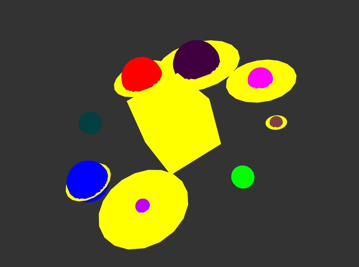
This DataSketch utilizes data from my Steam Library to create an abstract depiction of a solar system that is meant to symbolize my preference of games. As a game designer, I feel I don’t need to explain the importance games have had on my life as it seems fairly obvious that games give me passion and keep me being inventive. Each planet is based off of a genre of game and it goes as follows: Adventure is blue, Action is red, Casual is green, First Person is pink, Third Person is purple, Singleplayer is deep purple, Multiplayer is deep blue, and Puzzle is the toned red. The size of each planet is based on the amount of games I own in that particular genre (conversion is 193 games to 1.93 scale). A planet gets a ring if I have played over a hundred hours of 1 game in that genre (I converted by removing the “hundred” value and moving the decimal back by 1, 109.5 = .95). In the center of the solar system is a yellow cube that represents my subjective view of each genre. This is also why the rings are yellow as well, as I believe my bias towards a certain game/genre has had a significant impact on how much time I spend playing such a game. It is a cube as opposed to a sphere to represent how as an entertainment consumer, I am constrained by my own biases and the types of media I am willing to consume. The inspiration of the solar system came from my interest in science fiction. The closest piece that I would say inspired this work would be the game No Man’s Sky, as the idea came to me when I was playing the game.
Warren’s Steam Library: https://steamcommunity.com/id/LambdaPyro/
No Man’s Sky: https://store.steampowered.com/app/275850/No_Mans_Sky/
After todays class, we learned how to make our Max Sketches more visually involved. How can I make my design feel more animated, or expressive?
Just like our solar system, perhaps adding some more space between the cube and the smaller planets could show more “disconnect” between you and some genres. In terms of adding animation, you could have the planets rotate around the cube or maybe have the smaller planets slowly drift farther away from the center cube.
The most obvious way to make this visual more animated is to make the “solar system” orbit the square in the middle. However, in light of how difficult such an animation would be, you could also apply some kind of slow flashing to make the different parts of your study glow and radiate. This could make it visually appealing, and apply a unique flavor to your art piece.
I agree with what Garet said that it makes sense for the solar system to orbit around the cube. You could also try having each “planet” rotate on its own axis. To make that more interesting, perhaps the rings around each planet could be angled in different directions just like the planets in our solar system. In general, I think this is a very interesting piece, and it’s neat to see how the planet sizes compare to each other and the size of their own rings.
Like Jasmine stated, rotating the planets in different directions would definitely add a more eye-catching look. Also,
animation-wise the planets could move around the cube to really show how planets move realistically around the “sun”. Including fun patterns on the planets could give it an edge and gives the piece a fun aspect!
All the suggestions above are great ones. Something else you could do is place some spheres and particles within the rings, make the rings just a bit transparent and have then have the particles rotate around the planets (and within the rings) maybe one for each game with 100+ hours.
I think another fun animation you could include it have the planets kinda “pop” into place when the user interacts, like growing from the center of their rings into the size they are. Everyone else made a great suggestion with the orbit as well! Kaamil’s suggestion would be so cool to see too, the particles could just be an image displayed on the rings themselves
The orbit idea would be very cool and very difficult. One simple change I would make is to change the yellow of the rings. I would give each ring a different color similar to the planet to which they are connected, so they’re easier to tell apart. If that makes too big a difference, you could try reducing the saturation or opacity of the rings.
It would be interesting if you could animate the the planets orbiting around the cube like a solar system model. It might be beneficial to make each planet with an associated color scheme, maybe it matches the color scheme of the game it corresponds with.
I think mousing over the planets/genres and have them pop up with a text saying what they are could be a fun way to communicate what the planets mean.
Planets spinning around tilted just like the solar system which would be an interesting concept going with the solar system. Another interesting way would be to have the planets being blown into the air like steam coming out of a valve (probably see where I am getting at with this). I liked the color of the planets you chose.
I definitely agree with everyone who suggested to rotate the planets, it would complete the solar system feel. I feel like you might have too much yellow, since there’s a lot of variety of color everywhere else in your sketch. Maybe a more neutral color like white or making it semi-transparent would fix that?