Lately I’ve been thinking a lot about cities, towns, and the places which we call home; I’ll be graduating at the end of this year, and I’ll need to define a new home for myself wherever that may be. Before I moved to Worcester, my childhood home was Nashville, Tennessee. The city has grown massively over the past several years, but that comes at a price.
This piece demonstrates the mass exodus of the Black population from historic inner-city neighborhoods to outer-city neighborhoods in Nashville. With the massive influx in growth that Nashville is facing, already high housing costs are skyrocketing even further. Like many other cities in the nation, and in particular the south, Nashville’s socio-economic divisions tend to fall along racial lines. As such, many longtime Black residents within these neighborhoods are being pushed out of both Central and East Nashville.
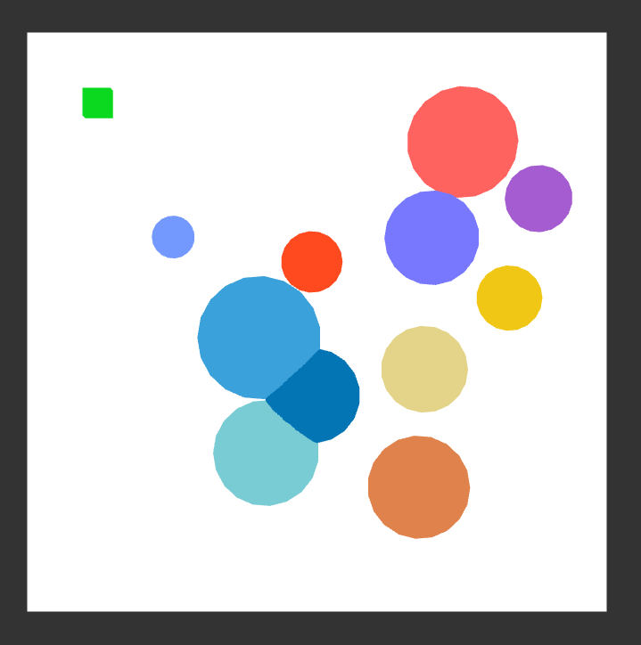
Each bubble represents a size-scaled percentage change in population of Black Nashville citizens. This percent change is the difference between the five-year average percentage of Black citizens between the five-year span 2007-2011, and the five-year span 2012-2016. Each bubble is located around where a neighborhood would be on a map of Nashville. The green box at the top is equivalent to a five percent change in total population of the area. The warmer colors indicate neighborhoods such as Cumberland Heights, Goodlettsville, and Neely’s Bend, which have an influx of Black citizens. The cooler colors indicate neighborhoods such as Edgehill, Germantown, and Greenwood, which have an efflux of Black citizens. For example, the largest blue bubble near the center represents Germantown, which saw a change from 60.8% to 38.4% over the time periods. 22.4% of the entire neighborhood, all Black and all Gone within just a few years.
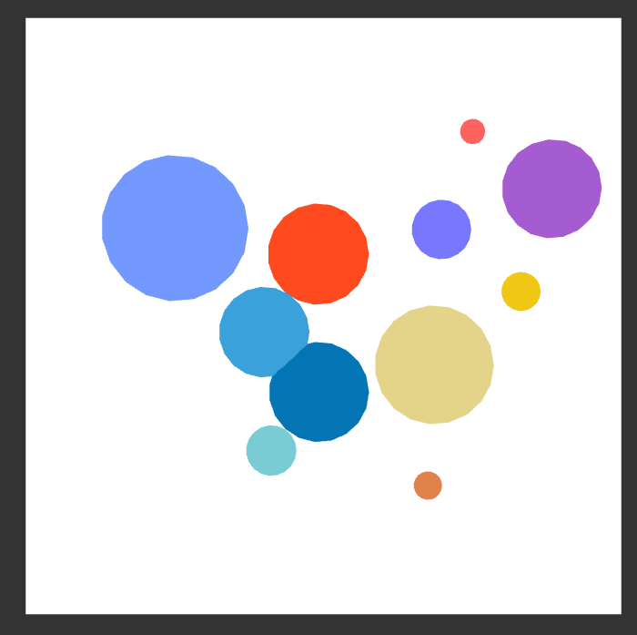
Here are some pictures of the raw percentages during the 2007-2011 period:
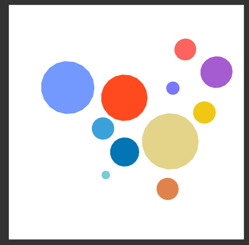
And during the 2012-2016 period:
My sources include this article from the Tennessean: Article
As well as government census data found in the American Community Survey: 2011, 2016
What I would like to know is what impressions does the coloration give for this piece? Originally I just chose the shading randomly and it’s not used to express the data aside from representing whether there is an influx or efflux of people.
With how this picture is meant to represent literal change, animation comes naturally. You can very easily have the spheres all move into their proper position to show the exodus in question. As for other visuals, it could be fitting to have a plane on the background actually show a vague map of Nashville. For instance, if the map just has streets on it, you could easily use that as a nice contras with the colors. Plus it would make your point more symbolically sound. Hope that helps!
It’s be great to see the bubbles grow and shrink over time, and then have the total number of people who have left grow to get a sense of that number.
I like the way you represented the data of the different areas of Tennessee. One suggestion that I would make is maybe having the white box represent Tennessee or something popular in Tennessee.
I like the color scheme and composition of this piece very much, they suit the theme and help tell the story. As there is not question raised yet, here is a one point suggestion. Max has a way to code the background color. When you set up jit.world, put in @erase_color 1. 1. 1. (the rgb values could be whatever you like). In this way you could have an actual background instead of a plane.
Having the bubbles grow over time would be a great application to this already-great piece!! A suggestion I have is maybe making the colors more similar to each other, as in making the warm colors different shades of red or pink, the cool colors different shades of blue (as they mostly are right now).
Because of the changes from year to year, the animation will definitely help bring your point home. As for the colors, I might choose skins tones or bluer tones that get washed out by yellower tones. Maybe not specially that, but including some contrast would help.