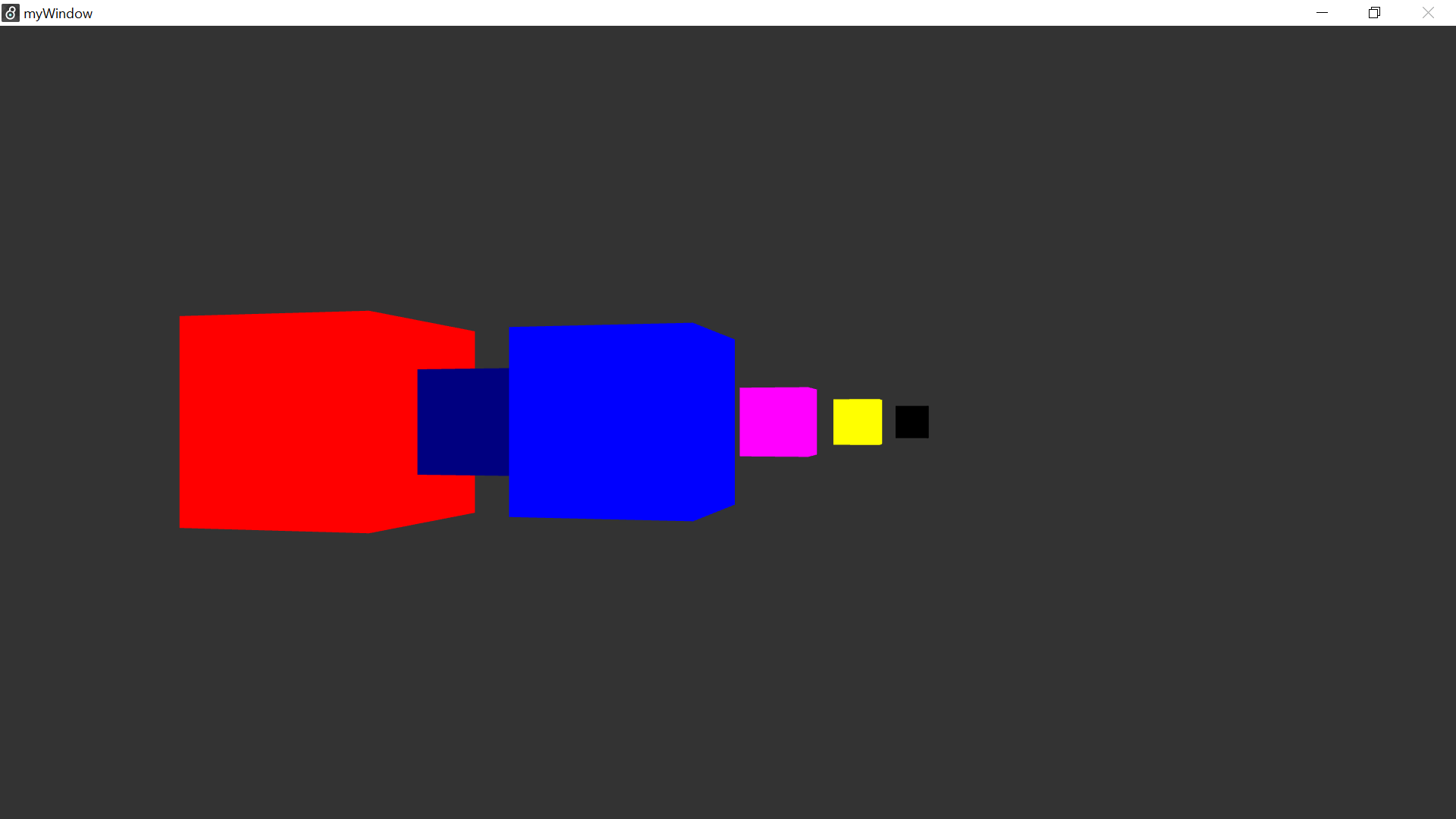
The animation is an improved version of the Data Sketch where each cube represents the number of subscribers on each streaming service. Each cube can now be clicked on and result in a reaction where it grows to a size in respect to the number of service’s subscribers. The cubes grow to their largest possible size and then restart, but the process can be stopped if they click the cube a second time.
The red cube is for Netflix’s 208 million paying subscribers.
The dark blue one is for Disney+ 103.6 million subscribers.
The bright blue one is for Amazon Prime’s 175 million global subscribers who streamed shows and movies in the past year.
The pink one is for HBO Max’s 63.9 million global subscribers.
The yellow one is for NBC’s Peacock and its 42 million U.S. ‘signups.’
The black one is for Starz’s 29.5 million global subscribers.
Since no one replied to my previous post, I am restating my Artist Question: I am planning to represent each streaming service in a more unique way, and I am wondering if anyone can suggest ways to do that? Additionally, I am wondering if there are any other streaming services people would like to recommend be added, and if so, what RGB color would best represent them?
This is a really cool demonstration of the power of different online streaming services! The last time I went to the film was like 5 years ago! hahaha…The colour designs are really nice since they reflect the logo of the provider.