So I really bummed myself out with this one, but having chosen to compare the rates of gun purchases to the rate of gun deaths in the US only eight or so days ago, I first set out to build a function to let me smoothly transition as data streamed in so I could use the values from a .csv as an irregular periodic input without offending my eyes with juddering transitions. I thought I would use data downloaded from the national weather service to compare Worcester precipitation over time, but my laptop described its anger at my attempt to process the last 300 years of daily rainfall by blue-screening.
Having decided that it was safer to test the design of my transitioner with random data input instead, I then built this function!
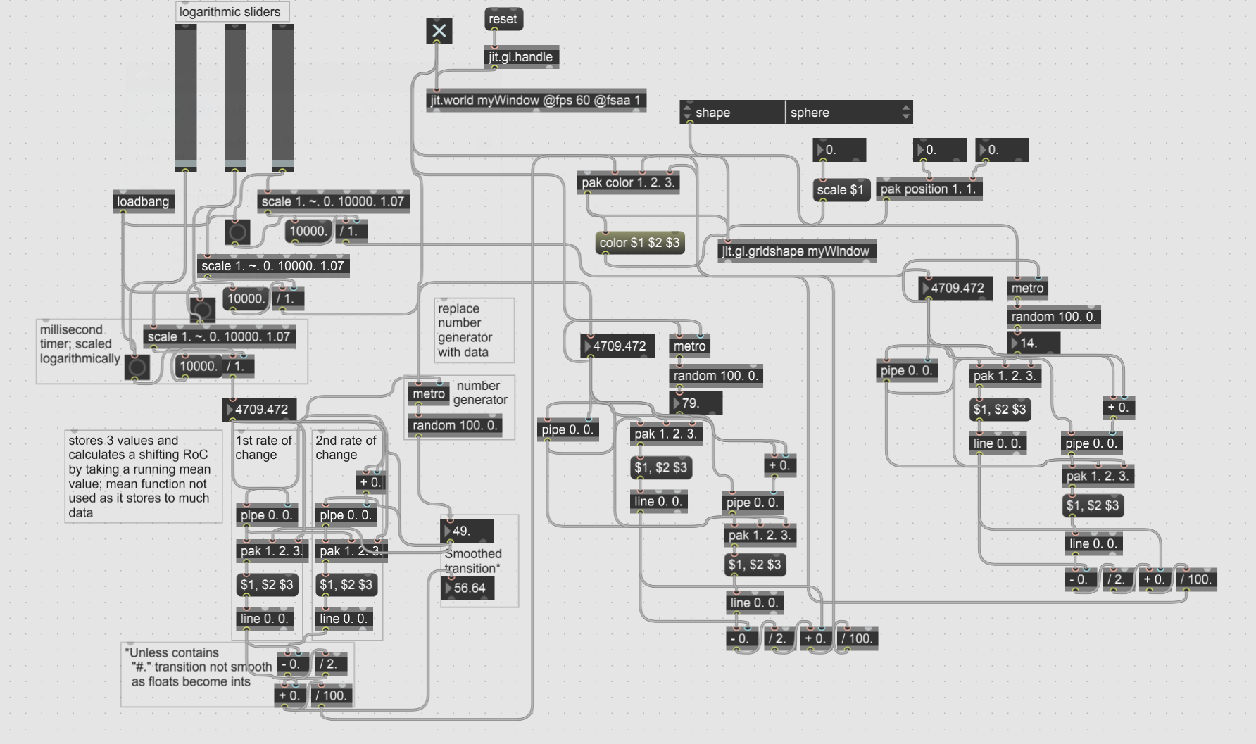
I then also built an explainer module with a few good revisions to break down how and what the smoother bits do in the above function as a way of refining the structure, familiarizing myself with the tools, and again, preventing seizures.
After finally figuring out that I could build something more elegant out of less data processed more, I settled on comparing CDC data on the average rate of gun deaths in the United States to the average rate of gun purchases. An earlier test while refining my color shifting module revealed that using the mean function collects and averages all values passed to it, and so unless cleared frequently it builds and averages a hidden list that, while computationally inhibitive for my test, proved to be exactly what I needed to display what I wanted with this first data sketch.

The sphere loads and shrinks to the rate of gun purchases on a plane background, both objects gray but of opposite shade to the other on the color wheel, and as their color values shift and are averaged back to the mean, the two remain indistinct but grow more apparently different until the program ticks up once, counting an averaged gun death, feeding a pair of new colors into the sphere and plane that average back to opposing grays as the sphere shrinks again.