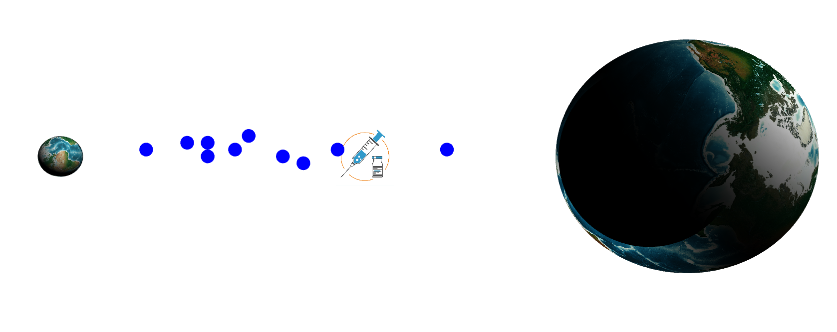
For my data art project, I went with the same theme of my data sketch but with different statistics. For this project, I wanted to visualize the disparity of vaccine distribution between high income “first world” countries and low income “third/second world countries.” I first visualized the first and second/third world as rotating globes. About 15% of the world’s population lives in the first world, while 85% of the world’s population lives in the second/third world. Then I took a look at COVID-19 vaccine distribution. 87% of the world’s COVID-19 vaccines go to higher income countries, while 12% goes to lower income countries. This disparity was absolutely insane to me, with lower income countries having far more dangerous and larger spikes and much higher populations it’s unjust and unfair that higher income countries get to take that much of COVID-19 vaccine supply. I visualized that statistic through the flow of blue circles that represent vaccines, as you can see majority of the vaccines are flowing to the smaller “first world” globe while the much larger “second/third world” globe gets little to nothing. Along with the flow, I played a bit with shadows and dimness. On the larger globe I upped the shadows to kind of show that the lower income countries are struggling and still in the dark with COVID. While the smaller globe is bright and cheerful as they’re doing much better with higher vaccination stats. When you click on each globe you can see statistics about vaccination rates, in higher income countries about 1 in 4 people are vaccinated while in lower income countries, about 1 in 500 are vaccinated.
Source: https://www.cnbc.com/2021/04/09/who-says-poor-countries-have-received-just-0point2percent-of-worlds-vaccine-supply.html
I wanted to show that lower income countries are still in the dark with covid-19, how do I communicate this better?
Edits:
I have an opinion on the assets used (the planets and icon in the middle). I think your piece stands out amongst others as it looks very professional. I feel as if the would be an actual expression of data that you would see developed. I would maybe move the icon above the blue circles just so they look as if they are coming out of the icon rather than appearing on top of it.
To answer your question, I don’t think “income” is necessarily illustrated in your piece. I think you illustrate well that only a small percentage of countries are receiving COVID-19 vaccines due to the size of the globes, but there’s no indication that those countries are higher income than the others.
I noticed that the vaccination symbol appears closer to the larger globe. While this may be due to the size scaling of the globes, it is still interesting because your previous description mentioned a lot of vaccines are made in countries that don’t actually receive them.
In my opinion, the larger darker globe seems more realistic to me than the smaller brighter globe.
Permissioned opinion – I really liked how you created the vaccine distribution in the center, but for the world. You can either make both of them the same shade or if you could put some well known wealthy countries with low populations on the left and huge population poor countries on the right such as using country shapes, I think the point would come across stronger.
I think possibly overlaying a darker circle over third world countries may help show the disparity. This can be done by putting a sphere/circle on an above layer and changing it’s opacity over time.