1 in 5 girls miss school due to a lack of menstrual products. The lack of being able to afford period products(such as tampons, pads, diva cups, etc.) is recognized as “period poverty”. This sketch was meant to draw attention to how difficult it is to menstruate when in poverty.
Often times when menstruators lack access to safe products, they risk inflicting physical harm seeking other, cheaper alternatives such as cardboard or rags, or may use products for unsafe periods of time in an attempt to ration their supply, which can lead to UTIs.

The mental toll of being forced to go through these unhygienic practices can cause depression, anxiety, and increased distress. I chose to depict feelings of unease and stress in my piece with the sharp and jagged red and white lines; almost evoking a sense of alarm. The color scheme of red is meant to represent the blood of menstruators and the white I interpreted as the color of a tampon.
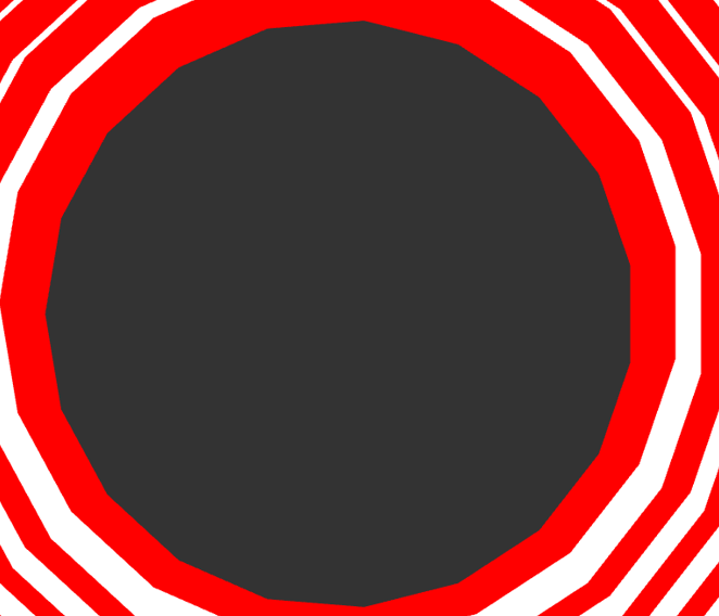
Lastly, the large, black dot in the middle is representative of well, the period itself. I meant to showcase it as the center of attention, to tie back into bringing more awareness towards struggles menstruators coming from low socioeconomic backgrounds face-especially young girls.
Q: I hoped that keeping the focal point a simple, black dot highlights the overall importance of the period. Does this showcase that?
Sources:
1.) 1 in 5 American Girls Have Missed School Due to Lack of Period Protection: https://news.pg.com/press-release/pg-corporate-announcements/nearly-1-5-american-girls-have-missed-school-due-lack-perio. Accessed November 13, 2019.
2.) Menstrual Hygiene Practices & Access and the Risk of Urogenital Infection in Women from Odisha, India. PLOS ONE. 2015;10(6):e0130777. doi:10.1371/journal.pone.0130777
3.) Measuring prevalence and impact of poor menstrual hygiene management: a quantitative survey of schoolgirls in rural Uganda. BMJ Open. 2016;6(12):e012596. doi:10.1136/bmjopen-2016-012596
4.) The association between women’s sanitation experiences and mental health: A cross-sectional study in Rural, Odisha India. SSM – Popul Health. 2018;5:257-266. doi:10.1016/j.ssmph.2018.06.005
5.) Overall website: https://sph.umich.edu/pursuit/2020posts/period-poverty.html
This issue is extremely important and it’s great to see someone focusing on it, I think the black dot does highlight the importance of the period. It grabs your attention and contrasts the rest of the piece as it’s not a color that has been used in the rest of the piece. Perhaps adding sharper shapes and designs like triangles may show more chaos and anxiety in the red/white part of the piece.
This is such an important topic and wildly under-discussed. The focal point of the large black dot does a wonderful job of representing impact, and also helped me understand what the piece was about even before I read the description (because it looks like a grammatical period, combined with the red rings). I think it would be neat to reinforce the jagged-ness of the piece with some harsher angles.
This image just screams to be spun around, if such a thing is possible. It’s a very solid piece, and the shapes leave so much open to the imagination. I think the big black spot in the middle is especially effective, so perhaps that could contain some image evocative of the point you’re getting across? Otherwise, I think that a little alteration could go a very long way with this design in particular.
This a great piece of art and I think the sphere in the middle works great, especially since it contrasts the other colors. I think it works fine, and even so you could make the sphere darker.
This piece really does ring alarms in your head with that red. To add to the importance of the center piece I could see a jerky pulse-like animation where the center grows and shrinks very suddenly, and then after a short delay, each ring suddenly pulses to follow suit all the way to the outermost ring to create a falling domino-like effect. Maybe this pulsing animation only happens every 28 to 30 seconds to show the cyclical nature of menstruation.
I really love your color scheme and I think that the black dot starkly contrasting from the red and white is really powerful!
Great concept, it showcases a real problem I had ever once thought about as a guy. I’m not sure if this is a result of the way it’s cropped, but I think the circle would be more clearly the focal point if it were smaller. It feels more like negative space at the moment. I would make much it smaller to the point that there is more red AND more white on the screen than gray.
Similar to what Kaamil said, I think showing what comes after the dark grey dot’s arrival is key to show what exactly happens in their inevitable arrival and emphasizes the need to be equipped with period products.
The focal point is great for showing the period. Also the reds and whites really match with the topic and are a great color combo in general. Maybe the focal point should be a little blacker but that is all I have to say on my part.
This piece not only shows a very striking imabe but also a strong underlying message. Even though I have no experience with such problems before, I can strongly feel the level of anger and depair behind. Having the black focal point is a very good idea, tough I do think the punch would be stronger if the black focal point is actually back instead of grey.
I think that the focal point being a black sphere is great. I do think that it would be good to make the sphere darker. This is a great piece and very thought-provoking.
The center circle surrounding by jagged lines definitely brings attention. I think overall the red and white parts have more attention than the dot because they are brighter and more animated.
I think you did an amazing job at putting the viewer in that unease you want us in. Others mentioned having the red and white colors jitter and move, which I agree would add to that discomfort. I think that having the one circle in the center as the focal point is very smart, although perhaps it could be a little smaller just to get more of that stark red and white around the edges.
Having the black dot in the center does make it clear of the importance of the period. The concentric circles help emphasize that as well!