This piece highlights the religious axis of my identity. I was raised in a specific branch of Shia Islam. Around 10% of the Muslim population is Shia, and the other 90% is Sunni. The Shia branch my family was associated with only has one million members, 0.1 percent of the Muslim population. I’ve always felt that the labels create dividing lines in this spiritual structure where I always wished that it would unify. In my lifetime, my family has grown apart from this religious community for various reasons. My family now practices in its own way. As a result, I’ve had control over my own spirituality as an individual, as there are no “requirements” to stay in a specific community. My religious identity is one of both isolation and freedom.
The black shapes represent the Sunni majority, and blue represents the Shia minority. There is darker blue spire off of the Shia shape to symbolize my family’s specific sect, and then a pink dot, how I stand alone yet free, among all the separations.
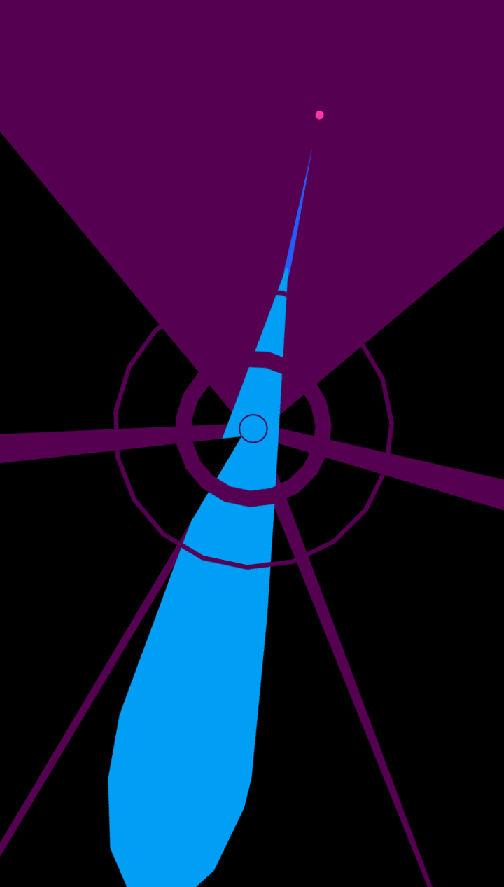
Part of the piece is to communicate splitting and fragmenting among peoples over time. Do the separating lines communicate this enough?
This is a very striking and colorful image, which inspires some interesting possibilities for animations and other additions. With how this art depicts faith, perhaps all of it could swarm around the dot representing you, as if the faith encircles you and encouraging the conformity. Or for an alternative take, the dot is dancing around the static pattern, showing that you aren’t bound by these shapes, and can instead bounce around them as you wish.
I think having the same colors not be split can better communicate the groups as their own identities themselves, unless you mean to represent intra-group separation, to which I think playing with gradients could be a thing to consider.
Your use of jagged and sharp likes definitely communicate the splitting and fragmenting among people over time. I feel like your dark color palette and line quality really get the message across. When initially looking at everyone’s pieces this one jumped out at me, so I think it’s doing a great job.
I like this one a lot. The blue shape striking through surely gives me a sense of breaking through and isolation. Still, just a minor point, the composition of this image might be a little misleading. I was focusing on the center of the image instead of the blue shape when I first saw it.
The separating lines are great, the visual is sharp and strongly conveys that the black forms are aggressing upon the blue in some way.
If there’s any way to make your specific point more clear, my idea would be to simply adjust the scale a bit. The blue spire is large enough that I don’t get the sense of it being overwhelmingly small.
This is already such a strong piece. To convey the sense of splitting and shattering, the pieces might benefit by including more organic breaks rather than the circles used.
The fragmenting is already strong in portraying of this piece but I agree with others that lines would be more effective in showing shatters. I like what you have so far and the black parts does remind me of broken glass.
This is great! Yes that is exactly the impression I get. I think it would be cool if you animated pieces breaking apart from each other and slowly creating the final image to add to the fragmented idea.
This is beautifully designed! The circular representations draw the eye very nicely and give the piece a thematically appropriate divine look.I think the splitting and fragmenting lends itself very well to animation. You can show how over time things separated, then how your family started carving their own path, ultimately ending in you and you being able to choose how you move forward.
I feel like the splitting lines work well to communicate the fragmentation of people, but if anything more uneven fragmentation and jagged edges might be more impactful.
I like the splitting line alongside the over lapping shapes creating an almost “graphic design” look. I’m excited to see what you do with your animation!