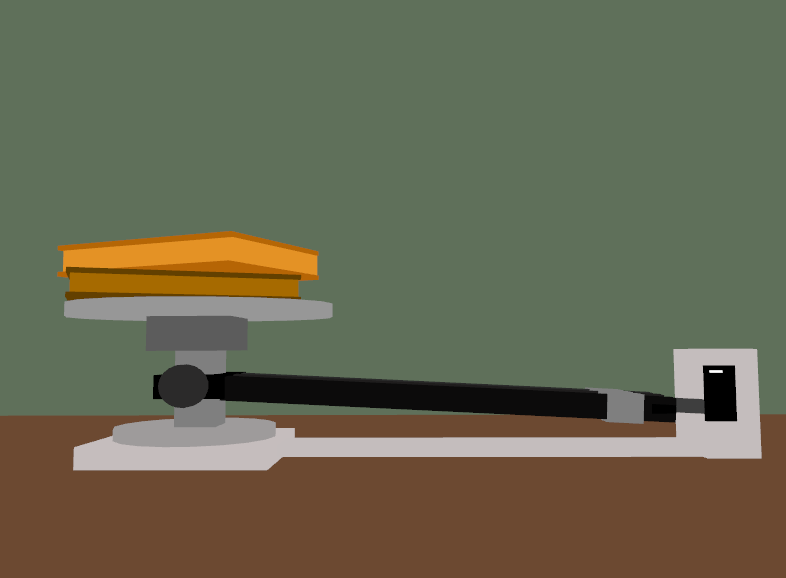
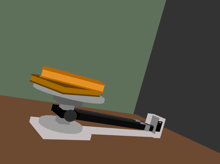
One of the data statistics that I wanted to focus on is the idea of learning. Learning has helped me through many different situations, whether it just be for school or for understanding other’s feelings. A person learning can help them improve from their mistakes and even make them better people. During my time at school, I personally have not experienced any forms of setbacks that would result in me having less educational opportunities. I am very grateful that I have the privilege to continue to expand my mindset and grow as a person. However, many others in America do not have this privilege. Especially in the South-eastern states, White students will have almost double the amount of educational opportunities than that of Black and Hispanic students. The graph from Propublica even showcases that this statistic is worse in other areas of America. The graph really displayed the situation of the educational system and made me realize how unjust it can be for others.
Source I used : https://projects.propublica.org/miseducation/
My question pertains more to the concept of representing the educational opportunities on the scale. Is the books a good representation of my idea, or would adding text/another object help in distinguishing the symbolism?
Symbolism-wise, I think books are very representative of education, and their use in this piece makes sense and was a good choice for your piece. However, the comparison to the educational opportunities of a white person using the triple beam balance was a bit less clear to me. (This may have to do with the fact I don’t really understand how the balance works. :'( ) Perhaps if the white educational opportunities was also represented using a quantity of books, the disparity would be a little clearer.
The books are a great representation of educational opportunities, but I believe the scale could be double-sided. If there were more stacks on one side than the other, it would be easier to convey the lack of opportunities. That way, one side would have more books/”opportunities” and the other would have less, which offers a clearer portrayal of the severe opportunity gap.
I would not add text, the art alone works great, I would just reframe it so you can see the piece a lot better. Only add another object if you feel it is going to add to the point you are making.
I think this piece works well, but I agree with other comments. I think it should be a double sided scale to really highlight the disparity- what you have right now is kind of confusing. Text wouldn’t help much and I think it would take away from what you have, though
Image wise, this piece looks very complete and demonstrates your skills so well. I like how everything is set up. But, same as other comments, my problem when preceiving the message behind this piece is also about the triple beam balance. The symbolism could only be understood if the audience know how such balace work. Maybe change the balance to a more common one would help. I like it very much nonetheless.
No text should be added as the image alone says a lot, but it isn’t immediately clear that the weights are in a disproportionate balance, as my attention is entirely on the books, not the imbalance itself.
This might change the feel of the piece in a way, but I think the symbolism would be stronger if you included other school supplies, like papers or pencils. Books could symbolize a lot of things, but a collection of objects which are connected as being “school-related” could make the symbolism stronger in my opinion.
Also I want to go out of my way to say that your piece is absolute insanity and my jaw dropped when I saw it. It’s aesthetically pleasing, technically impressive, can tell exactly what it’s supposed to be in literal terms without even reading. very cool
I love this piece and how detailed it is! I agree that changing the type of balance might be better and putting different types of objects on the other side of the balance might show the disparity a bit more.
This sketch is super detailed and must’ve taken so much time and effort. I agree with all the comments previously made, the books work well and you could add something like a graduation cap on top of the books to emphasize it further.
Object wise, I think your symbolism is spot on! I don’t think you should add text, but I think you might want to include a second scale to represent white students. The book could likely be larger in comparison.