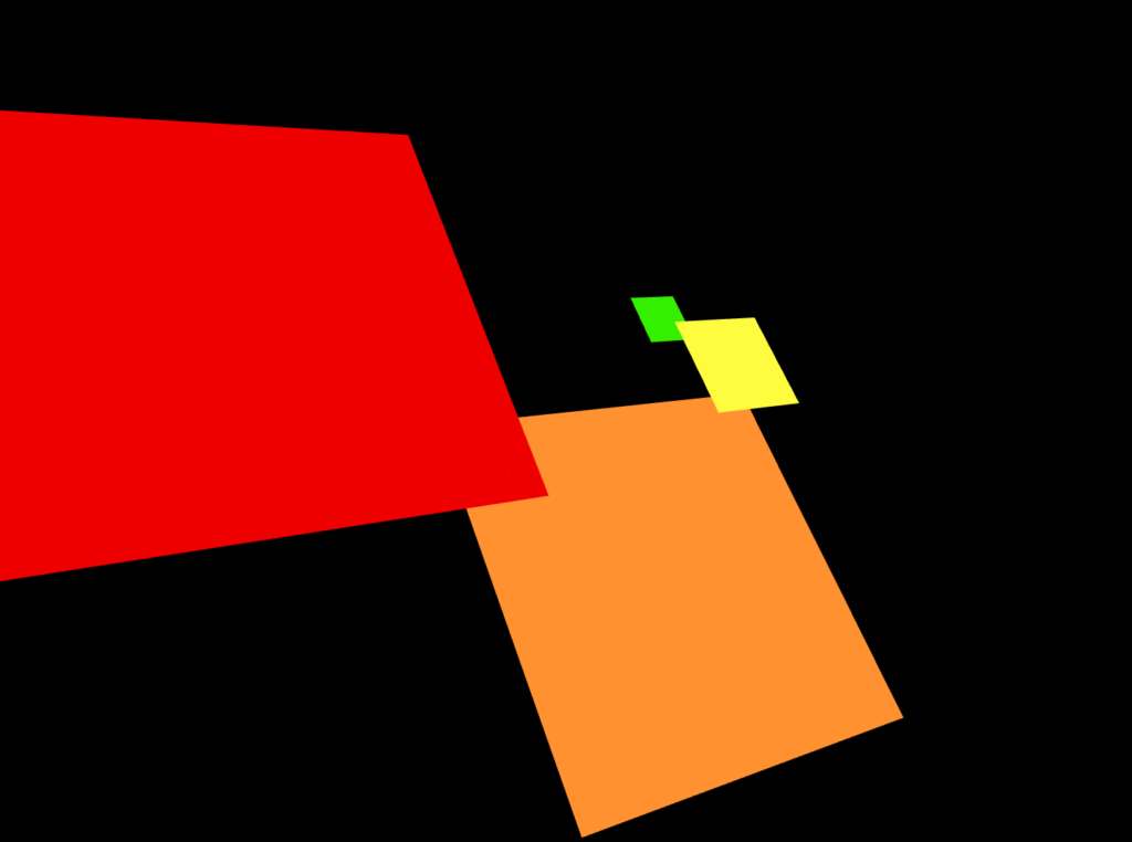
This composition represents stress levels of American teens. In a survey of 35,000 participants, 82% said their stress levels ranged from sometimes to all the time. In my piece, the red square represents the ratio of teens who said that they are stressed all of the time, with orange being sometimes, yellow being rarely, and green being never.
Stress plays a huge role in our mental and physical health, and currently it feels like there’s more to be stressed about than ever. As an anxious person, I don’t know whether it’s reassuring or not to know that a vast majority of people feel somewhat similarly to me, but it’s clear that understanding how to manage one’s stress in a productive way is crucial. In future iterations, I’m hoping to potentially include other information from my dataset that discusses how teens handle stress.

The current iteration of my design is fairly simple, and just uses flat planes to represent the different groups. I wanted to avoid spheres because without lighting it’s difficult to convey any sort of 3D space, and I thought that the perspective makes for a unique composition. That being said, I don’t really know if the planes worked as well as I planned. Does anyone have suggestions on how to make a more visually interesting composition while still appearing to be in 3D space?
The play on shape and size was a great way to capture one’s attention! If you’re looking for a bolder statement visually, maybe you could play on texture/patterns? Such as making the red square have jagged edges to represent the severity of stress to create a sense of alarm. This could continue on to the other shapes for ex, making each one get smoother to display the lack of alarm. 🙂
Adding some textures to the square planes may convey some more emotion. Like having the red square have a more chaotic texture/design to it to show more stress/anxiety (like a glitch effect or just a pattern on the square itself).
One suggestion that I have is possibly adding some rotational jitter to it, depending on how big the piece is. The only reason I suggest this is to convey to the audience how stressful some students are feeling. For example, the big red plane could jitter a lot, representing how many students feel “shaken up” by the stress, unlike the small green one which would not move at all.
Layering the squares is already a good idea for making the piece reflect a 3d space. I’m not sure if this piece would work as well as it does if you tried making the squares cubed.
I think having each shape shake with an intense, stressful, vigor that is increasing with the colors would be a good way to show the stress.
I agree with the idea of adding textures to each plane to convey the severity of each stress level. If you’d like to add some animation to you price, you could have each plane fade in and then overlay each other to almost build the feeling growing stress.
My idea would be to make the objects 3D as well. Perhaps even create cubes which are a darker color, and keep these shapes as lighter surfaces on the cubes.
Cubes would make a great use of making the space look 3D when placed correctly. Maybe having each block shake at a different frequency (or any action to show stress) to show in a physical way stress is harmful to the body.
I like the striking composition of the squares a lot. They are very simple yet effective. I would say the current composition is already a strong suit of your work. If I were you I might want to look more at the color scheme to make the image look more balanced.
I really like the layout of your piece, I actually find it visually interesting from this perspective. One possible way to incorporate animation is to have the square fade in and out like breathing. The more stressed square could be going really fast like how breath quickens during panic/anxiety attacks but the green could be at a calm steady pace. Just a thought!
I think this is a great idea to illustrate the issue of stress. My only suggestion is that since in your screenshot the entire red box isn’t in frame, in addition to the angle, makes the red and orange box look very similar in size. Maybe moving all of them closer together would emphasize the difference in size between the red and green squares.