For my data sketch I decided to work with a topic that was prevalent in my young life – the amount of assistance that those with learning/cognitive disabilities receive in their schooling years. Growing up I have seen the disregard that some teachers and schools in general have for those with disabilities, specifically watching as my brother with Asperger’s struggled to get the help he needed to understand and complete his coursework.
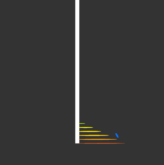
In specific my data is showing the 14% of students ages 3-21 who receive special education assistance through their schools.
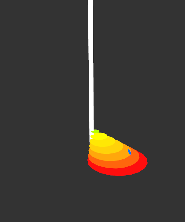
While this is just the sketching phase, I would like to make a more impactful image out of this stat. I think that making the image look like an uphill battle/a staircase helps express my point.
As for the design itself, is it coming across strong enough? Do you think there is a way I can share this information in a more creative manner? I think I may change it to be a spiral staircase, do you think that would get too confusing?
Source: https://financesonline.com/education-statistics/
I think the staircase is a great representation of the struggle, and it showcases your point clearly. Making a spiral staircase would draw me in even more because it adds more dimension to your piece. If anything, you can play more with color if you expand the staircase. If you changed it to spiral, it still would represent an upward battle/manner, so I wouldn’t find it too confusing. Love this concept!
I think adding a spiral staircase would be perfect, it would show that the path leading up is confusing, chaotic and not easy to navigate as just a simple/regular staircase. Maybe adding an aspect to show how people without cognitive/learning disabilities have it easier, like putting some people/dots already at the top? Just to show some comparison and difference
In terms of using animation to aid this particular visual, you might try to make the climb up these stairs looks staggered and slow, to show the sheer effort required to climb them. Otherwise, you could make the stairs themselves spin, making it look a bit more disorientating. It’s a solid design, though there’s not much I can see being added in terms of animation, since it’s a simple enough concept.
I love the idea of using stairs to represent the uphill battle people with learning disabilities face in getting the help they need. I also think the spiral stairs are a great idea to add visual interest and to make the staircase look even more challenging to traverse. It would be neat animation-wise to see the blue dot struggle to climb the stairs.
I don’t think a spiral staircase would be confusing, as long as you make sure the steps align well enough to look as if you could go up them. This is a really cool idea to display the data!
I could see this being very impactful. It’d be very interesting to see the camera at the bottom looking up at the steps to really accentuate that feeling of an uphill battle. Excited to see what you come up with.
I like the idea of this visual being an obstacle the must be climbed, especially with the side view you’ve got in the first image. Imagining that the colored circles are a staircase, it’s not at all steep. That would make it relatively easy to climb, which I don’t think was the intent.
I think shaping your piece to be a spiral staircase would help you create the impact you want. I would be interested in knowing what the small blue oval is, that’s the only aspect that I’m slightly confused about.
The spiraling staircase would be appealing to see and animation of struggle would make the graph very relatable to many people. I think that also maybe a slowly growing staircase would also amplify the message of a struggle. The staircase has very nice color combinations.
Overall the design is very strong in my perspective. I like the composition and the use of a long wide rod to represent the process of learning. One thing that did not come through me well might be the color. The color kinda implies to me people are having a less and less hard time coping with learning disabilities.
Animating the blue dot would be cool. I think it would be good to change the shape of the circles to more resemble a staircase, make the sides of the stairs sharper and give it a more triangular shape? Sorry if that is confusing. I think that the size of the shapes and the blue dot really adds to the tone of the piece.
I really, really like the staircase idea to illustrate your struggle. I think a spiral staircase would look amazing, and I think it’d be more difficult/tedious to make than confusing for the viewer. The only thing I’d suggest is maybe making the staircase look a little steeper to make it look like it’s more difficult to climb.