The final iteration of my interactive touch project has gone a long way since my original concept, although this iterative process only reinforced my chosen under-appreciated truth: Nothing is Holy!
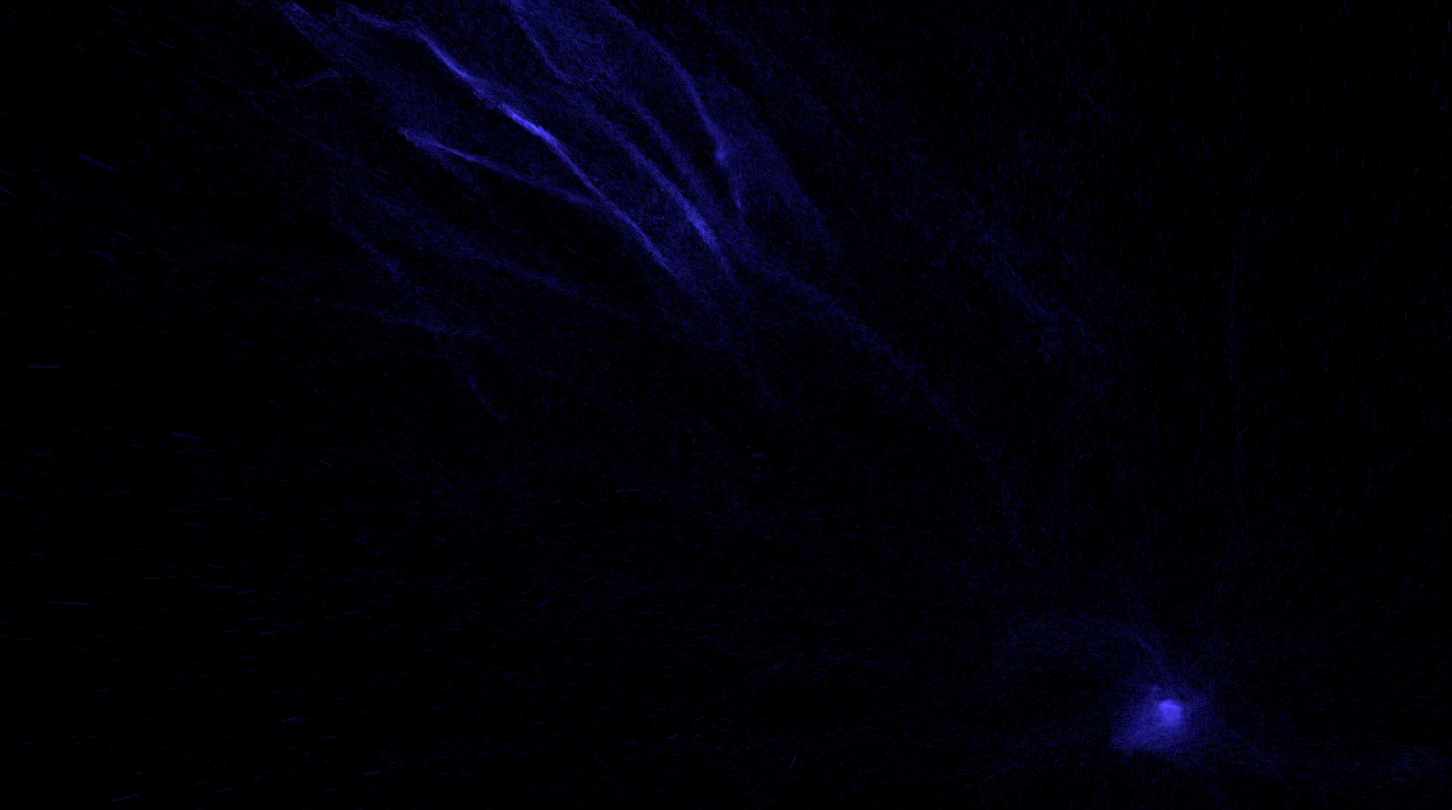
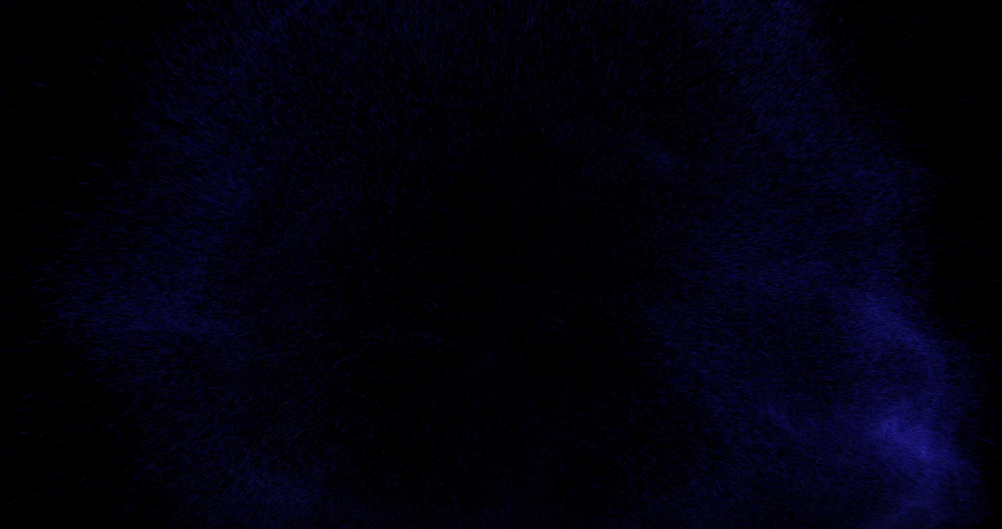
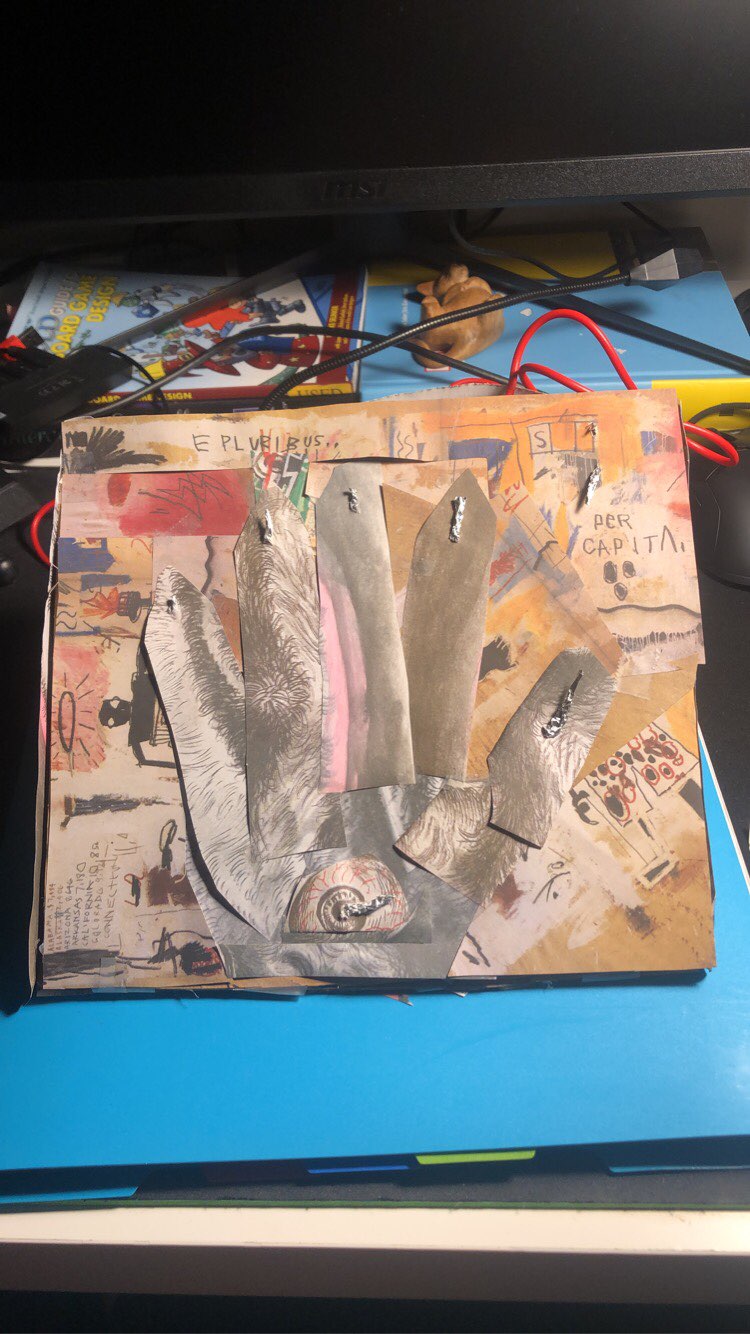
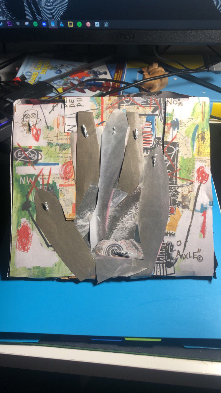
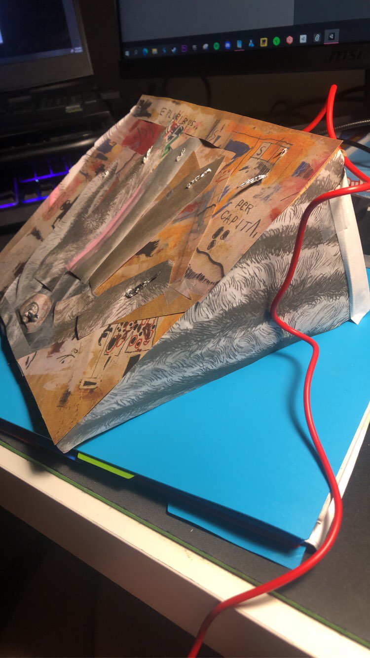
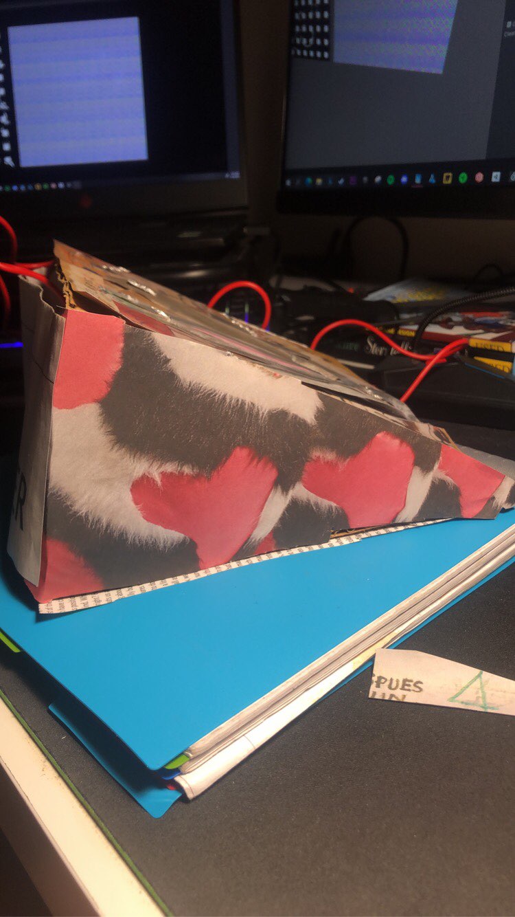
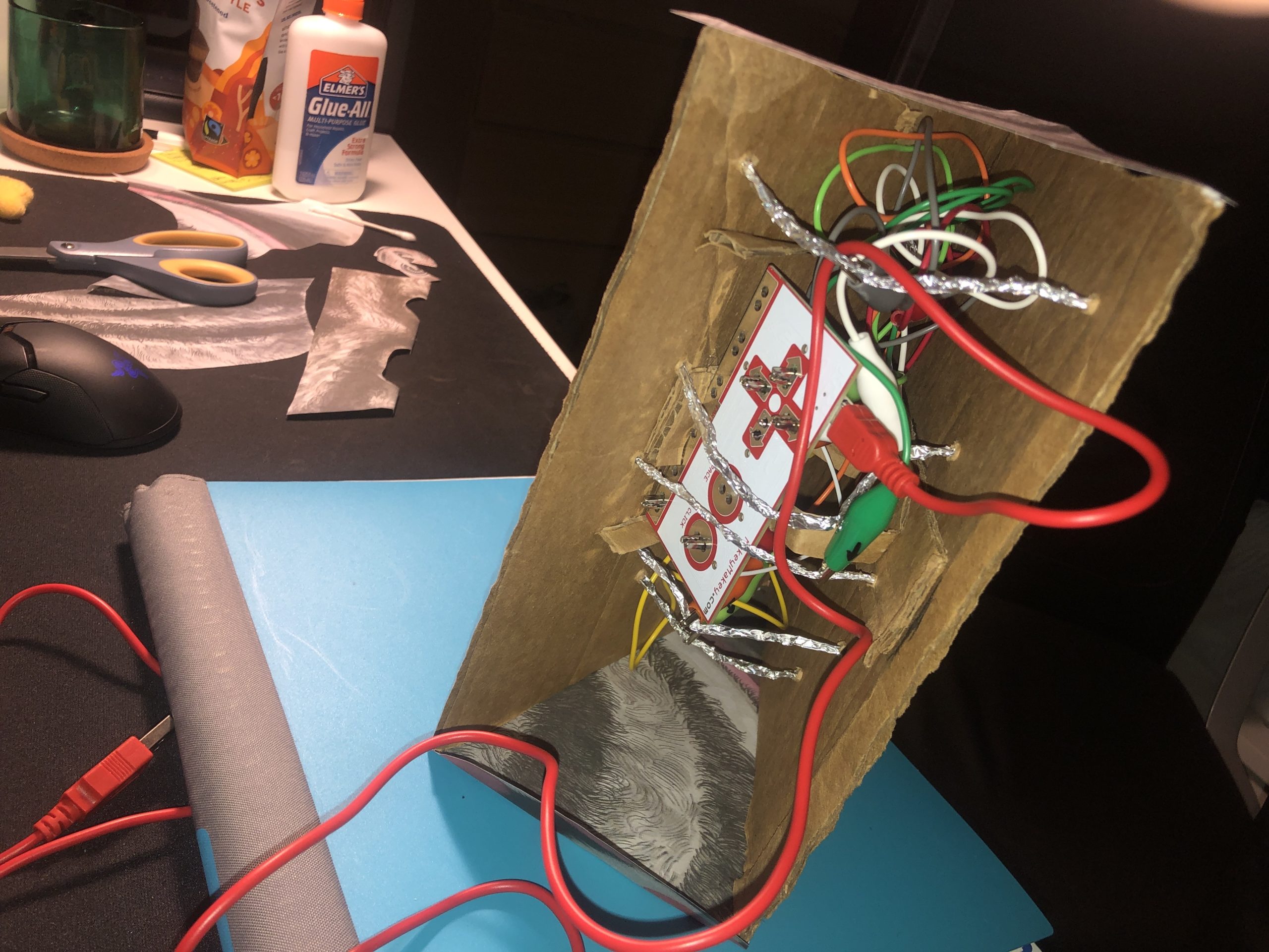
The inputs are 6 sensors, 5 for each digit and one to “power on” and “power off” the system. It is usable for either left or right hand oriented people (all the user needs to do is flip the box around) with each side decorated with collaged cutouts from an old art newspaper that I had held for many years. With the main four digits of the hand (index, middle, ring, and pinky) the user moves the particle system’s center, having all of the particles follow in its path. When the user presses and holds the thumb input, they will begin to “charge up” the particle system, changing its color from blue to red and increasingly grow in a concentrated, intense, size. Whenever the user releases their thumb, the particles will explode outward (with ferocity dependent on how long they had charged up for) and then resume a blue neutral stance and freely flowing near the center of the system.
It’s hard to capture a moment with this interactive art piece, as the particles are in constant flux. This makes the user enjoy the interaction and the movement they are creating more, as opposed to finding the perfect angle to preserve.

Artist Question: Does this feel playful and inviting?
Your piece feels very welcoming for users because of the uniqueness of the fluid movement. The design really draws the audience in- just like today in class when everyone wanted to test it out! The shifting shapes and colors go to show how playful and eyecatching your design is.
The visuals were very drawing, and I wonder- do the shapes always have a new unrepeated pattern when moving? or do they restart. The only opinion I have is maybe having multiple colors for the particles, instead of just blue and red.
The particles move in a randomized turbulent force that has its nuanced force values change over time, so technically no, but similar appearances can make one question just how many unique permutations are possible in anything created under a system/set up rules.
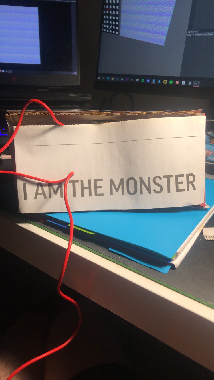
The physical object is very striking and eye-catching. I do think that the particles are definitely playful. They look almost like a firework. What does the “I am the monster” quote represent to the design of the project?
It was a headline in the newspaper I collaged with and thought it would be humorous to hide the wires with that label.
The animation and real-time is amazing. The piece seems playful, but the music doesn’t really make it inviting. Why did you choose those colors? I like how you describe it as a gathering of particles, but it did not seem like that when I saw it during the presentation on Monday.
The universal design of having the device be compatible with left and right hand users was user friendly, but I have to agree with Stanley that the music is not very playful. One opinion on how to make the piece better would be to have different sounds for each input. Also why did you choose to put I am a monster on the back of the device?