For my contribution to the Museum of Underappreciated Truths, I decided to make my project around a topic I’m involved in and passionate about: The benefits of joining a fraternity. The reason I chose to do this is because joining my fraternity has greatly impacted my life for the better, so much so that I decided to run for the position of rush chair and won, which means that it’s my job to recruit new people. Another reason is that I feel that there are a lot of outdated misconceptions on what being involved in a fraternity is really about. Unfortunately, the stereotypes that exist aren’t entirely grounded in fiction, and fraternities do have a history of hazing and having negative effects on people. Through my project, I want to show that fraternities as a whole have come a long way and don’t reflect the stereotypes commonly known anymore.
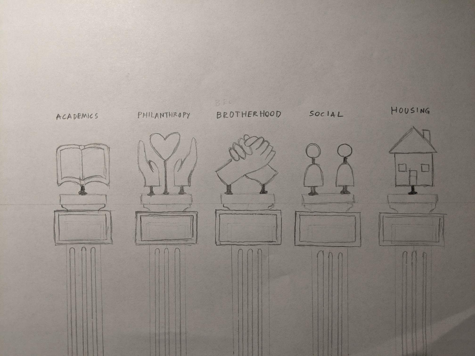
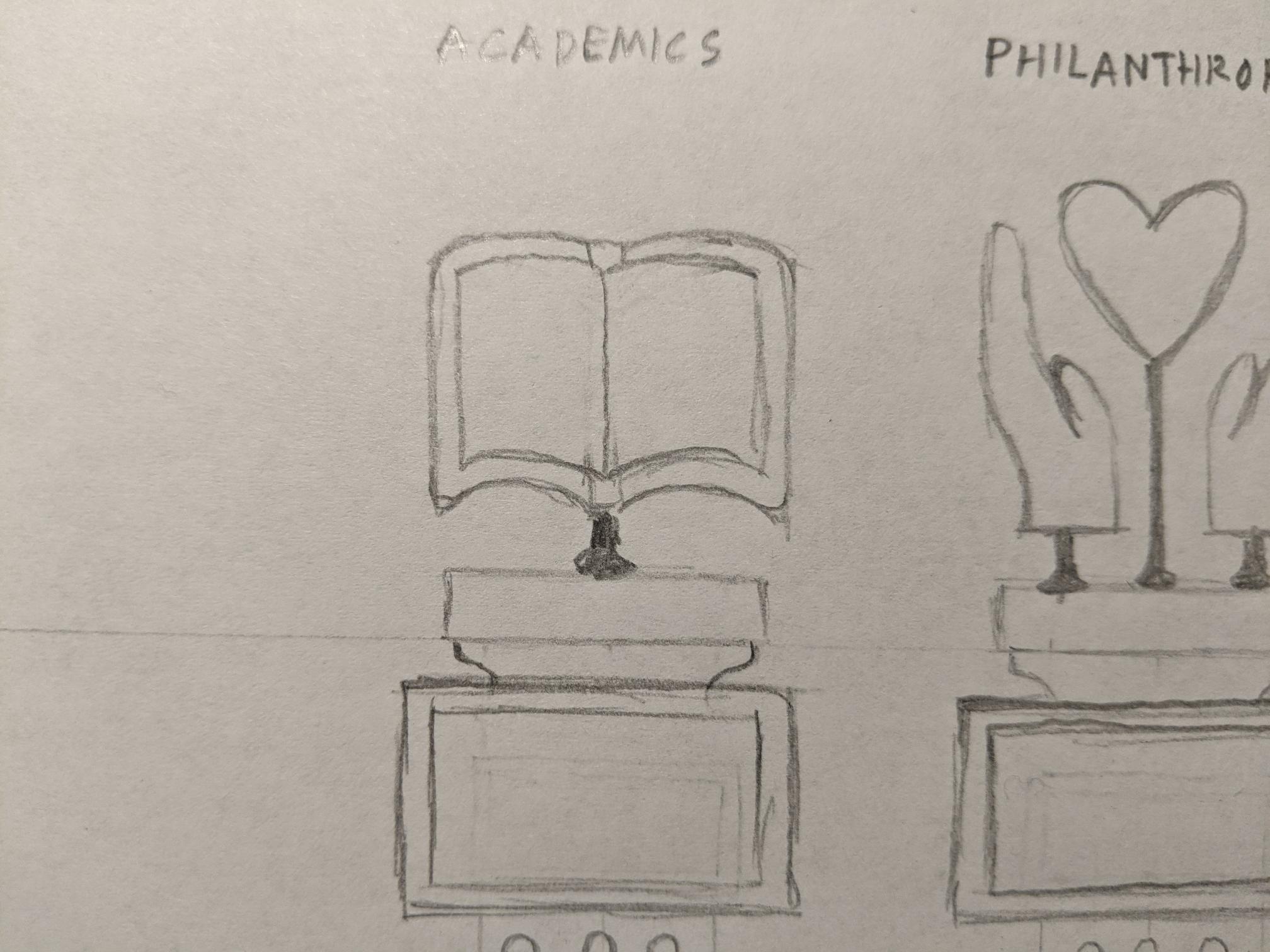
My idea is to take the museum theme literally, and lay out my user interface like it’s an actual museum exhibit, with five statues sitting on pillars which represent what I think are the top five benefits of joining a fraternity. I want my input to look like it is above, where the user can tap on any one of the five statues. I want the output screen to start out looking identical to the input. However, when a statue is tapped, it would be zoomed in on the output. Under each statue is a screen which would then play a short animation which I’d make in Adobe Animate. Also, I’m thinking of doing some voiceover narration explaining my points.
My artist question is as follows: I want my exhibit to have a minimalistic aesthetic and make the user feel calm and safe while viewing it. Is that effective, or does it just come off as boring?
This sketch has made me less on-edge about frats/sororities as it highlights the benefits of being in one! The minimalistic aesthetic could be viewed as unwelcoming as making things all-white could give off a barren/cold aesthetic. Adding some color would definitely convey a calming and safe vibe as it frays from the cookie-cutter-like feel.
In response to your question, museums normally have barren walls, so it makes sense why the walls are particularly blank. As for the statues, I think it would be nice if they were colored, which would allow them to stand out amidst the greyscale walls. The symbols used for each trait of Fraternities are also quite good, conveying simply and effectively every aspect of frat life. It’s a genuinely nifty concept. I would like to ask in turn, what’s the animation for each section gonna look like? Is it just a zoom in on a specific image followed by text/narration? Perhaps you can add some smaller details to make each image more lively, no detailed animations, but perhaps particle effects? Do whatever you think feels right.
My idea for the animations was to have the camera zoom in on the statue, and the plaque underneath it would be a short animated scene illustrating the benefit selected, with some voiceover narration.
The design of the concept is very open. When viewing your piece, rather than feeling safe, I feel more of a sense of pride from these pieces. Many of these pieces are very hard to obtain and can take years of effort to form., which is something I respect in fraternities.
Are you going to have the labels each piece go on the pillar? I really like the designs but covering up the words I was confused about some of the pillars. This is very nitpicky but I think some identifiers would make this strong piece stronger.
I was probably going to keep the labels above the statues, almost like a sign over the exhibit.
I think the minimalistic layout you have will showcase your point well. Would it be beneficial to include an ambient sound of people wandering around in the background to immerse the person interacting even more?
In respones to the artist question, I can definitely feel the museum-like atmosphere you want to go for and I dont think that looks boring at all. Another good way to help audience feel safe could be using the color scheme. Human are more inclined to feel safe in warm colors, so you can probably use some thinking in deciding the overall color scheme.
I think the input idea is super neat! After the statue is clicked, what animations are you thinking of doing in Adobe Animate?
For the animations, I want it to zoom in on the statue and the plaque underneath it would display a short animated scene illustrating the idea. I’m thinking around 7-10 second animations with simple bubble characters participating in an activity related to the topic.
To address your question, I don’t think the minimalist presentation is boring at all. You have multiple focal points which are visually interesting and may contrast each other. As long as the visuals themselves are interesting, the minimalist look will thrive.
Visually, I think this will stand out and be interesting to the viewer. I do not find the idea boring, but I see it as a set of pieces to something bigger. How do you plan to make the statues?
I think the minimalist aesthetic helps give the piece a sleek modern look. Maybe in the animation you can have the statue turn to color though, to show that there is more depth within each facet. Brief question, what are you going to make the physical statues out of?
I think a minimalistic approach to the design would be very fitting to show that fraternities have come a long way and have “modernized” so to say. I’m excited to see the final outcome!