Being the privileged cis white male college student I am, it’s not common that I find myself in the minority. This was quite apparent during the class exercise from last week. I was within the circle on every single axis except for one; religion.
I’ve always found it interesting how people have so much faith in something so controversial. I won’t get too deep into how I feel about faith, but one thing is objectively and provably true. When it comes to religion, no matter what you believe, most people would say that you’re wrong. It’s easy for people to forget that since many live in families or communities which share the same beliefs, but when you look at data gathered from across the world it becomes impossible to ignore.
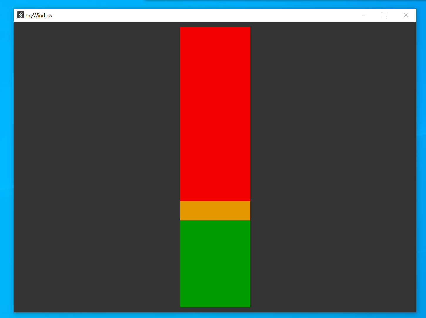
In the visual below, the green bar represents the percentage of the world which follows Christianity, the most widespread religion in the world. The yellow bar represents the percentage of the world which is agnostic, a group that admits they can’t prove or disprove the existence of any god. The red bar is everyone else, the people who firmly belief that Christianity is untrue.
31.11% of people around the world are Christian, although there are many denominations which can have incompatible beliefs. I also included agnostics in yellow, since even though they don’t follow Christianity they technically wouldn’t argue against it. This is the absolute most generous visualization for anyone on earth, yet the bar is still approximately 60% red.
It’s pretty basic at the moment, it gets the point across but there isn’t a whole lot going on. The idea I’m leaning towards is to show a screen with many of these bars side by side, each representing a different belief system. The way I have it set up currently, I only have to replace a single number to create the correct display for any other religion, so it wouldn’t be too difficult to add more of these.
NOTE: My point applies to any religious belief system, it’s not about Christianity specifically. I picked it simply because it’s the most popular, so I can guarantee that the results for anything else would be even more compelling. Those results will be added and shown alongside this one in the final version, creating extra meters with more red and less green.
Revision Question:
I used the colors to try to get across the idea that the meter is lower than one would want it to be. Is it working?
I think that the colors do a good job of showing contrast between those who agree and those who don’t. I am not sure if I agree that the meter is lower than one would want it to be though — instead it to me it just shows the wildly contrasting beliefs of people. (I’m not sure if what I’m saying makes sense, but like I don’t necessarily think it’s a bad thing that a majority of people do not agree on this front.)
I think the meter gives the idea across quite well, but I feel as if the art needs more subjective pieces. Maybe you could use the meter on a plane or circle, and give that your own meaning.
I think the colors are fine the way they are. The message I get from the image is that there is more of a divide between people on religion, rather than there is a different amount of people who believe different religions.
The contrasting colors convey your point very well. It would be interesting if you added motion between the three levels to show the tension between faiths and beliefs.
I think the colors kind of connote bad and good, as green and red together often carry those meanings. i.e. Religion bad, atheism good. I don’t know if this is what you were going for, but it is the vibe I get from the sketch. To spice up the sketch I think it would be cool to see more data from maybe other religions like Islam (which is very rapidly spreading), Judaism, Mormonism, Hinduism, etc. etc. As an animation, you could have a solid-color bar representing a population, then have other colors “fill up” the bar to show or signify the spread of a belief system / lack thereof.
I think the idea is working, because the red portion grabs more of my attention than the rest – which I think is your goal, but I usually associate red and green as bad and good.
I really like how you used color. It is very succinct to what you want. Maybe as interactivity you could add the option to show different religions as differing colors, but in all honesty I like the way your piece looks and its simplicity.
Personally, I’m not sure if the color choice specifically is getting the message across that you want it to. Maybe that’s just because the red bar makes up most of the sketch, but since it’s the majority my brain wouldn’t associate that with wanting it to be even bigger.
I think the colors are a little confusing. I get the idea behind the bars, but I think that there should be a different way of showing the difference between these groups as some may be just as unaware how many of each other there is.