For my updated Data Art piece I wanted to take my visual to the next level by making it into a spiral staircase that appeared when the user clicks a toggle. I am currently still working on the animation and getting the stairs into the correct positioning, but here is my current work 🙂 I will update as I fix the bugs
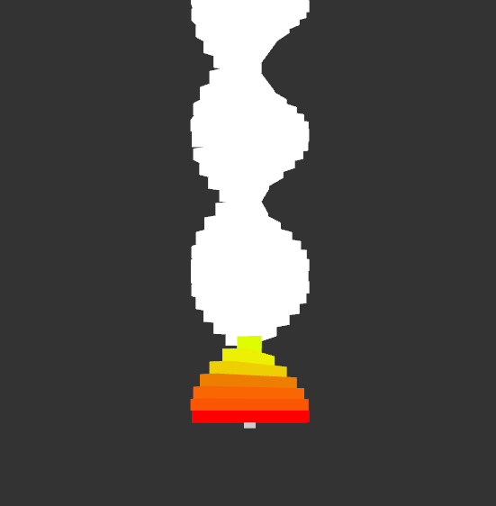
Finished or not the design of this is already striking. Looking at the design, I’m instantly reminded of DNA and genetics, and combined with the staircase I’m getting a pretty clear message from this piece. The warm colors are a great, eye-catching element that draws the viewer to the bottom and leads the eyes up. Great work!
I love the shape of the spiral staircase! I think it works really well for what you’re conveying. What are you planning on doing for the animation on this piece?
For the animation I was hoping to do an interactive element where the stairs would rotate into shape and the color would move into place
The colors flow really well, I’m excited to see the finished product? What interactive element are you planning on adding to your finished piece?
For interactivity I was hoping to make it so that when the user clicks the colors and stairs go into place from being a straight white line
I find the color contrast very striking in this image. The contrast helps with the data and allows the audience to visually see the contrast. The drunk randomizer sounds like a good idea, but it also might lessen the overall impact of the message. My neutral question is what was the design process to making the staircase in MAX(more of a technical question to how you went through with layering each rectangle)? I have an opinion on the color choice. My suggestion is maybe making the colors more transparent as you go up the spiral. This would allow for the large chunk of white to be somewhat visible, without it being too repetitive.
I put together the staircase in probably the most repetitive manner possible; I made an object for each of the individual stairs as well as the center pivot and I divided the degree of total rotations I wanted by the 50 stairs I needed to get the spacing. Professor Rosenstock was mentioning a multiply command that I could use to make this process more streamline and easier to control moving forward.
I meant “!” instead of the first “?”***
I like the color contrast and the jag-shaped staircase, making your thoughts delivered well.
What were your thoughts in terms of shape composition as you transitioned your piece into a spiral staircase structure?
I’m not quite sure what you mean – is this referring to the blockiness of the steps? The first data sketch was very flat since I was using planes, but this one is much more three-dimensional, which I think adds its own visual interest.
Would you consider having the entirety of the staircase be colored for a more gradual gradient?
The colored portion has meaning behind it, as it is the 14% of students receiving educational assistance, so I think that if I colored all of the stairs the piece would lose its meaning.
I found it quite unique the way it spirals, almost reminds me of DNA. I also found it interesting how you changed the art to a spiral staircase.
Is there a reason behind the color choices and their locations?
I chose the colors for purely aesthetic reasons, but they are placed at the bottom of the spiral staircase to represent the uphill struggles that can come with being in the education system with a learning disability.
What was your intention behind only coloring the bottom fraction of the piece?
The colored portion represents the 14% of students receiving educational assistance
To answer your question, I think either a slow progression of grey going up the stair or a randomizer would help in getting rid of the bright white. I am sure grey would be a good color as you said so the bottom would still be a great focus point.
The shape of the staircase reminds me of a strand of DNA, which makes the piece dynamic even without the animation.
Will the spiral be filled with a full color spectrum later? Just an opinion about the image. I like the idea of the spiral a lot, I can almost picture how great it would look like if you manage to put everything into work.
The spiral won’t be colored later, it is meant to have a strong contrast between the sections. I hope that the piece remains impactful once animated; I think that the shape definitely lends itself to animation!
I notice that the screenshot you provided seems to be from a different angle than the two you provided in your previous post. If you want to emphasize the challenge of this obstacle, I think even the camera angle can have a major effect on how long the staircase feels.
I have an opinion about adding the drunk function: I love the idea! It would definitely help break up all the white, I’m excited to see it!