For my data sketch, I chose to focus on the amount of student loans that the average person has, an issue that most to all of us in this class can relate to. For almost the past twenty years, the average student loans that a person has have exceeded the rate of inflation, and as of 2017 (the last data point I used for my sketch), the average student loan amount is almost double the inflation rate.
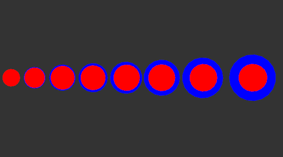
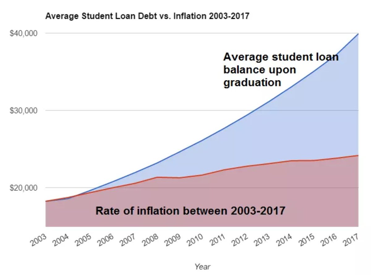
In my sketch, the blue circles represent the average student loan amount and the red circles represent the inflation rate between the years 2003 and 2017, where each set of circles represents another two years. In 2003, the two data points were almost exactly the same. Over time, inflation has increased at a roughly linear rate, and compared to the exponential rate of student loan amounts, it looks like inflation has barely changed at all. Below is the graph I used as a reference to get my data.
My question is: How can I make my sketch look more aesthetically appealing? I feel like mine gets the point across but looks very plain and repetitive.
I think that the sketch represents the rising amount of student loans very well. Even though you consider it to be simple, I think it makes for a nice pattern and an interesting piece. Perhaps some animation would help to add to it — maybe by having the blue circle grow over time to show the average student loan amounts rising.
I think that the sketch could use some form of animation that could allow the message to be bolder. I like the simplicity of it and how one can easily grasp it from the reading, but I do think that animation or an image, such as a dollar bill or a college bill, would allow the audience to better understand the message from the picture itself.
Animation wouldn’t hear the sketch, however if you want it to look more pleasing to the eye, I would suggest not using absolute colors in the rgb range (like 100% red). I was also considering doing the same with my project. Great sketch!
The sketch itself displays your point very well, so I would only focus on animation, which could elevate your piece. You could have the circles slowly appear as a gradient effect to show the gradual increase of student loans, which would definitely draw the eye.
I could see some really interesting things being done with weight, almost how debt weighs us down. Maybe you could arrange the circles in a downward parabolic arc to show this. Or maybe something with animation – have all the balls drop from the top and have the heavier ones(years with more debt) sink farther than the earlier ones.
This sketch gets across you point really well, but like other people have said, animation would help a lot. I also think your colors are too contrasting to look good- the 100% saturated colors make it really hard to look at it for a long time. Maybe this is something you were intentionally going for? Another thing you could do is make it slightly asymmetrical- aligning the top of each circle like they look like they’re on a table, move the whole line up to a third- some kind of asymmetry would make a huge difference.
I agree with everyone’s comment about animation; I feel like that will really help with the flow and progression of the story that the data shares. ( I also second Hannah’s point about the colors!!)
I think that the animation would solve the problem of it looking too plain.
Unrelated suggestion, I would consider changing the blue to something lighter. That way it would contrast more strongly against the dark gray background as well as the red interior.
I agree with the addition of animation, even if each circle group fades in to introduce each one to view. You could even take it a step further and have each fade in to show the growth of inflation and loans over time. I would also recommend looking at the color wheel to find colors that compliment each other to make to make the overall piece slightly more aesthetically pleasing.
The data is really great at bringing across the point of how scary rising inflation is with student loans. Adding floating animations and maybe showing a downward curve to show the weight of inflation could give the data more character. Color wise, having the colors not be pure red and pure blue but with other values would make the piece more pleasurable to look at. Great job with what you have at the moment.
An application of animation for this could be a scale animation showing the size increase for each circle, it adds suspense I think. I would maybe make your colors on your sketch less saturated, as they are very bright and striking. But I think adding animation will help with the issue of the sketch being “too simple”.
I think one way to enhance the aesthetics is to make the colors more representative of their meaning. The red and blue contrast well and are relative to the original graph, but don’t mean much to student loans or inflation. Maybe include some sort of image or icon to represent each. Playing around with the 3D aspect of Max may also help to change it up visually as well.
I agree with altering the colors a bit, perhaps maybe hues of green to represent inflation/loans as it relates to money? I really enjoy the sketch, and it’s crazy to see this statistic in visual perspective.
I think the sketch presents the information in an interesting way. I am not sure if there would be a way to make it more clear based on the cited source. The red and blue circles clearly show the disparity but the red circles seem fairly consistent to me.