For my data sketch I found ranking of the different US States and their policies regarding LGBTQ+ rights. Many states have adopted bills in favor of protecting the rights of LGBTQ+ people, while others have been actively passing harmful ones or refusing to acknowledge that there are problems at all.
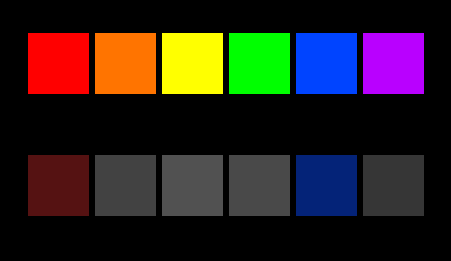
I have focused in on six key aspects of human rights to correspond with the six colors of the pride flag: Employment as red, Housing as orange, Public Accommodations as yellow, Education as Green, Hate Crime Acknowledgement as blue, and Name/Gender Marker Updates as purple. Using my sources, I gave the states a score for each category scaled from 0-3, with 0 being laws seen as actively harmful or a near complete lack of support, 1 being a small mix of support but a lack in majority, 2 being supportive but still either missing rights or having remaining “bad” policies, and 3 marking an overall good acceptance in that area. The numbers correspond to the saturation of the representative color box.
For the purposes of the sketch, I demonstrated two states: Massachusetts and Florida. Massachusetts by and large has legislation in place to protect against discrimination on the basis of orientation as well as gender in employment, has anti-bullying laws and laws to address LGBTQ+ struggles in education, and allows the update of name and gender markers on multiple forms of legal documentation. Florida, on the other hand, has some laws against discrimination in the workplace, but are limited, and updates to driver’s licenses, but lacks laws that de-criminalize HIV/AIDS, anti-bullying laws, and generally allows the denial of healthcare to LGBTQ+ people.
In possible future iterations I would incorporate other states, but I’m having trouble figuring out how to better automate that instead of manually inputting values. I’m also thinking about better incorporating and utilizing the third dimension available in Max.
Sources:
https://www.hrc.org/resources/state-scorecards
Question: I know that I will need to add text to the sketch, but are there any other visual signifiers I could be using to represent the information I am trying to show? Is the saturation of color enough to show impact or is there another way I could show the disparity between states?
As a suggestion, what you could try to do is to put many of the states in a sort of “pack” in Max. For example, instead of manually inputting each state as its own 6 variables, you could take groups of data that are similar to each other and categorize the states that way. For example, if Massachusetts is similar to Idaho, you would then only call for the variable data, rather than calling for the individual state data.
The image here is very evocative, especially with the meaning behind it. For the sake of animation and other additional traits, you could potentially shift the colored panels up and down to simulate a waving flag. Perhaps the top flag is waving wildly, like it’s active and thriving, while the other is slow and passive, as if it were waving weakly. Also, perhaps you could put images on the flags to represent the aspect of life each flag represents?
If I’m going to be honest, I feel as if the art is more powerful without text. In fact, since it is so simplistic it looks strong and firm as an art piece. I would consider finding another state that you feel would add to the piece. The saturation of the colors works too.
The saturation is definitely effective. If you wanted to add more traditional art, I could totally see a silhouette of two people standing together on the colorful platform, and then both of them apart on the less saturated one.
The saturation is a good way to convey this information, and I think if you were to add more states it would make this piece way more impactful. Maybe you could have a list of either some choice states or all of them that have pre-set values for all 6 of the boxes, and it inputs them into the places that data needs to go? That way viewers can investigate their state and other states, making it more interactive
I think that using the different states as some sort of interactive choice the user makes (maybe having a handful of states, showing each region of the US?) could be an interesting next step.
The saturation technique really drives home your point, and the simplicity of the piece is what makes it so impactful.
I wouldn’t add text, but instead would add an animation or maybe the squares fading in? That would add an eye-catching aspect.
Rather than using text to possibly convey either the state or type of legislation, it might be interesting to continue the repetition of rectangular shapes. You could include the states flag at the beginning of each row.
I think if you were to add too much additional information, then it could harm the impact that you have created. You could always include a color key boxed off to minimize its interaction with the main subject.
I agree with many that text would not be necessary because of the strength of the simplicity. But if you wanted to reference the states maybe using an outline of the states you are imposing to encapsulate the data. The colors work very well especially with the black background.
This is a great example of how affective the idea of less is more could be in visual arts. There is minimal elements, just colored squares in black background, but the connotation of each color help tell the whole story. I like it very much. Some labels could be added in the image just in case people dont get it right away.
I don’t think that text is necessary. I would show data for more states by animating the colors of the already-existing Florida squares.
I think the saturation on the colors works extremely well, and the contrast between the two states is huge. I think some way of showing which is which state may be a good idea, but text may not be the best way to do it. Maybe a silhouette of the state to the left of the squares?
I think maybe incorporating your ranking system may be another way to present the disparity, like have a number in the center of each square.
The color saturation is very good at demonstrating your data, However I feel as though this methods real strength comes from having multiple different states demonstrated. By having Massachusetts and Florida mentioned, really what I see is just a comparison between Massachusetts and Florida. While it’s very clear at how much better Massachusetts is compared to Florida, that doesn’t give a good impression as to whether or not this is something special about Massachusetts or Florida when compared to the rest of the country. Including more states for examples would really help flesh out the context.