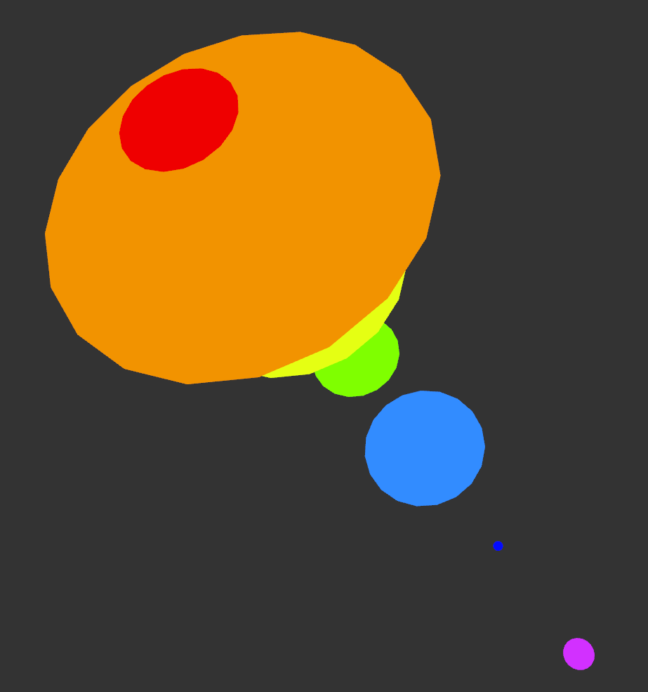
Front-ish view 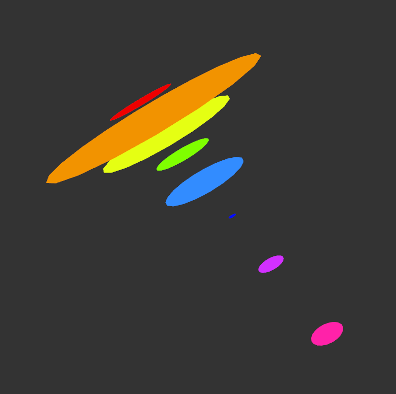
Side view
For my data project, I decided to work with some personal data of mine.
I keep a personal journal to help me remember how I was feeling and memories and experiences. I try to avoid writing in my journal a lot of the time, even thought I need to do it more often. So! To help me visualize how well I’ve kept up with it, I wrote down how many pages of journal entries and notes I took since January of this year. Here were the results:
January: 16 pages
February: 5 p.
March: 27 p.
April: 10 p.
May: 13 p.
June: 1 p.
July: 3 p.
August: 3 p.
(EDIT: I will have to review the data in the program again since I have reason to believe some of the numbers may have been put in the wrong spot)
The colors go from January to August represented by the colors red to magenta respectively.
It was kind of eye opening to me when I fell out of writing in my journal, and going through the entries, there were some explanations or me even writing “I know I’m avoiding this” and a time I mentioned “I didn’t have the journal with me”.
I wanted to use transparency on the circles alongside a bit of code to help me automatically space out my shapes, but I haven’t found a way to do so quite yet. Any suggestions are appreciated 🙂
This is a very nice visual, though the main problem is that it’s difficult to see motion in it. If you spin the discs, there’s no real affect to it. Perhaps messing with the colors or making the discs spread apart or shift together could work, otherwise this design doesn’t really have a lot of motion. Perhaps being explicit with the visuals and adding some pictures to depict the different months could help? Otherwise it’s rather ambiguous.
This is very pleasing to look at. For a suggestion of automatically spacing, you could try the layer function that was discussed during class. The only major issue that could happen from it is that the objects could be too close to each other, even though they may be layered properly.
I think that a fun animation that you could do is making almost a springy effect with the circles getting closer to one another then further apart 🙂
This is a very cute piece of work in my opinion and I like the image behind very much. In this case some labelling and maybe changing the background color a bit would make the image more appealing and easier to understand.
Animation for the floating pages would be a good way of showing some aesthetic creativity. I know that you can use hard code with max but I forgot how to do it. I just wanted to let you know that it is possible.
As someone who also i̶n̶f̶r̶e̶q̶u̶e̶n̶t̶l̶y̶ journals, I find this really interesting. I’m curious if you could find a way to make it so you can “flip” through the months like you’re flipping through a book. That could be interesting.
I like the visuals which use distinct colors and engage in more 3-dimensional space.
To elaborate, I think engaging in a 3-dimensional space demonstrates more complexity with the emotions and feelings you are expressing with this piece.
As an observer, the fact that all your disks align themselves on an axis suggests some form of future motion or rotation of shapes. That and spacing out our disks back and forth along this axis as you suggested seems really cool!