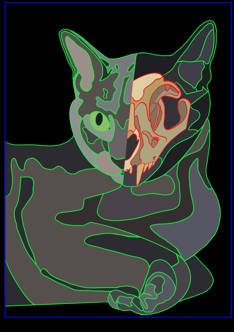
This is Sassy, my cat, mashed together with a cat skull. I’m going to cut the layers out of paper using different colors to create depth in this piece. I plan to use lighter colors closer to the center of the artwork where the shapes would protrude most from the paper when the cats face is mounted to the paper. Leaving the edges darker allows the design to look like it is gradually moving out of the paper and into a 3D form. The skull is colored to look like bone and the background of the skull is varied shades of dark gray/black to give the vague outline of the cat but draw focus to the skull and its texture. I also wanted to make the skull look almost like an x-ray of the cat’s head or like a mask. I also plan on making the eye color of the cat green in the final as well because it will provide an additional focal point in the piece that can help center the viewers eye and help with alignment for the viewer of the cats’ skull with the cats face by providing distinct facial feature markers. Some of the pieces will need different sizing as I start to think this out more.
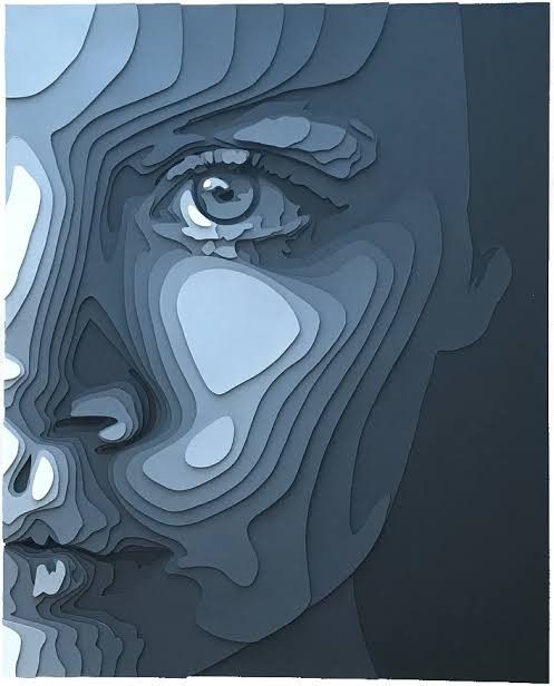
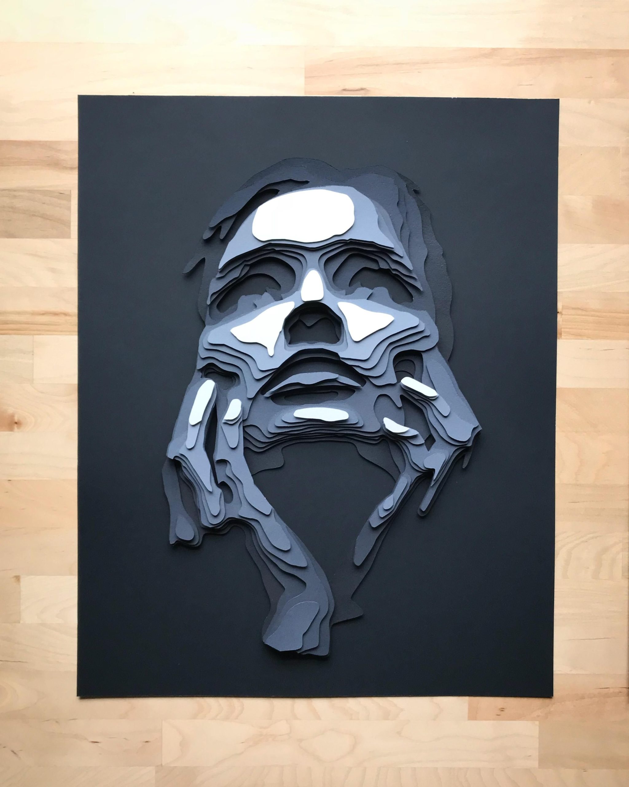
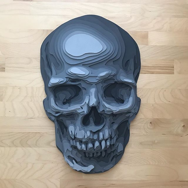
I thought doing faces using different layers was really cool and I knew I wanted to do something along those lines. I also really loved the idea of a skull and I’m obsessed with cats. This design also reminds me of my tarot card set. The blue faces and skull pictures are what I used as my inspiration for this design and they were created by Shelley Castillo on Instagram.

What is your plan for managing your layers before and while cutting them?
I plan on breaking everything apart in inkscape and editing them to be larger and cover more area. Each layer will have a number and I will match that with the cut sheet and build accordingly.
What’s you plan for keeping all the pieces straight?
I’m going to keep copies of the cut sheets I upload to the laser cutter and make sure as parts get cut they get numbered. The numbers will help keep things ordered and tell me where to place them .
How do you plan on making the different sections visually distinct?
I’m not sure I understand what you are asking with this question. I plan on using different paper colors and potentially a different texture paper for the eye and shadows on the skull. Besides that I’m not sure if your asking about the colors of the layers or not. The idea behind the design is to look like the figure is coming into focus from the black background and the light sections are supposed to be the highlights where light would hit the cats face and body and the rest of the picture is supposed to be different shades of grays to give the illusion that the cat is coming out of the background like in the reference inspiration photos.
How do you plan on managing the many pieces and keeping track of which piece goes where?
I’m not really sure about this yet, but I’m going to make my own cut sheets and print them out. When I’m done cutting each piece I’m going to match it up with the cut sheet and either put a light number or letter on the paper. I also plan on making the layers larger and layering them more effectively to keep everything together and limit the number of small floating parts.
What material do you plan on using?
I plan to use card stock for this project.
Are you planning on preserving the green and red outlines in your finished piece, and if so how?
I’m not planning on preserving the red and green outlines. I like the red around the skull but I’m not in love with the green. These colors were mainly for me to see where the layers started and stopped. I’m hoping to make something more seamless like the inspiration pictures. I have made a new sketch that is not posted yet with the outlines all the same dark navy/gray color that is seen around the cats ear on the skull side. I’m planning on this color being the entire background for the cat and then gluing all the pieces to that and mounting that on the final backing paper.
Do you plan to have a slightly hollow region within the cat skull and the left half of the face?
I plan to cut the colored skull parts out and paste them on the face. The darker tones of the cat face on that side will not protrude as much as other layers because they will be located closer to the background and not built up as much. I think this will give the appearance of a hollow area in the eye, nose, and around the teeth in the skull but still maintain the shape of the cat.
What background color are you planning on using?