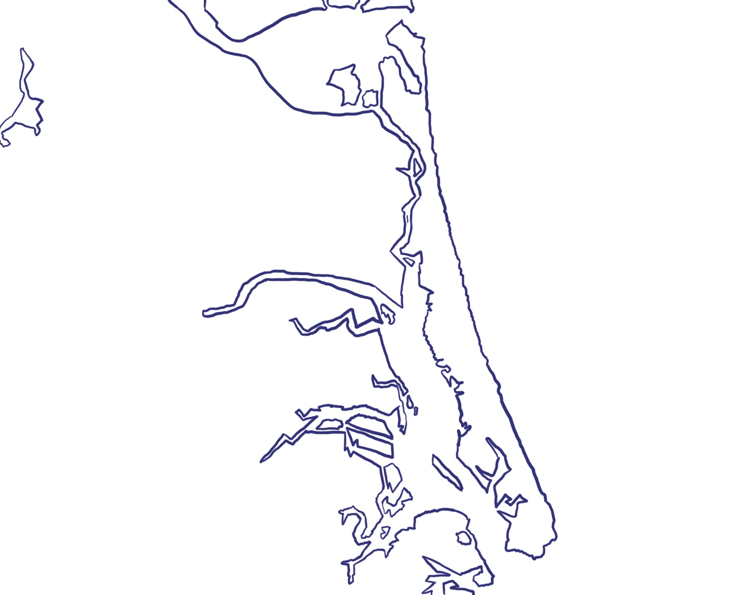
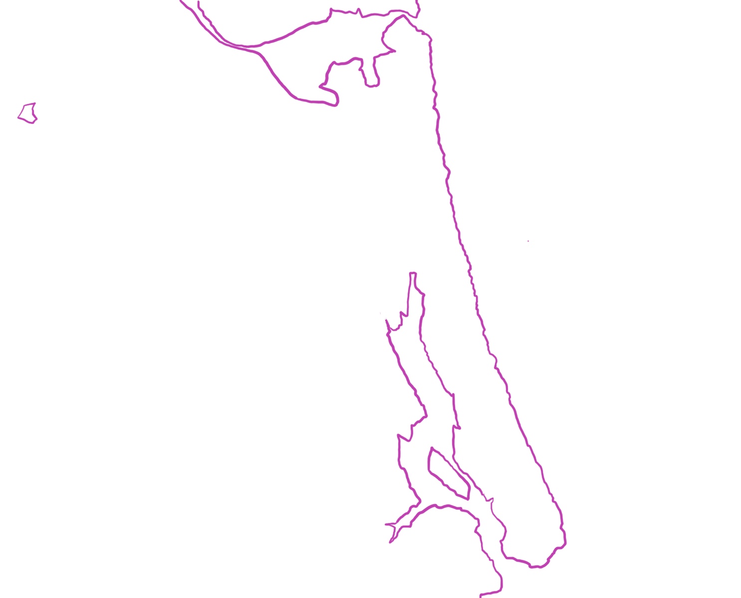
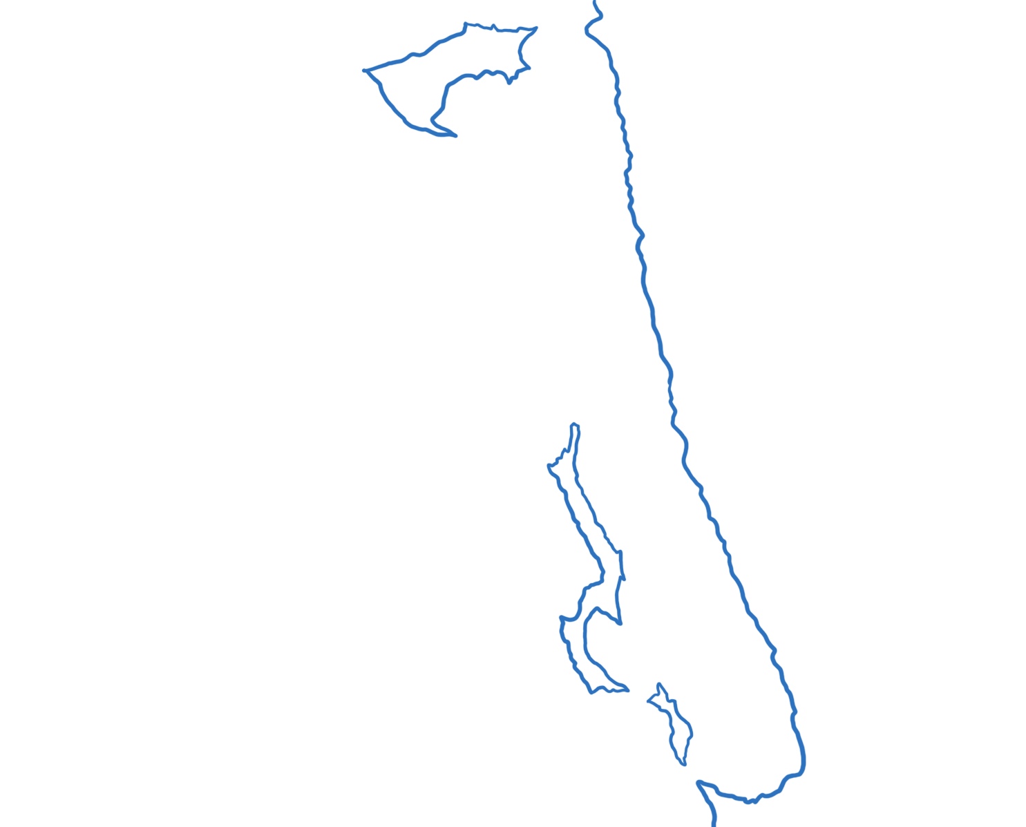
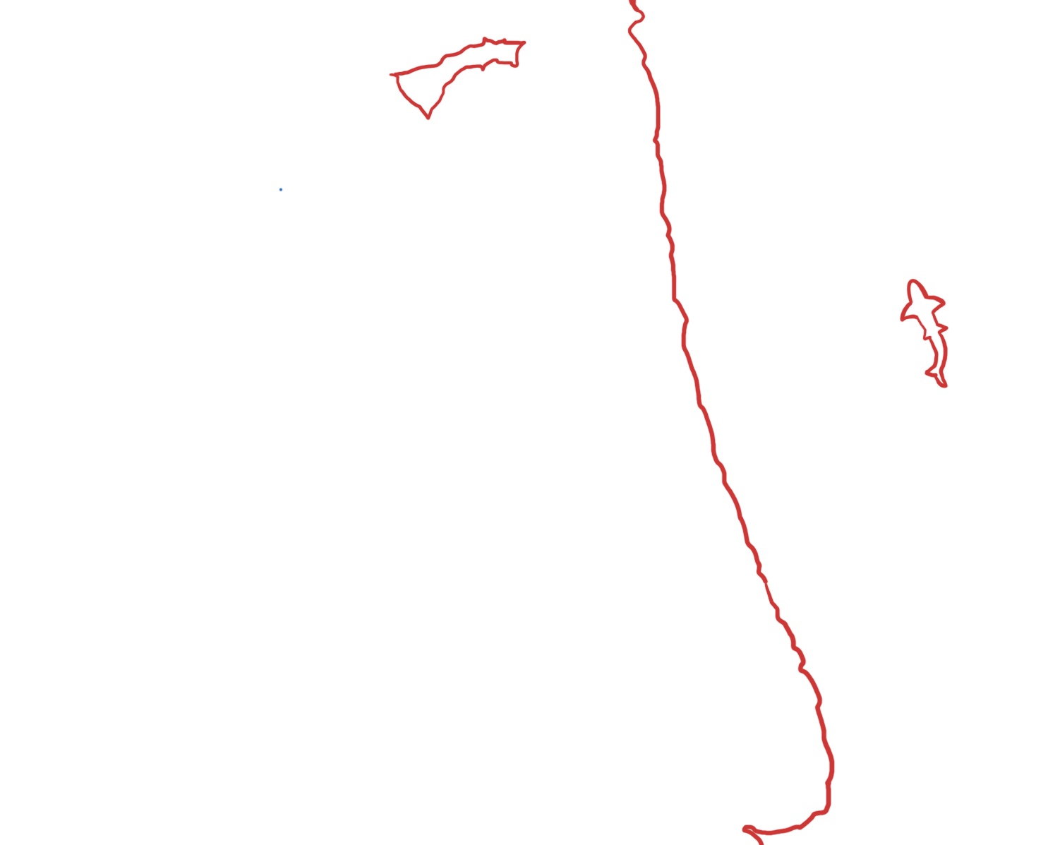
I’ve separated my layers for this project and plan do a frame to make it feel like you are looking at a photograph of Plum Island. In the last photo you can see my starting to incorporate the frame into my first cut of the project.
Does anyone have any suggestions for the colors for the layers? I can’t decide if I want to do blues or something less traditional.
I would find that making the layers apart of an overall gradient would come out really nicely. I would suggest a green to blue gradient for ocean vibes, but most types of gradients would look really nice.
I agree with Alex. A green to blue would look very nice and make it clear that these are islands.
I was interested in the detail of the outline and the inclusion of the shark.
What materials were you planning on using for the different layers?
A thought I had was that you could extend the frame across the different layers.
I am interested in hearing your thoughts on the material you will use. I appreciate how each layer gets more and more detailed. I agree, blues and greens would give traditional coastal/ocean vibes, but other colors could also be unique.
I think a blue gradient would look nice, but I’d be interested to know what type of material you’re using. If you’re open to it, I think it might be cool to use a mix of wood (land) and blue acrylic (water)!