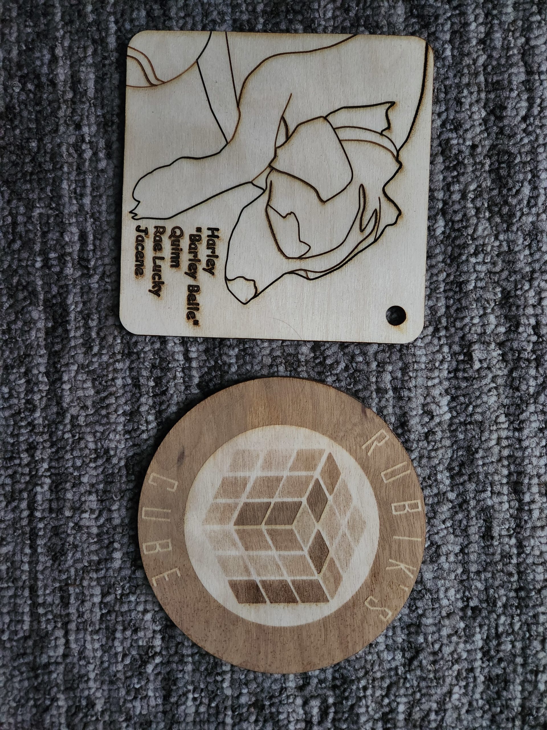
I started to do my second drawing of a Rubik Cube but was unable to finish it. I tried to be a little ambitious and use different powers for different colors. I think I finally have the procedure down for how to do this properly, but there was a learning curve that took me longer than expected to figure out.
Update: I went back to Unity and retried doing my first and second cuts using the knowledge I gained on my first attempt. They came out much cleaner and more how I envisioned them.
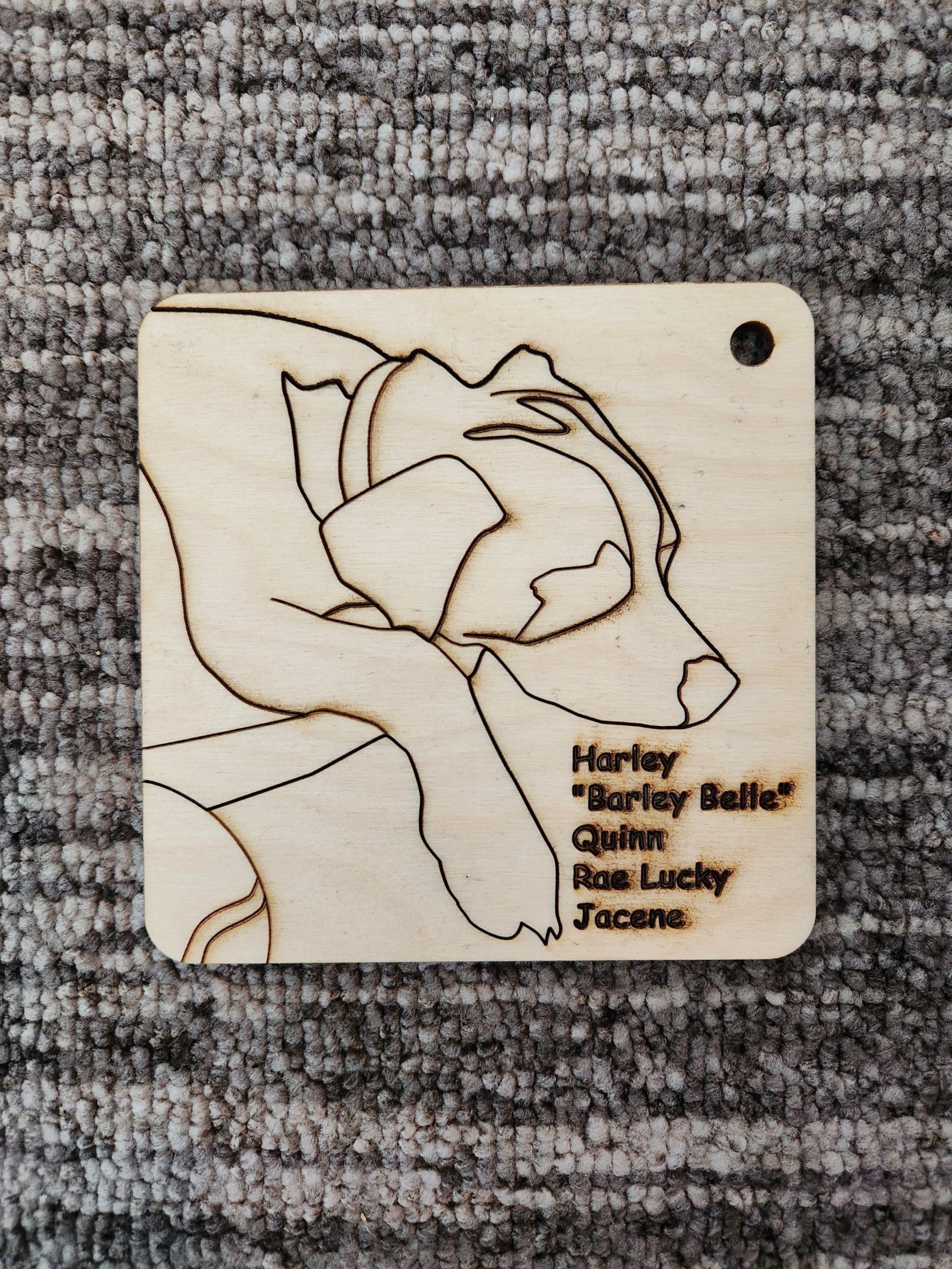
I noticed that the rounded edges of the piece give it an overall more charming and “comfortable” feel. The contrast between the main part of the piece and the text has a really striking effect. I appreciate how the art feels abstract, yet makes a very clear image of a dog
The style of these drawings is striking. I’m struck by the simplicity of your drawing for a complex 3D figure. I appreciate the deliberate use of lines.
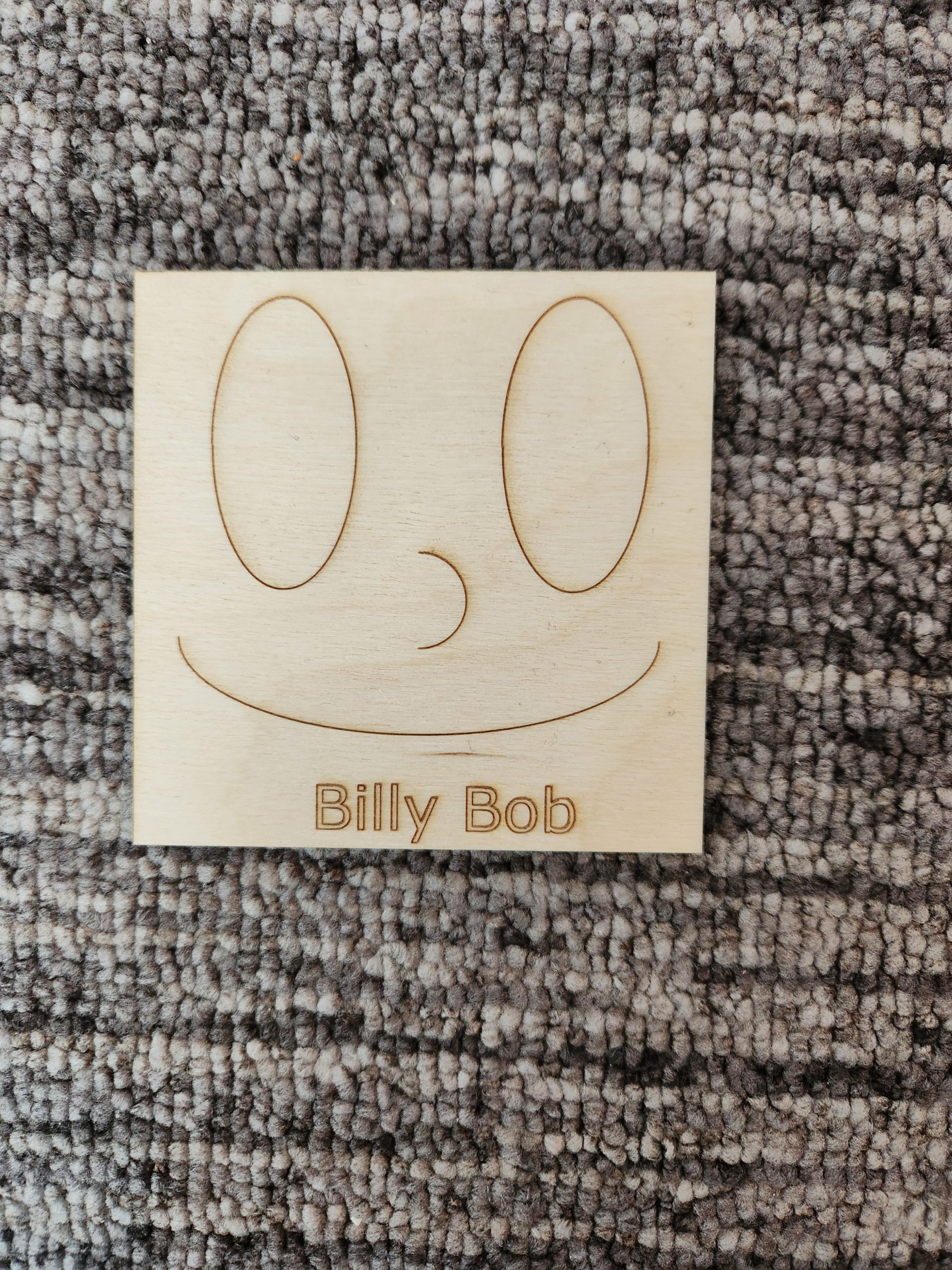
I noticed billy. What a goof! He has such geometric construction. I’m struck by the way you outlined the text instead of rasterizing it. I appreciate the way you cut his outline into a square, it reminds me of my favorite cartoon character. 🧽⬜🔺⚪
I noticed the intricate line work on this design. The simple design has unique curved lines that must have been challenging to do in inkscape. It is very visually pleasing. I also really enjoy the darker color of the writing. It makes the words stand out in contrast to the dog.
I noticed your use of both images and lettering. I’m struck by the emotion that comes through from the piece. I can tell that it means something to you. I appreciate your composition of the image, it fills the space in a very satisfying way.
I appreciate your use hard lines on prominent features of your dog, it gives the dog a well-defined form which looks very good! Your lettering is also very bold looking with the darker, heavier lines used to create it which I think also look good.
I notice the dog’s nose, and I think it particularly turned out really charming. Overall, the art has a peaceful vibe. I didn’t notice until other people mentioned it, but I also appreciate the rounded corners on the piece. I think it makes it look more finished overall.
I like how the design is detailed but is also simple at the same time. The dog is also very cute!
I noticed the different shades between the dog and the text. The text pops out more due to the darker lines and goes well next to the lighter line drawing of the dog.
I love the rubik’s cube!! I appreciate the different raster engraves to represent the color from you drawing!
I’m struck by the different levels of darkness on the rubik’s cube piece — it has a really neat effect!
I appreciate the time you took to give each rubix cube part a different raster engrave power to make it look like different color parts showing it’s unsolved, it’s a very cool detail!
I noticed The different raster powers for the rubix cube. The differences are there but still subtle but it adds to it in a way, it looks very cool regardless!