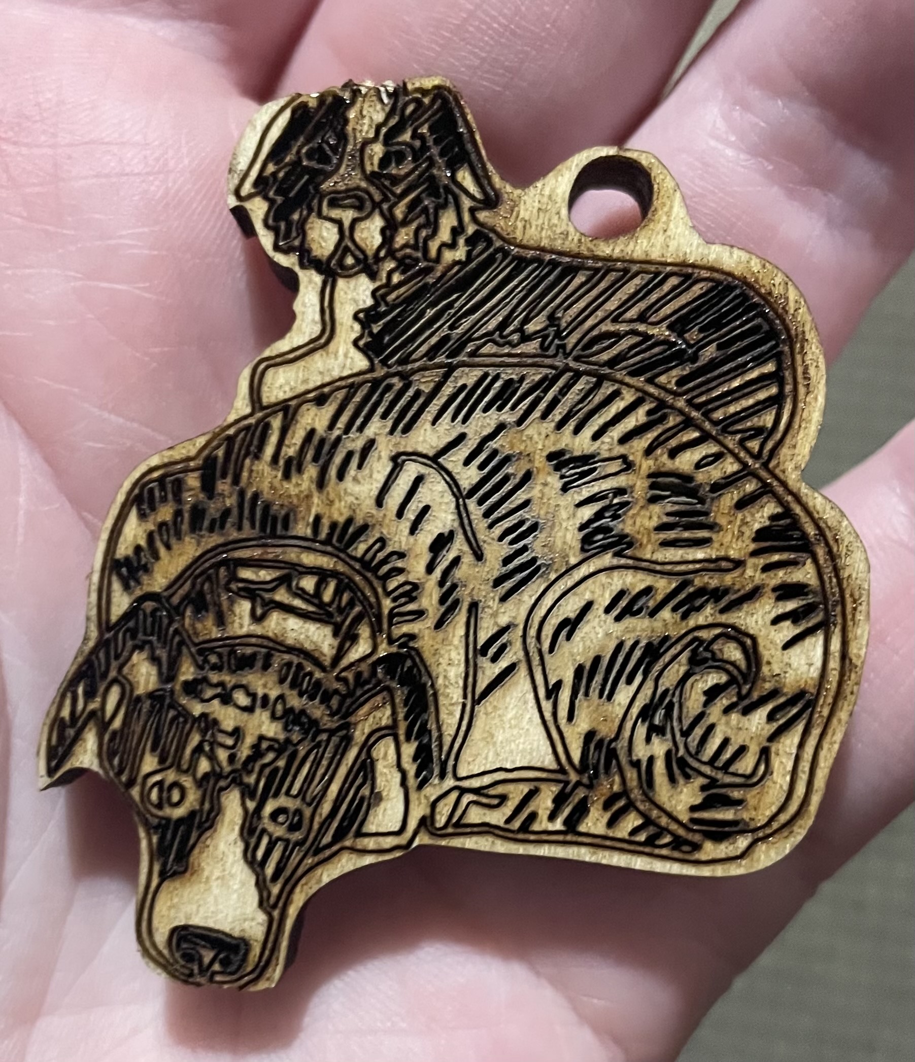
For my first cuts, I tried cutting out drawings #1 and #2. I had trouble getting the power settings right on the first drawing so ended up having to cut it out again after the test print.
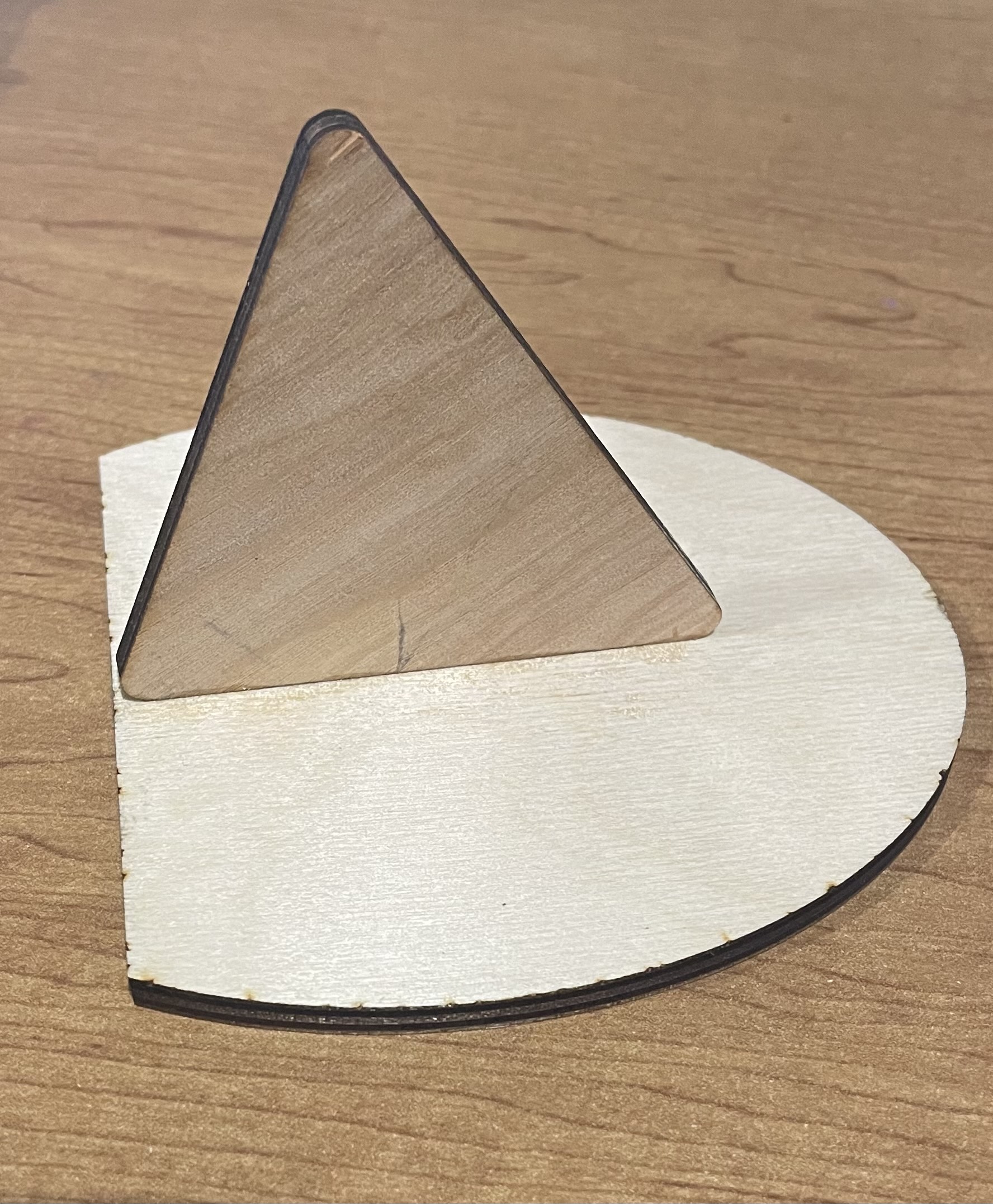
My second cut was more tricker with the raster engrave since it was a drawing on paper traced in inkscape some lines transferred over a bit strange. I had to change the design mid cut due to the border not cutting out correctly and having lost it’s original position on the laser cutter bed. It was originally suppose to be just the drawing that was gonna be cut out. I added a oval shape border for it to be in with text filling up the extra space, making a stand as well out of extra cut wood to create a mini portrait.
The idea is very thoughtful and the lines are deliberate. I’m struck by the contrast between the wood and the print. I appreciate the varying shades/layers of laser cutting
I appreciate how you were able to achieve different shades for the words and the drawing using different powers and speeds with the raster.
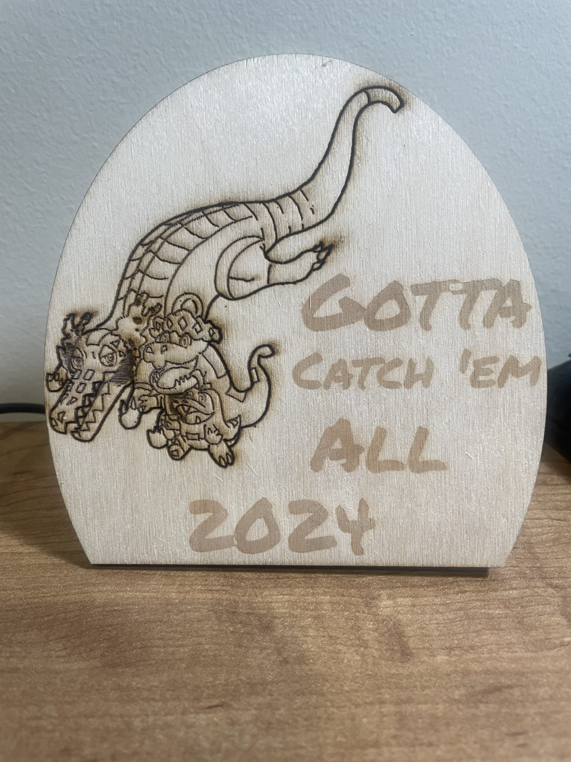
The use of vectors versus raster came out very well, and made the fire on Skeledirge more clear. As a standee the piece works really well, especially with the very nicely done text to accompany the image.
I noticed the fur texture, it looks great and shades well. I am struck by the dogs. What tha dogs doin⁉⁉⁉⁉⁉ I appreciate the way you cut out the outline as an outer stroke rather than a box.
I noticed the details on the evolution line. This piece has a very professional feeling to it with how clean it is. I appreciate the extra work that went into making a stand that helps display your cut.
I noticed the texture in both your designs. Using a mix of vector engraving and raster engraving adds depth to your drawing #2 and the detail on the fur adds layers in your drawing #1. I find this very visually pleasing. I also really like how you cut the wood to allow it to sit upwards by itself. This is a creative way to showcase your work.
I noticed your use of different engraving styles. I am impressed by the detail within the dragons. I think the composition of the characters is super cute. I appreciate the way you used a unique boarder shape.
I noticed the lines used in your dogs are very dark and provide a nice burnt look to the dogs’ coat. This was not a feature I was thinking of, and I think you used it well. The other image contains more detailed with less shading, this I think looks better for that more animated design.
I appreciate the dark lines and the burn marks on the first cut. It gives more feeling to the piece and even if it wasn’t intentional I think it gives the dogs more dimension.
I noticed your attention to detail when engraving the Pokemon and as a Pokemon fan, I love it.
I’m impressed by your ability to improvise mid cut to make your Pokemon piece work — it worked well! I also notice the little overlap between the two T’s in “Gotta” and how they kind of cancel out — I think that’s neat 🙂
I’m struck by the way you had the line art of the Pokémon contrasting with the very light raster for the text. it looks very nice and fits well. Very pleasing to the eye.
I appreciate the way you added the stand to the second one so it could stand up rather than being just a wood piece that had to pay flat.
The first piece is also very detailed.