For my first cut, I chose to cut out my Drawing #1 of a yarn ball and crochet hook. I had the speed high and the power low for the engraving, and it is darker on some lines and lighter on the rest. Not sure why this happened, but will fix it for my next cuts.
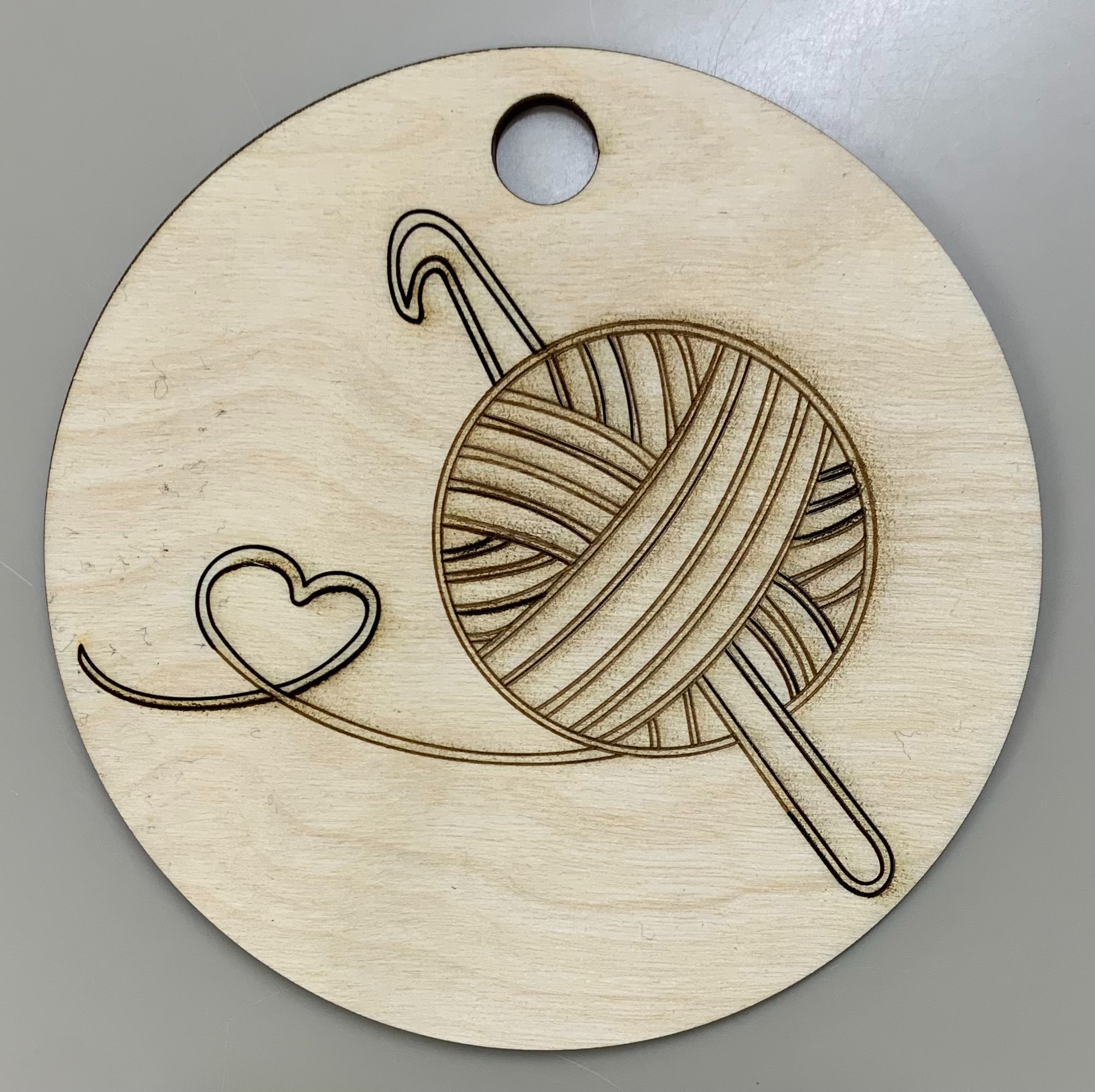
I noted the piece came out nicely as a charm. The darker lines do clash a bit, but I find the spotty burn marks to add an interesting. although unintentional effect.
Whoa, check this out! We’ve got a yarn ball that’s so off-the-hook, it’s spinnin’ its own love story in threads right here on this wood slice! I noticed some nice outline yard. I appreciate the way you cut a circle out as it matches the yarn ball.
I noticed the different shades within the vector cuts. I know you said this was unintentional but I believe that it adds depth to your design. I’m struck by the way you utilized fine lines to portray lots of detail. I appreciate the way you used a very simple design. It draws my eyes towards the heart in the string of yarn.
I noticed the curved lines and crochet hook sticking through them, I think this gives your design a nice 3 dimensional look. The darker lines in some locations does I think take away from the pieces as a whole. I appreciate the heart though that you added, it is a nice touch.
I notice the heart in particular, I think it is very cute and turned out nicely. I am trying to figure out if the crochet hook is really big with a normal size ball of yarn, or if it is a normal size crochet hook with a small ball of yarn. Either way I really like it, it looks like a logo for a crochet website or app!
I appreciate how crisp the lines are. I like the consistent spacing of the lines and the laser cutter did a great job with getting the smaller details. The inconsistent shades of the lines help give the piece more dimension.
This piece I noticed has a very nice charm to it in terms of the line placement that make it feel like a store logo with it’s strong graphic design.
I noticed that the cuts are very clean. The overall image is nice and smooth with the lines and works very well as the ball.
I appreciate the way you also made it into a usable item by adding the hole on top.