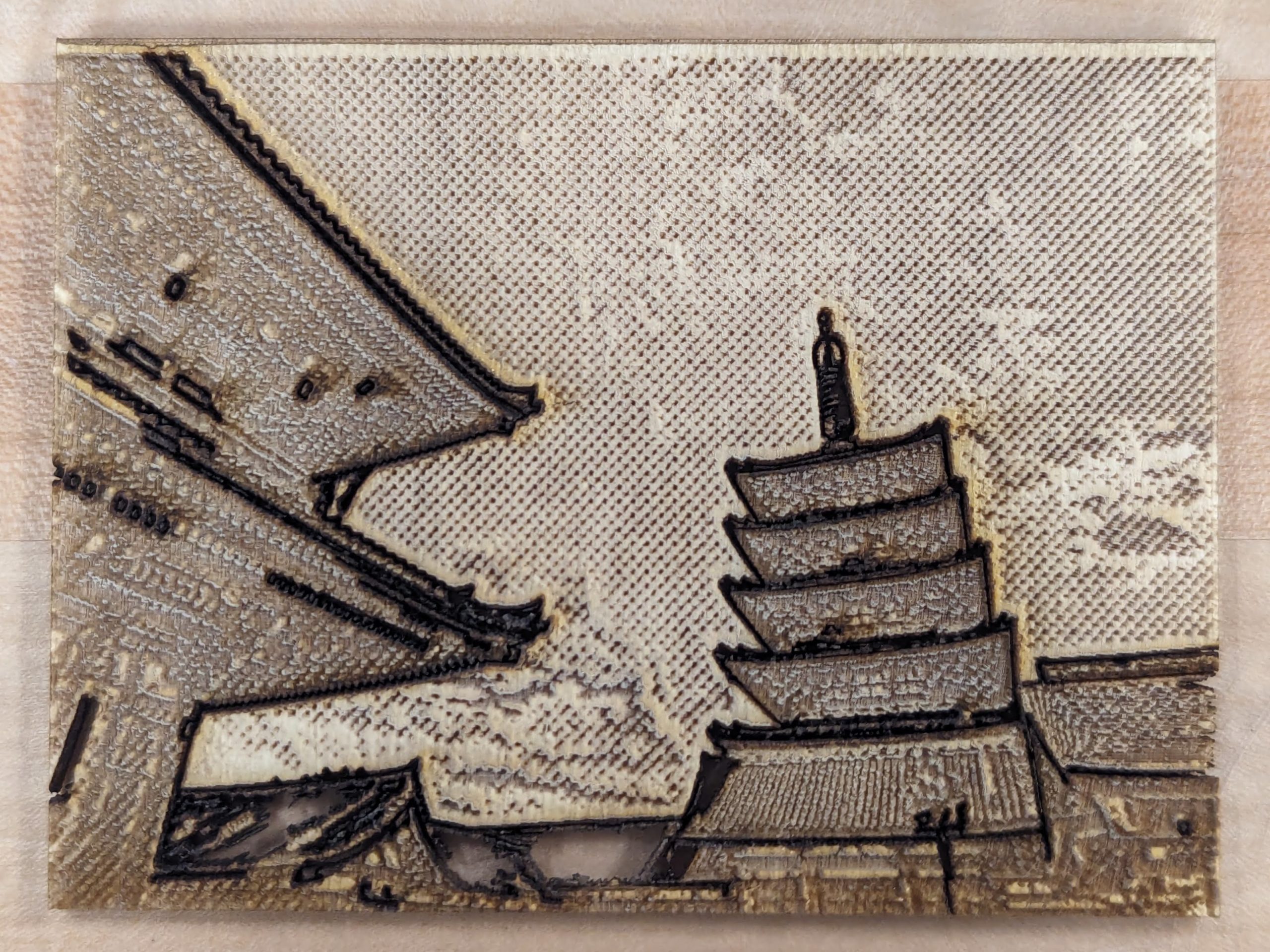
Statement of Meaning – I appreciate the angle the work is at, it makes the piece feel more striking, like it towers of you even though the wood piece is small. This image translated really well to wood.
I noticed the attention to detail in your image. I’m struck by the personal connection/meaning in your artwork. You are clearly a very thoughtful artist and you must’ve spent a long time on this! I appreciate your vision and effort
I noticed the variety of textures in your design.
I’m struck by the way you utilize a mixture of raster engraving and vector engraving to add layers to this piece. I appreciate the way you used a photograph you took to create this.
I love the depth that the angle of the reference photo gives to this piece! I appreciate the extra dark edges around the buildings, which really add to the dramatic perspective. I think this would be a make a really cool postcard!
I noticed dithering for this photograph. The contract is very crisp in this cut and the photograph translated very very well.
I’m struck by the way you composed this image for it to cut very clearly. The texture is very surprising.
Statement of Meaning – I appreciate the angle the work is at, it makes the piece feel more striking, like it towers of you even though the wood piece is small. This image translated really well to wood.
I am struck by the different textures for the roofs vs the underside of the roofs vs the sky. Very detailed and impressive, good job!
I noticed the attention to detail in your image. I’m struck by the personal connection/meaning in your artwork. You are clearly a very thoughtful artist and you must’ve spent a long time on this! I appreciate your vision and effort
I noticed the variety of textures in your design.
I’m struck by the way you utilize a mixture of raster engraving and vector engraving to add layers to this piece. I appreciate the way you used a photograph you took to create this.
I love the depth that the angle of the reference photo gives to this piece! I appreciate the extra dark edges around the buildings, which really add to the dramatic perspective. I think this would be a make a really cool postcard!
I noticed dithering for this photograph. The contract is very crisp in this cut and the photograph translated very very well.
I’m struck by the way you composed this image for it to cut very clearly. The texture is very surprising.