I ended up revising my design a fair bit but the inspiration is still there. I ended up theming my lantern around older nintendo systems such as the NES, SNES, N64, and Gamecube.
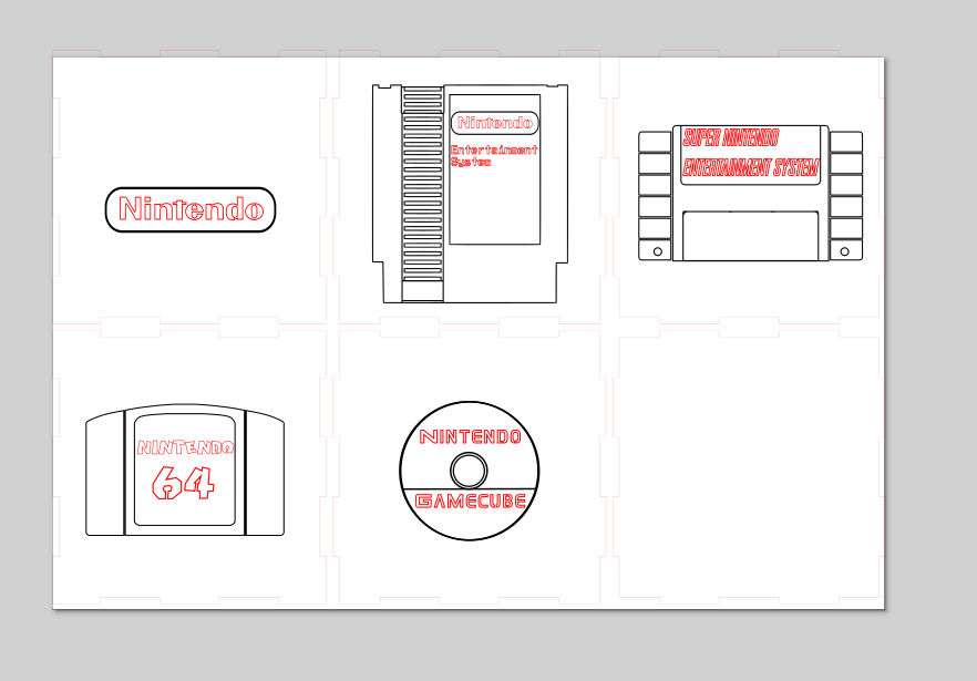
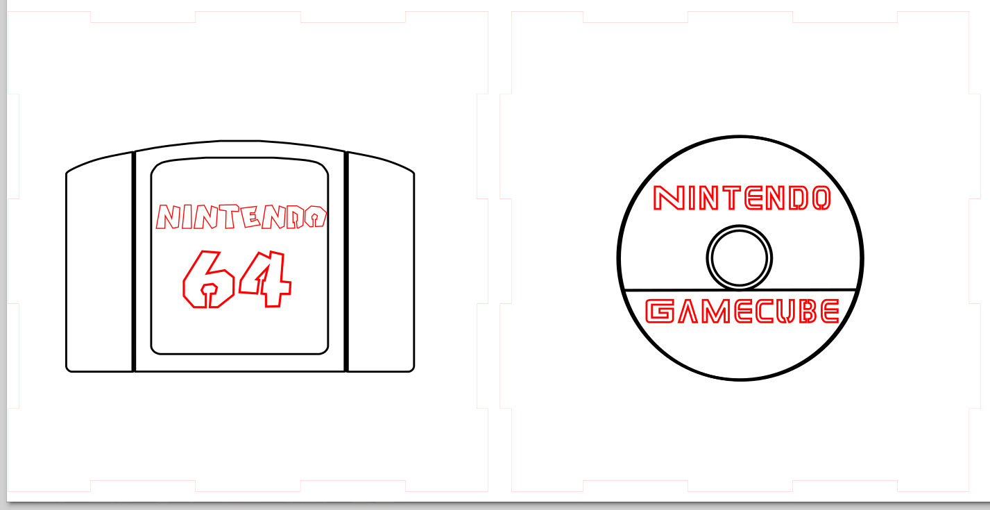
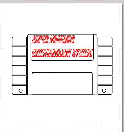
The pieces are shown above. The top will be a general nintendo logo. Each side will have an engraving of the physical game format relevant to the system I put in text. The first three are cartridges, the last is a mini dvd. The fonts are all relevant in to the specific system they describe. The base plate will just be blank. Below are some close looks at the panels.

I adjusted the text to work as cutouts. I am still wondering if I should have more elements cut out versus engraved. I am concerned it will come out awkward though, and there is a lot of elements contained within others as I have it designed right now.
In my opinion, I think it would be nice to have some more pieces cut out — like the center of the mini dvd, the little circles at the bottom of the SNES, etc. I’m a little worried about SNES font though — I think there might be too little space between the letters. (I ran into that with mine, and it disintegrated some bridges I had… oops). I love the idea and I’m excited to see how it turns out!
I love this idea, and all the logos are really well executed!
What type of lighting are you going to use??
In my opinion, you should use some RGB lighting since Nintendo has always been the most colorful of the companies.
As for the cut-outs, I think a few more couldn’t hurt. Maybe add some drawing on the sides of the characters or icons, such as Mario, the Tri force, or a Pikmin.
I find your piece to be very nostalgic. It reminds me of my childhood. Do you plan on using color either within the lights or on the wood? In my opinion, I think that you might want a bit more cut out. I think as it is right now, you won’t get a lot of light coming through.
Your design is very fun to look at to see how Nintendo cartridges have changed on old consoles. I think having more cutouts couldn’t hurt like the rectangles of the entertainment systems side or just adding iconic Nintendo franchise logos in some of the corners.
I love the design, especially how the fonts match up with each type of game. I am interested to see what type of light source you will use. I think more cutouts couldn’t hurt as long as they add to the design.
I like how all the drawings are cohesive despite not being of the same console. I also love the detail of the font matching. I think that the engraving is cool and there is a good balance between that and cut outs. I think it might be interesting to see adding a thin cut out line around some parts might help add visual interest. What is your plan for the light source?