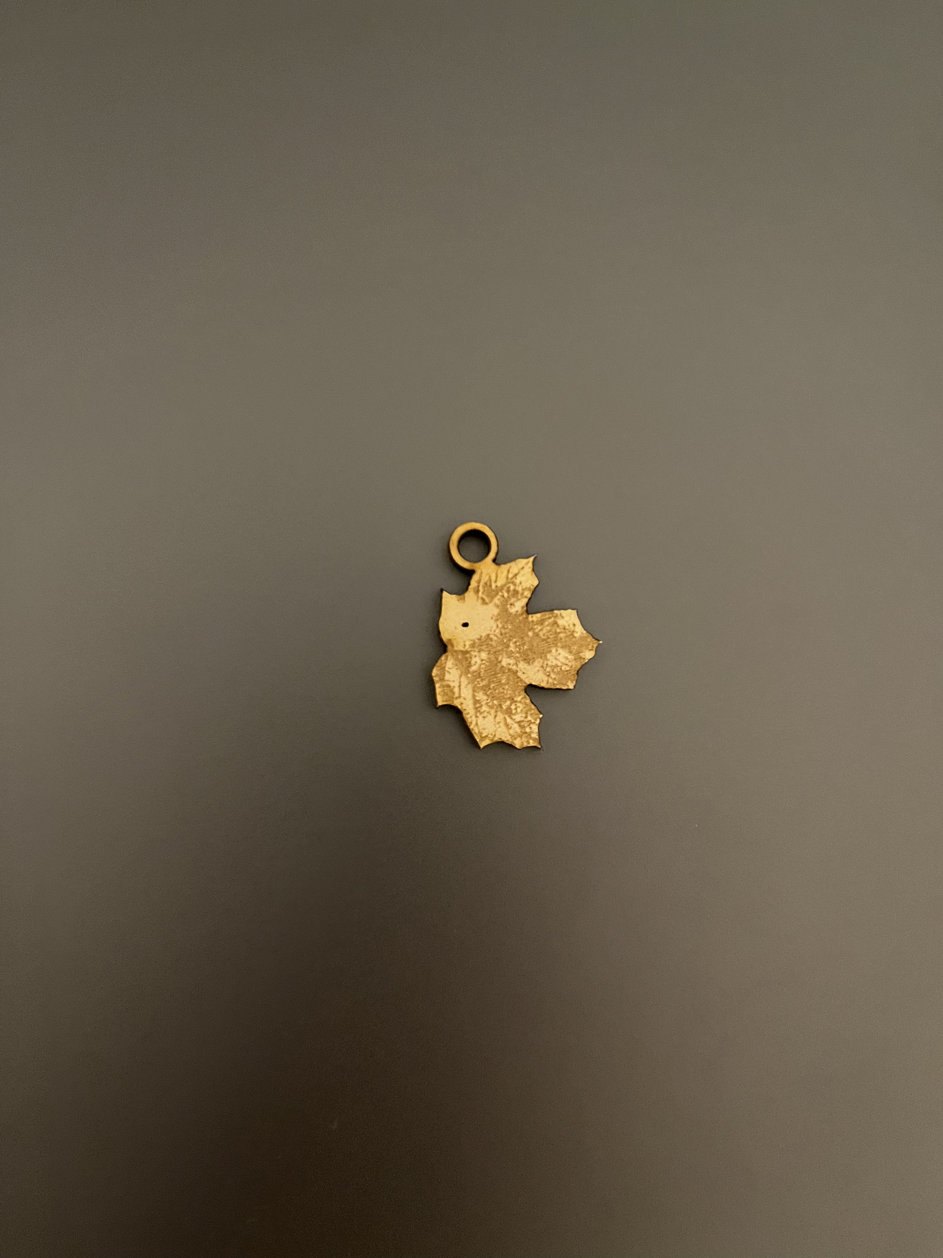
I ended up cutting my first and second drawings. It went pretty smoothly overall, but for some reason a few of the lines on my drawing #1 piece were engraved slower than others and were engraved deeper as a result. The stem on my leaf pendant was also cut off because I made it too thin, but I am still happy with the result.
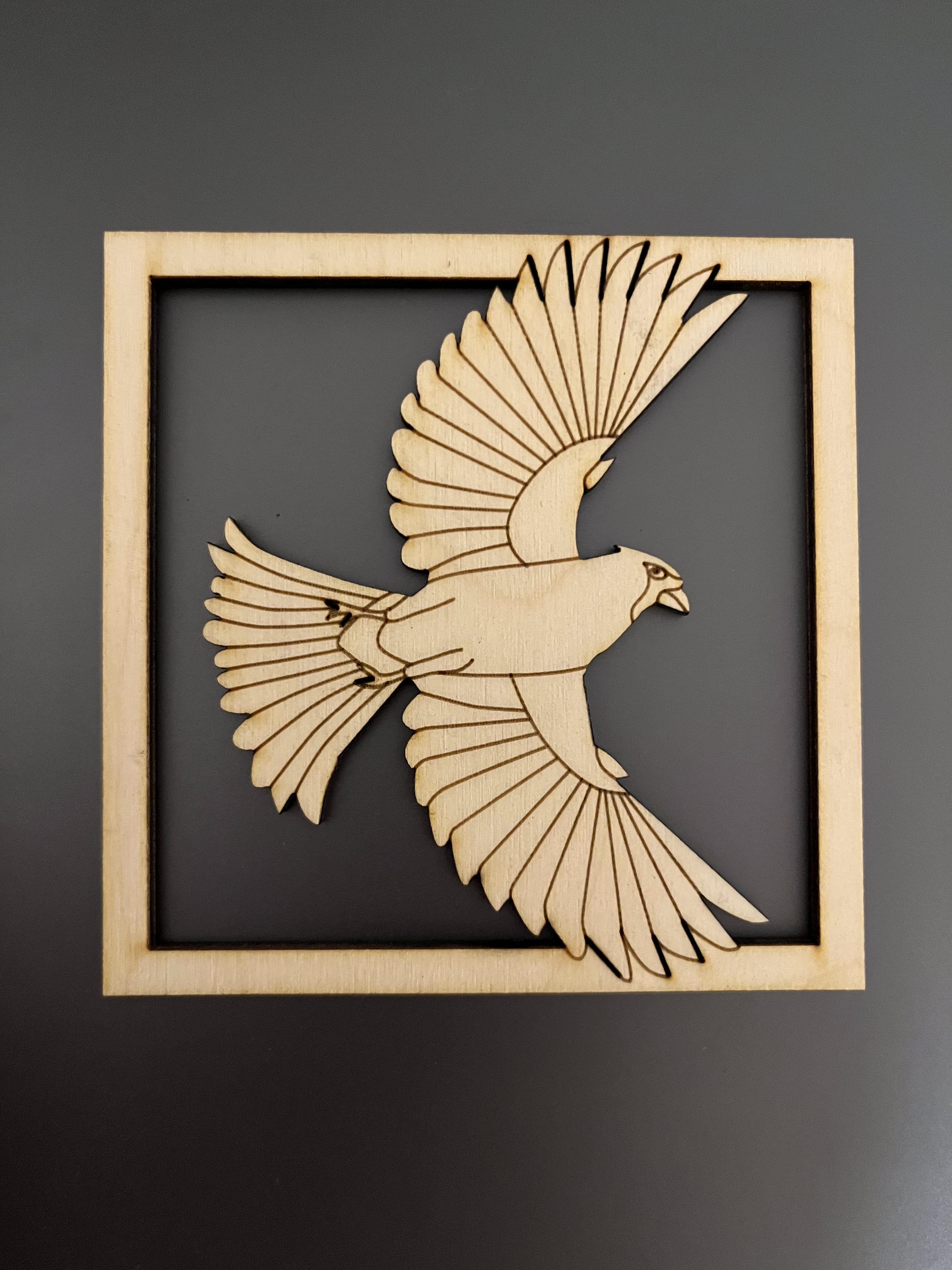
I appreciate the way you were able to capture such depth and detail without the need to raster, or different depth engraving. It’s just the right amount of detail, it looks like it’s popping out of the frame.
I noticed how clean the vector engraves look on the bird and how much depth was added just by cutting out the material next to the bird in the frame.
I appreciate the way you had the bird extend outside the box, adding dimensionality to the piece
even if the darker lines on the bird were unintentionally, i actually think they provide extra depth to the piece! especially the lines around the feathers that intersect with the border. the way it is done makes it look like the bird could easily pop out or spin around!
I am struck by the attention to detail and realism of the leaf!
I noticed how you utilized the negative space really well then constrain it with a frame. Very neat idea.
I’m struck by the way the realism of the leaf and the way you used the laser cutter to lightly burn it to get the texture.
I appreciate the way you were able to integrate the bird into the frame, it adds a unique flair to the piece!
I’m struck by your use of negative space in your bird design, it really makes it pop out! I also notice how clean the lines are. I really also appreciate the level of detail and texture on your leaf raster.