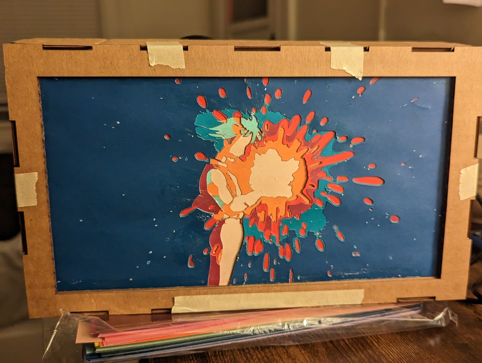
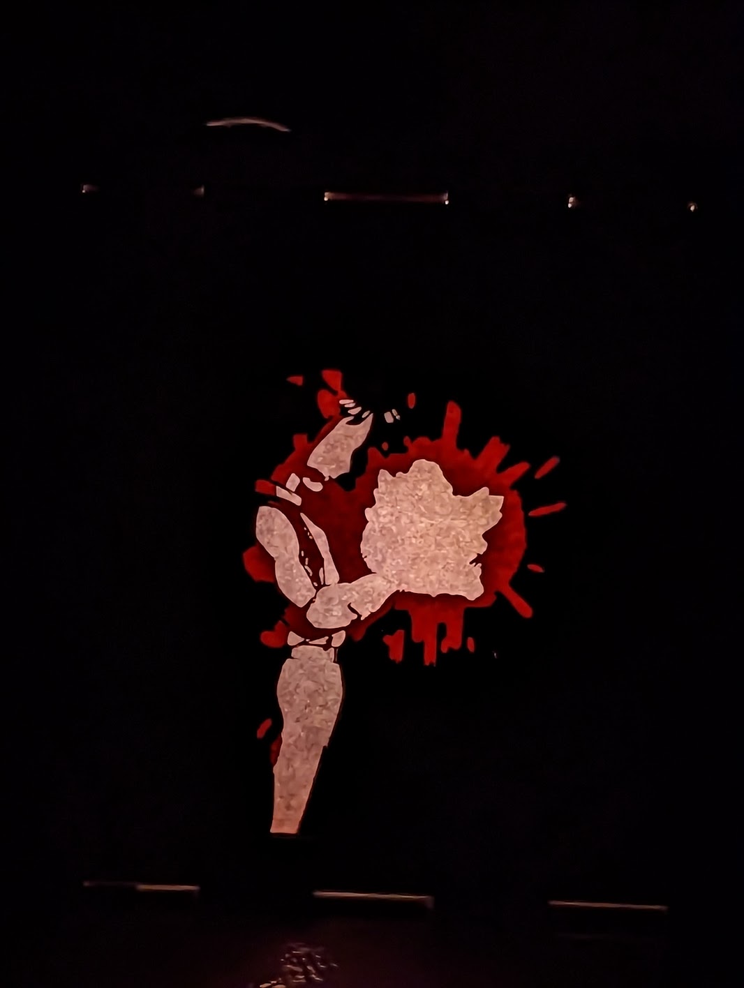
For my lantern project, I decided to do one of my favorite scenes from Howl’s Moving Castle where Howl is holding the “fallen star”. I thought that this would be a really good scene for a lantern because of the brightness of the star and the darkness of the rest of the scene. I used layered paper with different colors to create my design.
2/08/23 – At first, my idea was to laser cut all of the paper, but after the first four layers, the laser was not cutting the paper quite enough to take the pieces out. I did not realize this while I was in the lab, so I went and used a Cricut to do the top layers. Overall, I really like how the layered design turned out. The light shines through where I want it to and I think I got the box size correct for the look that I am going for.
I used a light board that I borrowed from a friend for my light source because my initial plan to use fairy lights did not work. I then uploaded Arduino code to the board to make it flicker and look like light that might come from a lantern/fallen star.
My next steps would probably be to make room for the cable for the light, fully build the box, and paint the box.
One question that I have about my project is what color would be the best for the box. I was thinking of doing either a black or dark blue but it might also look good with a lighter color.
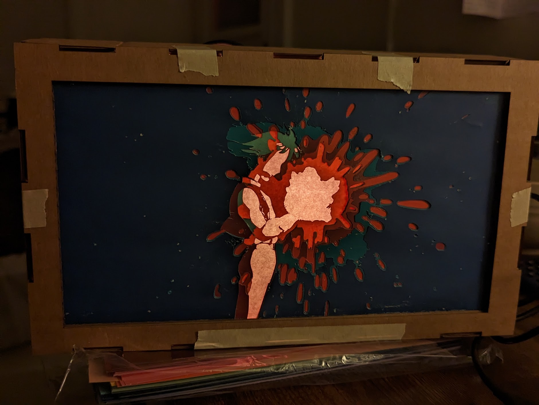
I think dark blue would look good for the box. I know people in class suggested patterns, but I think keeping it simple would add to the impact of the subject. You could write on the corner of the box what movie this is from, but other than that I think it should be kept simple.
I really like the outwards splashing effect that the piece has. How did you mount the paper to the cardboard frame? I agree with what Taylor said about making the frame a dark blue, since it continues the darkening effect as you move away from the center of the piece.
I think this lantern project came out really well. I agree that a dark blue border box would match the best. I am struck how you are able to make this picture with only shades of blue and red.
Your use of color is very impressive. I notice the strong contrast created both while the light is on and off