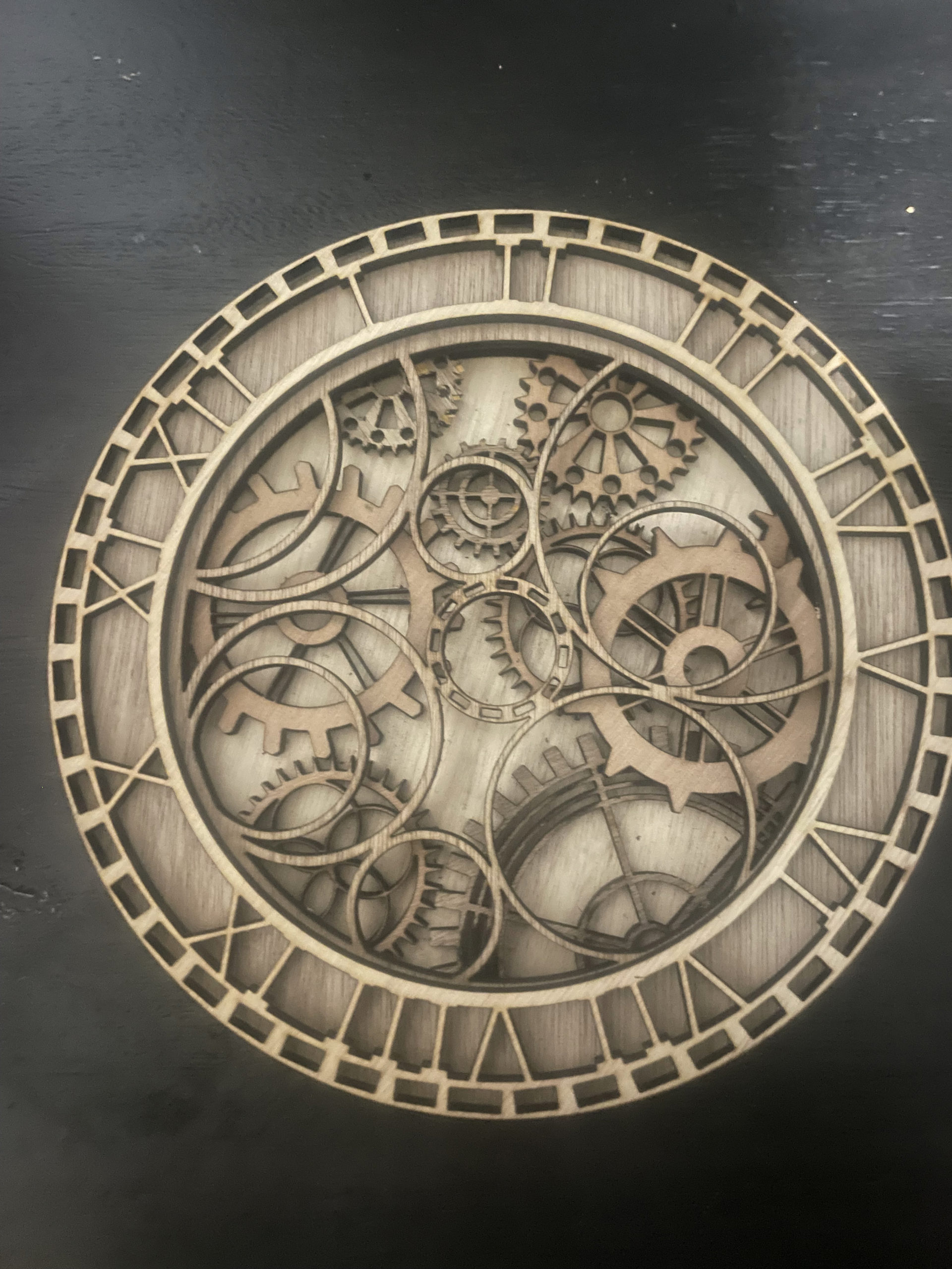
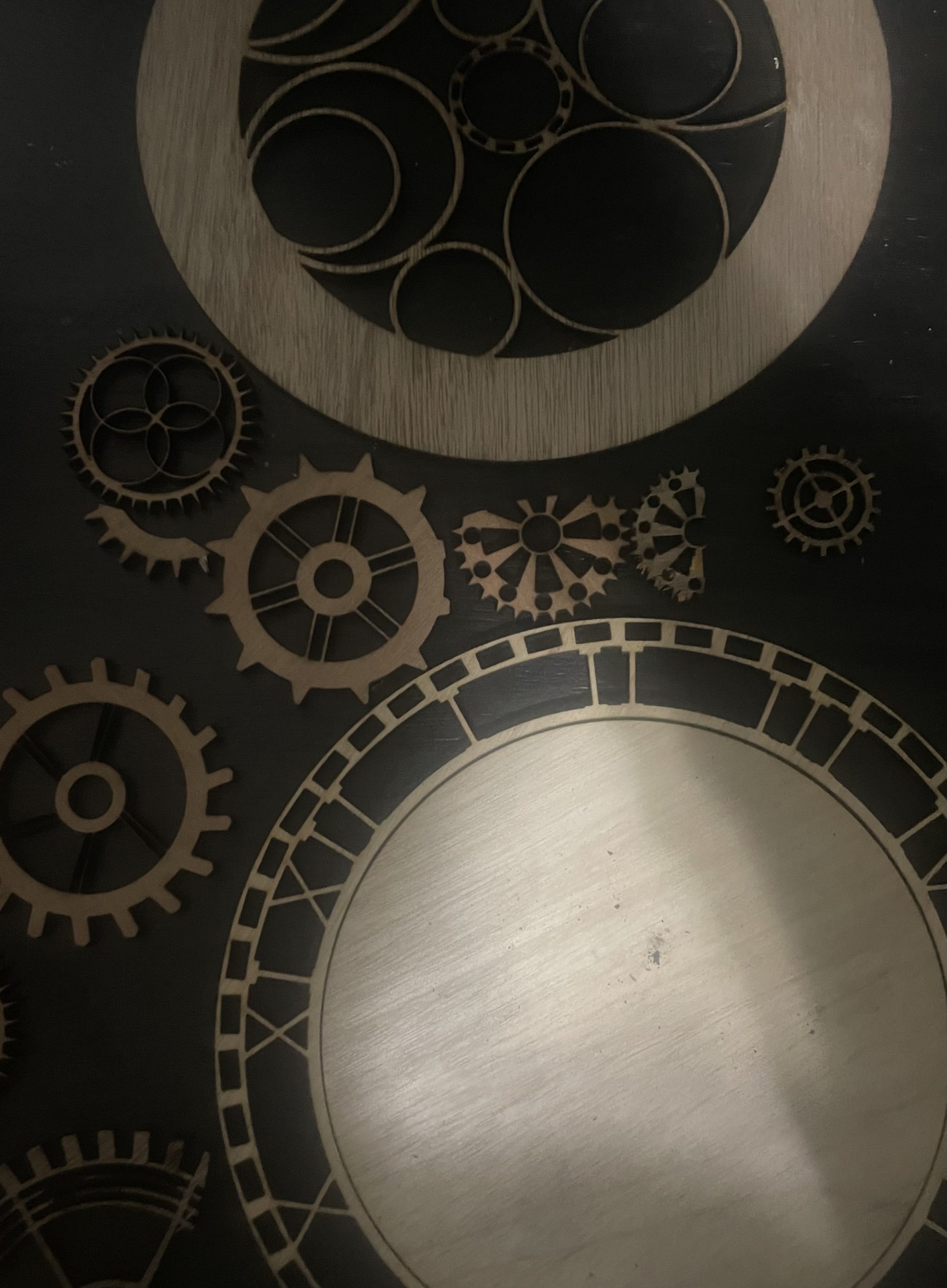
For This project I continued to work on creating my layered clock design with gears. I still require at least 2 more rings to complete the project and a working arm piece to make the clock work. Artist Questions:
Do you think anything could be gained by adding a rastor engraving to some of the gears? varying the shades of color or completely blacking some out?
i do think it would be interesting to try adding raster engraves to the gears. maybe some kind of patterning? this piece is super awesome and i love how you’ve managed to make the exterior ring so delicate!
I think there is a lot of texture created by the overlapping gears already but engravings could add something but it may be too busy. Opinion: you could engrave the outer ring of the clock behind the numerals so that the numerals pop more.
The complexity of the gears is amazing. What made you choose this style of clock? If you want a more antique look, you could use raster engraving to add wear marks.
I think a raster engrave to fully shade each gear would be really cool, it would add more definition to each of the gears and add more depth to the piece.
Overall, I think the piece is really awesome and I love the aesthetic!
It would be cool to raster engrave some of the gears for sure! Typical mechanical watches usually have components made out of several types of materials with varying colors. That would be a nice touch for sure!
to get contrast between the layers you might try engraving a pattern onto each layer you cut. Have you though about having not all the cuts be the same material?
How do you keep these pieces together? I think rastering little details might be cool, but too much might be distracting from the overall piece.
I think adding a raster to the gears would be a good idea as it would add more dimension to the piece.
I appreciate how you were able to add roman numerals to the clock which function as part of the art, and a way of connecting the inner and outer rings.
Holy! This is cool. The layered effect made by the gears makes the clock feel vintage. I appreciate how the classic perception the roman numerals give to the clock.
I like the amount of detail in the gears and the layering on the clock face edge where the numbers are. It looks like the clock you see in old time movies when they are at a train station, it also reminds me of the movie Hugo where the main character lived in a clock tower at a train station.
I think giving the gears some wear marks with rastering might be cool. I think that blacking the gears out and going over each gear might be a little too busy with everything happening in the piece.
What type of clock arm are you planning on using?
The one opinion I have for this piece is maybe consider using some stains of different colors with the rastering of the gears to provide more depth especially around the numbers on the edge.