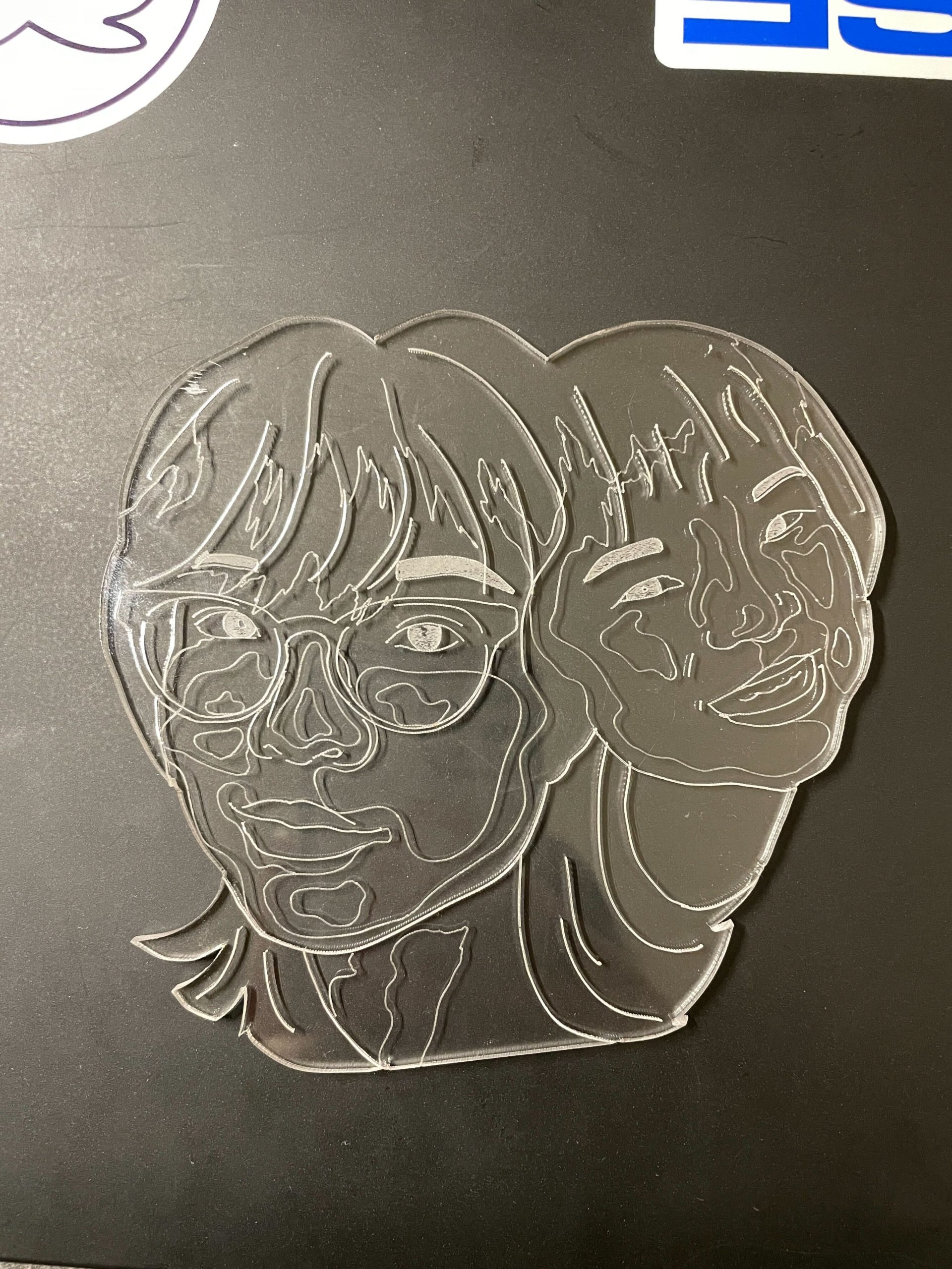
Here are my first test cuts of my layers design! I cut this on clear acrylic and am currently trying to decide how to position my two faces. Just as a quick explanation, this is a design of current me and young me and I’m planning to add transparent colored acrylic layers to add a typography effect to the design.
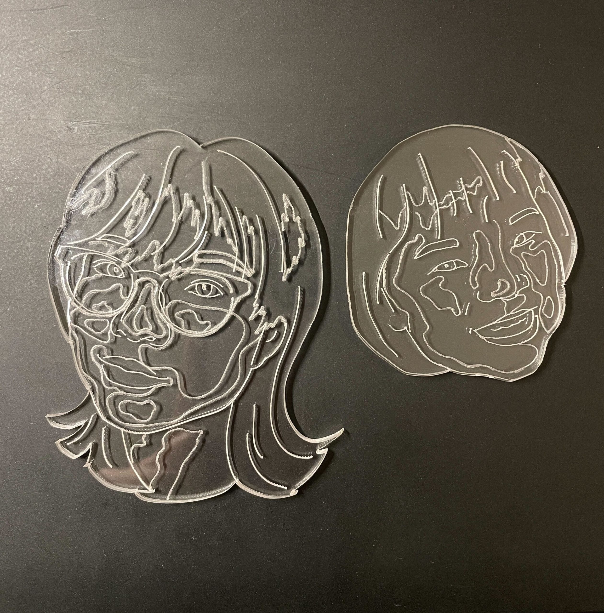
My main dilemma right now is tying to decide between the combined design vs the overlapping one. With the combined design it’s easier it terms assembly but I’m a bit stuck on which overlapping areas of the faces I’d like to set as another acrylic layer. I like the concept of the physically overlapping faces and maybe adding some variability by attaching them to strings so they could move around/swing but it’s going to be more difficult to assemble and details between the overlap are going to be lost.
One last thing I noticed with the clear acrylic is that the engravings stand out much more against a solid dark background and I’m wondering if I should incorporate that into my design.
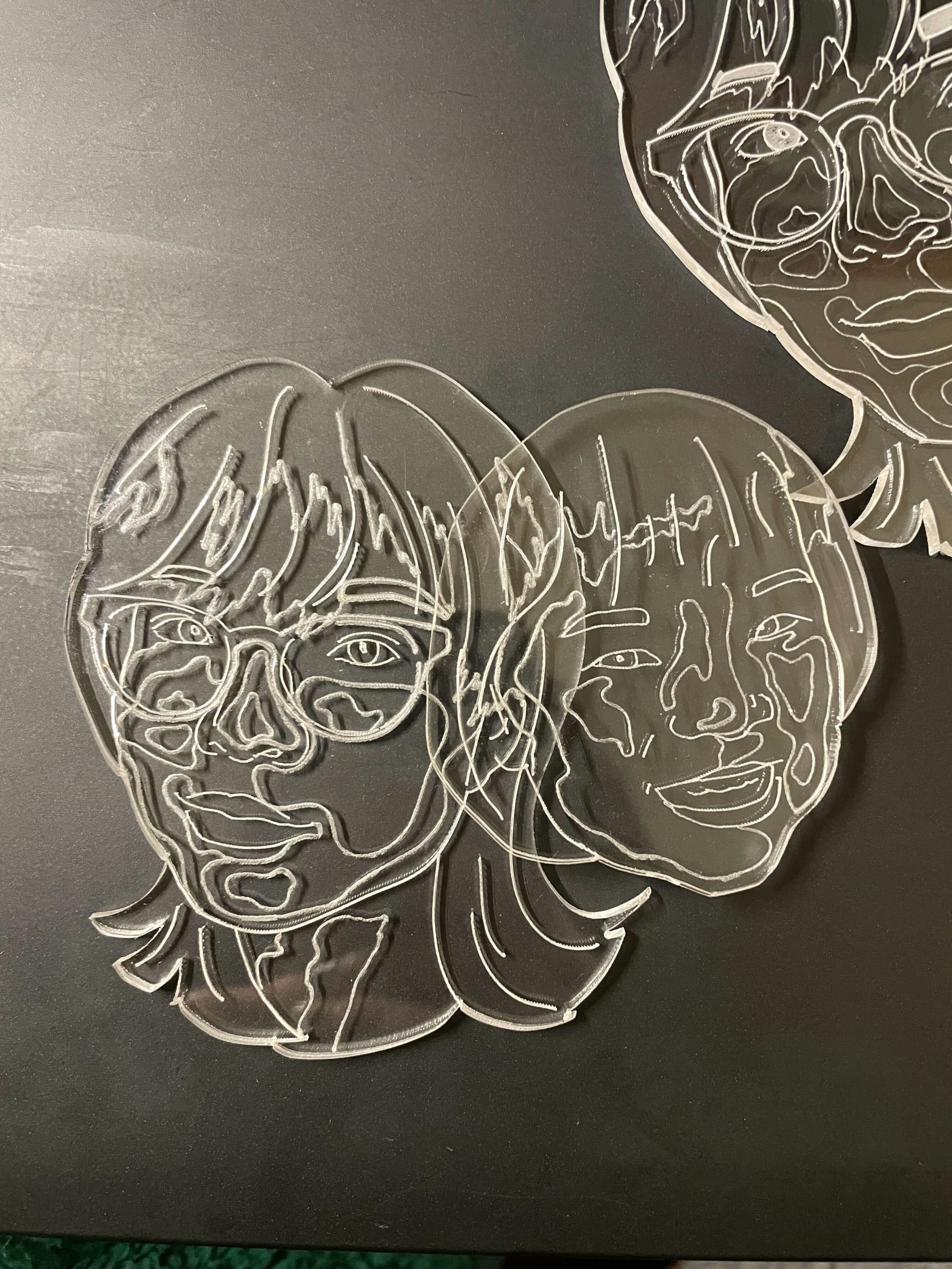
I like the combined one! The extra lines get taken out leaving a cleaner look.
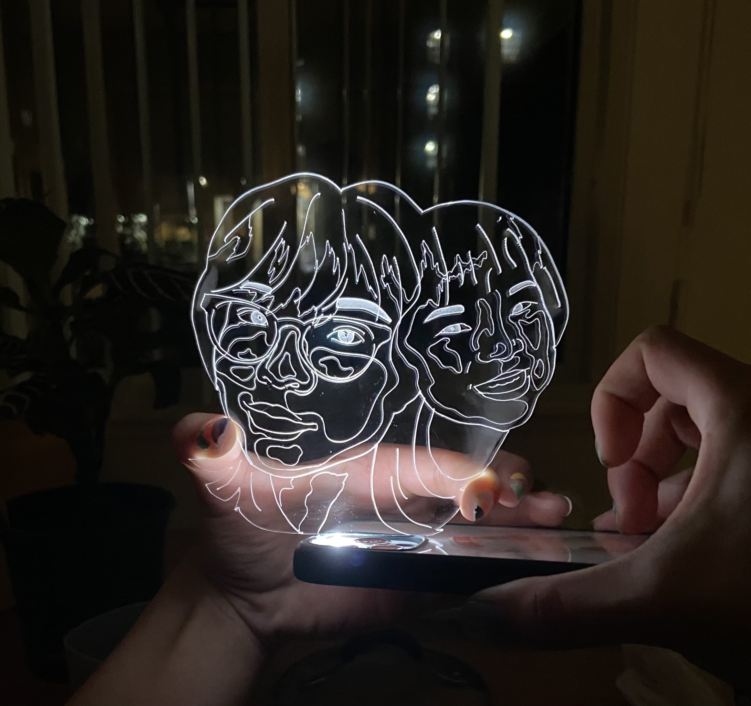
I like the concept of this piece. It gives a futuristic sci-fi look. Great work!