I’m pretty late but here’s my layers project design. Basically its a combination of current me and young me, the black outlines are going to be different layers of acrylic to kind of create a typography map of sorts of the faces. Something I’m conflicted about is how to position the heads, which pieces of overlap I’d like to be layered acrylic on top, and what colors of acrylic to use. I’d like to use two different colors each for each face but it’s a too expensive for my budget.
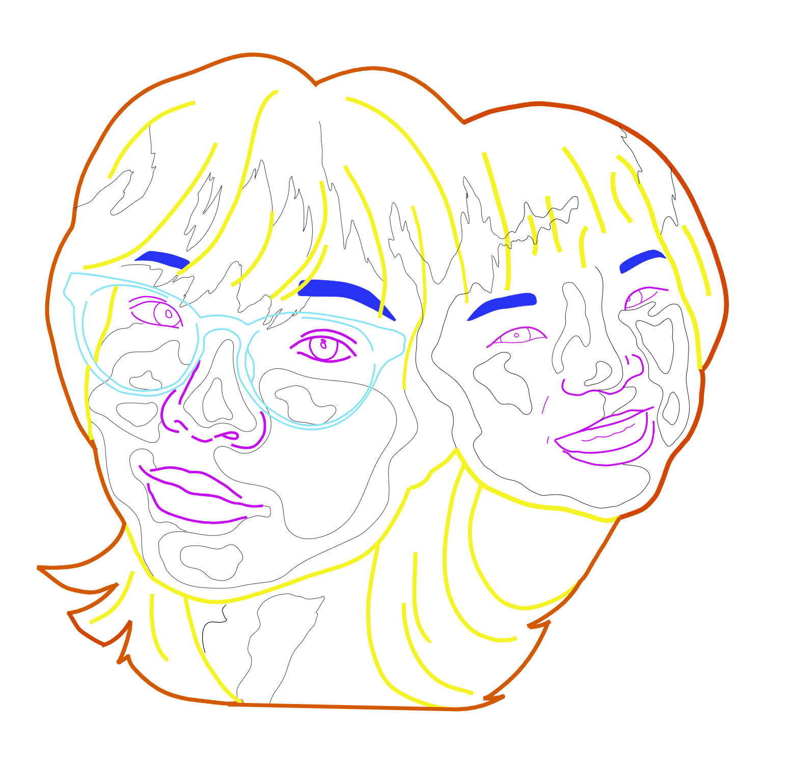
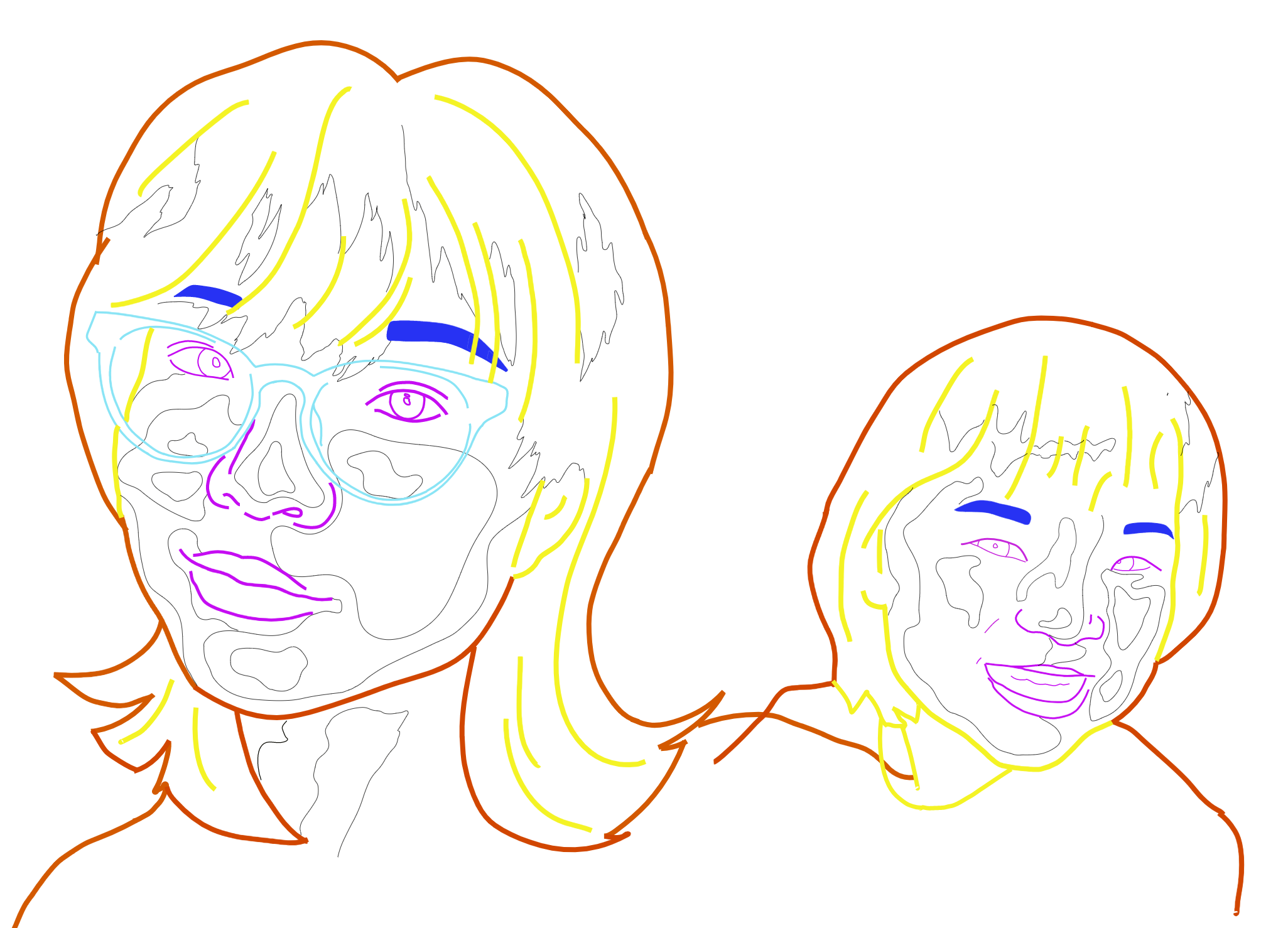
Just a bit about my process, I essentially put my images into Gimp where I made them grayscale, then applied a cutout filter for the typography, traced, and then positioned the two drawings.
What does each color differentiate between in your sketch?
What is your plan for binding each layer together?
What inspired the idea of the “new you” “old you” combination in this piece?