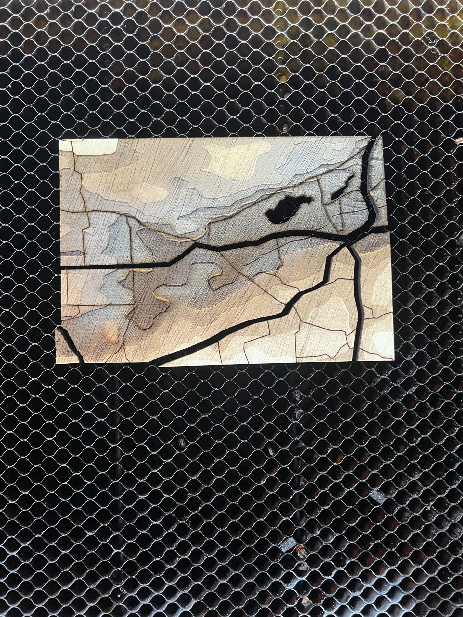
The current iteration of my project is a topology map of a section of Woodstock Connecticut. I used different strength rasters to give a sense of depth and different shades for different elevations. I also vector engraved minor roads and vector cut major roads and some bodies of water. My plan going forward is to add a back layer of blue construction paper to both connect all the pieces together and make the water cutouts blue.
What could I do to give a more layered feel without recutting everything to make each elevation its own layer?
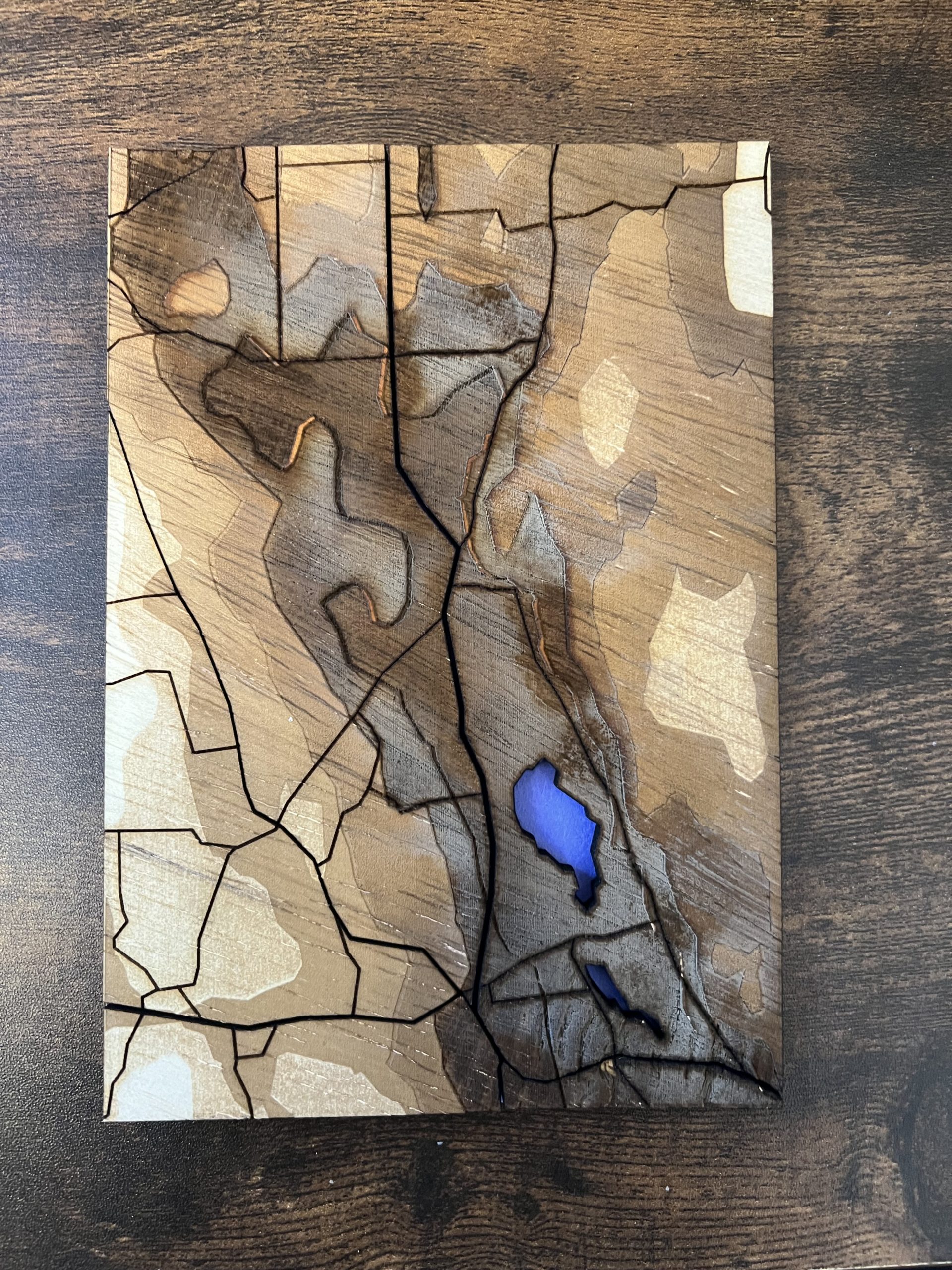
cool! i actually don’t feel like the layered feeling is lost at all. I love the way you’ve engraved it with so many different shades! I think maybe if you wanted to add a bit more depth, you could consider painting a dark wash, to fill in cracks.
I also think the engravings add enough depth and I really like the coloring of them. Is the bluish color just from engraving?
I found your use of color and different engravings very unique. If you want to up the differentiating, maybe try using a pencil or a really small paintbrush to go along the outlines of each layer to add shadows?
I found the different colors on this map to be very stunning. I am impressed by the blue color that you were able to achieve on the material. I think you did a good job achieving the topology feeling.
you could try instead of just different depths of engraving having each depth layer be some sort of pattern. How do you plan on holding all the pieces together?
I glued the pieces to a blue piece of construction paper to connect them and add a sort of water layer for the pond cutouts.
Maybe to give more depth you could stain pieces to give the illusion of being farther away with darker wood? I really like how you have done that with the engravings but it might add the extra you want without having to recut.