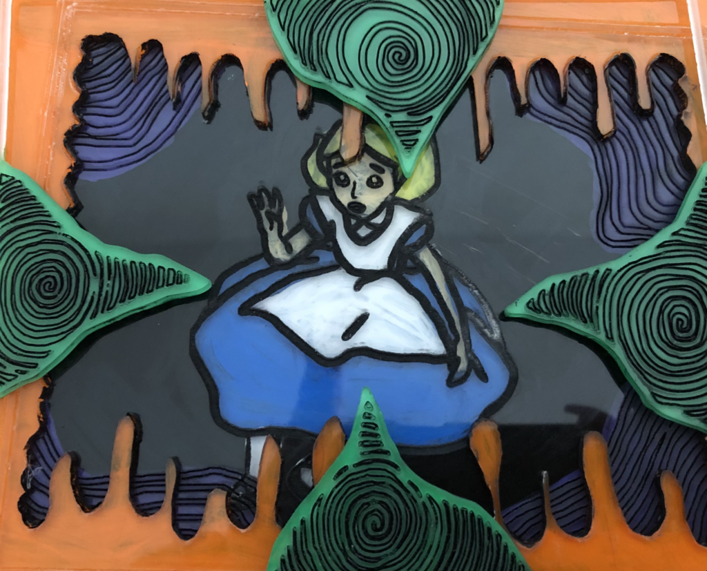
Here it is! Alice is finally complete after lots of painting and cleaning up. I am not entirely happy with this piece, but I a pleased with the risks I took and how I worked around issues. If I would do this project over, I would’ve worked more with the accuracy of my sizing and cuts.
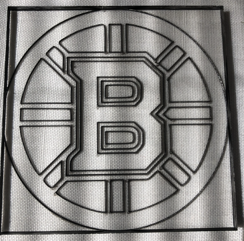
I also had some spare time in my time slot where I engraved an acrylic coaster for my father. His favorite sports team is the Boston Bruins.
Hi Marcella! I found the layers in your concept design to be very eye catching! I hope that these translate well to your material of choice. To answer your question, I think that having Alice in one of the middle layers will help give a falling appearance. I also think that you could use cardstock to emphasize the details in your design.
Hey Marcella. I appreciated how detailed your design was! What inspired you to create an Alice in Wonderland piece? In response to your question, I think you should keep Alice falling away because I feel like that gives it a dramatic feel!
Hi! I remember being stuck by your bold choice of color palette. Is your plan to use colored acrylics for each layer? Or were you thinking of some other combination of materials? In response to your posed question I agree with Hannah that Alice should be middle to back of the layers to enhance the sense of depth and dramatic falling.
I noticed that your paint looks sort of translucent, and it almost looks a bit glow in the dark. I wonder how you plan to display the piece? In my opinion, the black looks a little strange on the green parts, but I understand you probably did it for emphasis.
I like how you painted in the engraving lines black, it really makes the details stand out. The emotion on Alice’s face also shows through really well.