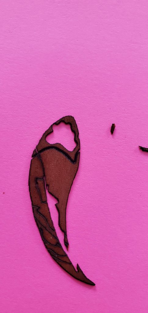
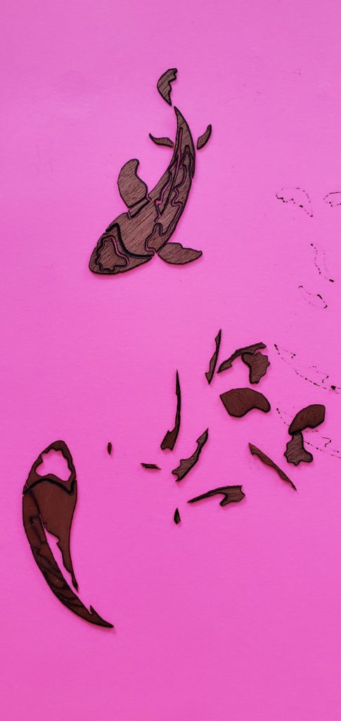
Since last time, I have attempted cutting out the koi pieces for my piece. I used the pink cardstock underneath the veneer layer and used the magnets to hold the veneer and paper down. Unfortunately, I still had pieces fly away and disappear in the laser cutter. I am going to look into getting masking tape to put on the veneer so that I can hopefully prevent the small pieces from breaking and flying away. I tried to use basic glue to stick scrap veneer to cardstock and found out that it warps the veneer and leaves cardstock on the back.
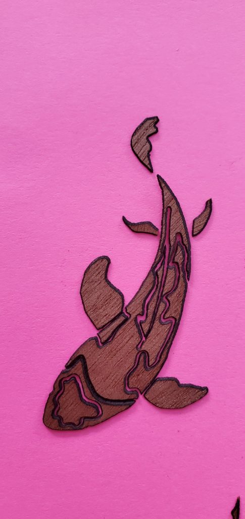
Something I expected but was curious about how others see it, is the negative space in the details on the fish. I sorta like that there is space and feel like I could use it to my advantage by putting a color underneath. I am excited to use acrylic to give the piece more depth and hope that everything starts going smoother with my cuts!
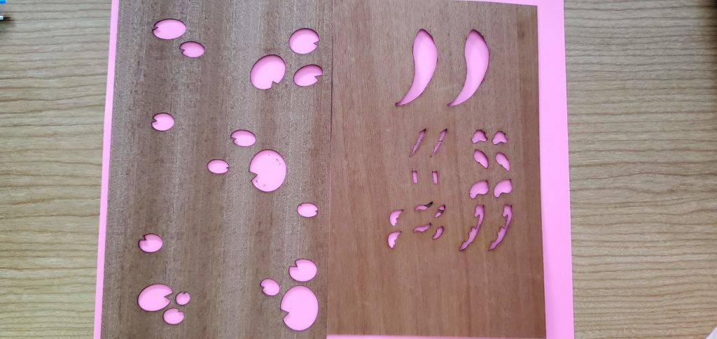
This last picture are the wood veneers that I picked out for the piece! I’m still trying to figure out if clear acrylic would go better or a blue acrylic, but I’m worried about introducing a color to the piece.
FINAL UPDATES
This is one of the videos I took from my last laser cutting session. I thought it would be interesting for others to see how nerve-racking cutting these small pieces were in real time. There is also two layers of masking tape on the back of the veneer that unfortunately did not keep the pieces from flying away.
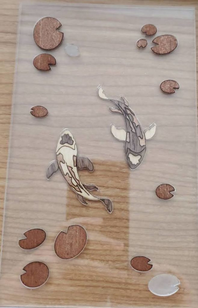
Here is a picture of what the piece looks like as of now. Unfortunately two of the lily pads were either lost or broken so they will be cut out tomorrow (may 2nd). I’m debating adding a final layer of acrylic to lay on top of the lily pads and making little wooden stand for the piece to sit in. If anyone has any thoughts leave them below, but also thank you again to everyone who gave suggestions along the way!
Hi Lauren,
I appreciate the amount of detail and hard work you must be putting into your piece and I really like the flowy design of the fish. How many different colors of veneer do you plan to incorporate into your piece?
Thanks Sameer! Right now, each of the fish will have 3 different veneers and there will be one veneer for the lily pads. The last picture I posted are the colors that I hope to use but that could change in the future if I feel like one of the colors doesn’t work as well.
i really appreciate how you chose a fish as your main subject and i love how you used very fluid lines to make it look like he was swimming
Thanks Helena! I really like the serenity that fish have, and koi ponds especially have something calming about them.
I am struck by your dedication to this project and your plan to use veneers, especially as they have been difficult to use thus far.
How are you planning on incorporating the layed design of the wood veneers with the acrylic later again? I’m not sure if the wood will have a single plain at the top or if your were planning on raster engraving into the underside of the acryslic layer to fit the fish shapes up into the acrylic to have a sealed blend of the two. My only worry is if the raster engrave will distort the transparency of the acrylic.
My opinion of your question of clear vs blue acrylic is that while adding color to the water would be cool, I feel like with ever type will distort the piece the least is better. You have so many details and I would hate for them to be lost under a blue hugh.
Hi Iris! I think your the first to say go with a clear acrylic, I was also worried about a blue color distorting the piece. However, I may be look to find a light blue while I test the design with clear acrylic. As far as laying the piece, I plan to raster the top for an inlay fit of the lily pads and just using the weight of the acrylic to keep the koi pieces in place. I am still trying to figure out how to keep everything from moving, but may raster a second layer of acrylic for the fish to lay in!
Hi! I’m struck by how small and intricate the details of the piece are. With the close up photos how small they are really shows. What made you decide to do different wood veneers for each layer?
Thanks Emily! I really wanted to use the veneers for a piece as soon as I saw the variety pack that Professor Rosenstock showed in class. I love the idea of having different natural colors and wood grains incorporated into a piece.
Hi! I really appreciate all of the problem solving you are doing for this piece and continuing to create your vision despite all the problems.
My opinion / answer to your question is that a blue acrylic especially one that is very light would contrast the warmth of the wood and add to the piece.
Thanks Grace! It seems like a lot of people feel like a blue acrylic would work well, I may have to look into some options soon!
Hi Lauren! I appreciate the dedication that you are putting into the tiny details of the piece and not giving up despite the trial and errors! I was wondering if you are planning on leaving the lily pads a natural wood colour or if you are going to stain them? The fish look beautiful and I am really looking forward to seeing your finished piece!
Thanks Imogen! My goal was to create the entire scene using natural wood colors so I don’t plan on staining anything right now. Maybe that will change later!
I appreciate how the fish design captures a lot of dynamic movement. It looks like the fish is actually swimming. What are your plans for displaying it? In my opinion a blue acrylic would definitely help create the idea of fish swimming in a pond.
Thanks Alexander! I planned on laying the piece in a raster cut of plywood, however I won’t be able to do that with acrylic so I’m not sure yet.
Hey Lauren! I am struck by how you managed to create a sense of movement of the fish! I think that if you use a blue acylic, that would look nice against the fish.
Thanks Hannah! I am glad you felt like they were moving, that was a goal!
Hello! I am very impressed by all the detail you were able to get in the veneer. How do you plan to bring these parts together? In my opinion I think it would be really fun if you could get it to seem like two fish are interacting or playing.
Hi Lauren! I noticed how you paid attention to your limited materials. I remember in conference you mentioning this. Did you have any intention with any of the curvature of the pieces? In my opinion, I really enjoy the patterns as they feel more natural and broken up. I’m impressed on how you captured this!
I love how the first fish came out! I have a lot of respect for you continuing with the small pieces, they are difficult to work with. I like how the back fins are disconnected from the body, and the way their shapes portrays the movement of a fish in water well. Personally, I think adding in blue acrylic with that dark veneer would look really cool, but if you plan to use a bunch of different colored veneers in the piece then I think clear would be better suited.