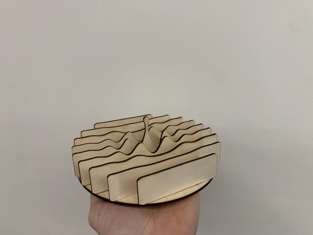
I am pretty happy with how my piece turned out. personally I like the idea of using wood to represent a water drop because it is normally such a rigid and strong material, using it to represent a fluidity and motion is really interesting to me. Do I need more layers to properly represent the drop? should I use color somehow? I was thinking of painting the edges blue.
More layers will definitly add more detail that could be beneficial, I think multiple shades of blue paint would also add to the end result.
Very nice piece here Jakob. I also think more layers would add some nice detail. Are you considering staining it at all?
I think adding more layers near where the drop is and keeping the quantity further away the same could help with the ripple effect of the water drop. And I agree with Grace that adding multiple shades of blue paint could add more to the end result.
You could add more layers if you want the extra detail, but I think the amount you currently have conveys the water drop aswell. If you are staining it, I think it would be cool to do different shades of blue (adding more stains to one while less to another).
Hi Jakob! I agree with the previous comments that different shades of blue stain/paint might be helpful. I think making the edges a deep navy might be interesting to make the piece pop or creating a gradient of color up the sides of the vertical pieces and alongside the edges. Mixing acrylic paint with a bit of water can help make the paint a bit more see through.
I agree that adding some more layers would take this piece up a notch. Color may be a great addition as well. I do like the idea of using multiple shades!
Hi! Art and math, my two favorite subjects and you’ve put them together beautifully! To address your question the only thing I think would take this piece to the next level while maintaining the simple beauty of the form and contrast, is to maybe double the number of layers
I definitely think more layers would add extra depth and make it more dynamic. One suggestion I have is to add even shorter pieces on the very edge so it makes the piece more circular.
In my opinion, more layers would look cool, but I don’t think you need to add them if you don’t want. I think in terms of color, painting each “slice” a different shade of blue would look really cool and add some depth to the piece.
i think it is esp interesting how you chose to place the wood kind of on its side like that, i really like it and think it like brings a new perspective
Hi Jakob! I appreciate how you used spaced out layers to create your design! I think that adding color or lights between the layers would add a cool element as well!