I did all ten layers of my piece on plain card-stock today, and I really love how it turned out! It took a little while getting through all the layers but it was cool to see how they built on each other to achieve this final result. I’m going to tweak a few small parts that are bothering me (and maybe add another layer or two) but ultimately, I would be happy to use this design for my final on the coloured paper.
My question for anyone viewing this is should I remove the horizontal lines that are on the 3rd and 4th ‘petals’ from the left and replace them with what all the other ‘petals’ have (the three stacked ovals)? I’m not sure if their different design disrupts the flow of the piece.
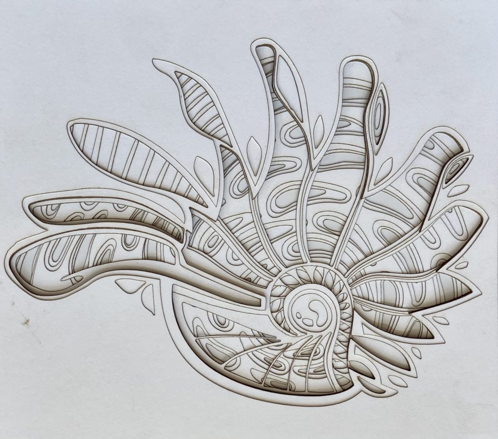
Hi Imogen,
In response to your question, my opinion would be to keep the same oval flow as the rest of the piece. But it is just my opinion. Can’t wait to see your piece on the colored paper!
I think you could try incorporating some ovals into the third and fourth petal to keep the repeated oval pattern as well as keep the initial lines. But if visually that isn’t what you want I think trying all ovals in that section could help you see if the flow is disrupted when the lines have been taken out.
Hi Imogen! In response to your question, I think you should keep the lines. I think it is nice to have some variety among the ovals. Very nice piece though!
Hi Imogen! I think possibly have a middle ground between the two might be interesting. Such as a pattern that morphs the ovals into the lines and back. Other than that I’m more on the side of keeping the ovals for the piece. I’m excited to see the final version!
Hi! I want to say that when I first saw your piece i was so struck by the design and illusions of movement you created that I did not notice the different patterns on the 3 and 4 petals (it also took me several mins to figure out what ur question was referring to). Anyways, in response to your question my first thought was to have all ovals, but then I saw Kat’s comment and I think this could be quite cool. Some way to seamlessly meld your patterns will benefit the impact of the piece. So cool as is though 🙂
Personally I think I would replace them with ovals, it would really help bring together the flow of the piece. Astonishing work by the way!
To me, the lines don’t disrupt the flow of the piece, they almost look like elongated ovals. I can’t wait to see this in color!
Hi Imogen! I think the lines add to the flow of the piece! Maybe to make them more similar to the other petals you could try to make the shape more like the oval shapes you have in the lower layer.
interesting how there is texture inside the cuts, was it hard to cut that?