I had some issues with my exported files not containing all the drawn lines, but today the problem was solved! (kinda solved, I had to have the lines redrawn) I am happy with the way these turned out.
Hi Imogen, in the 2nd design I appreciate the way you arranged the repeating ellipses, it makes the image as a whole seem to convey an organic subject while still being technical in composition.
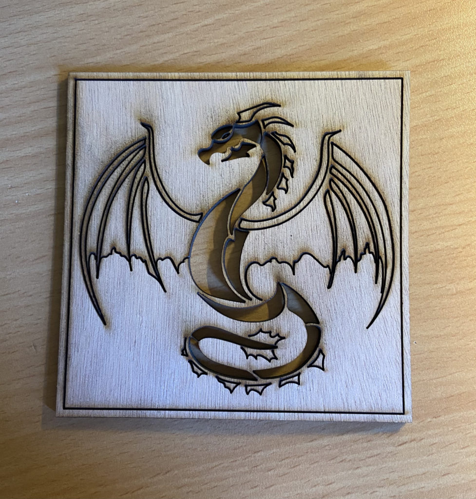
hi Imogen! I really appreciate your use of negative space in this dragon. Usually negative space creates a lack of attention in the piece but in your case it really draws the viewers eye to the dragon, it makes the dragon seem so much more powerful!
I appreciate the engraved border around the dragon, it gave it a formal look. I was also drawn to the three curves of ellipses and they reminded me of birds flying in circles.
Hi! Both are so striking! I love dragons and so it brings me great joy to see you draw and laser one with suck strong powerful emotion. I am struck by the ending placement of the many repeatin ellipsis in your drawing 3 cut. The p5 code specifications you choose created a beautiful and pleasing form that surprised me! Well done!
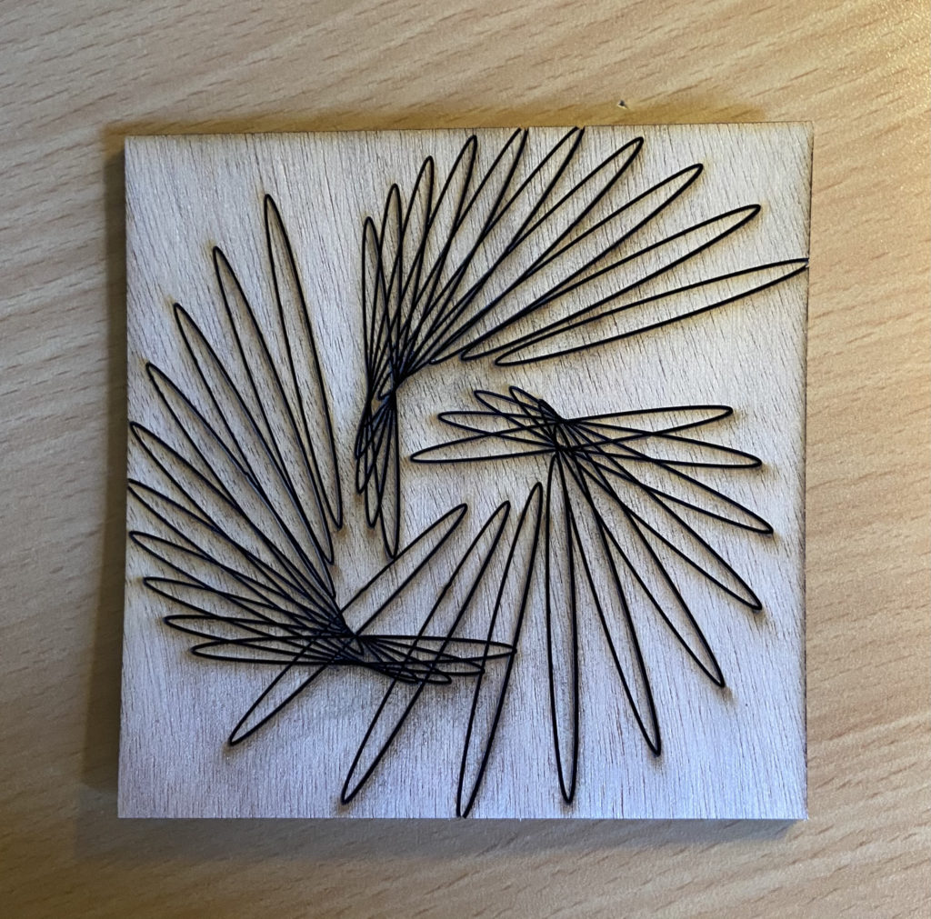
Hi Imogen, in the 2nd design I appreciate the way you arranged the repeating ellipses, it makes the image as a whole seem to convey an organic subject while still being technical in composition.
I am pleased by the way you made the dragon with bold lines.
I am struck by how you were able to make the wings of the dragon so symmetric and how dramatic the piece is as a whole.
hi Imogen! I really appreciate your use of negative space in this dragon. Usually negative space creates a lack of attention in the piece but in your case it really draws the viewers eye to the dragon, it makes the dragon seem so much more powerful!
Hey Imogen! Your dragon looks great! I appreciate the pose you cut the dragon in. It looks like it has jumped up and is ready to blow fire. Nice job!
I appreciate the engraved border around the dragon, it gave it a formal look. I was also drawn to the three curves of ellipses and they reminded me of birds flying in circles.
Hi! Both are so striking! I love dragons and so it brings me great joy to see you draw and laser one with suck strong powerful emotion. I am struck by the ending placement of the many repeatin ellipsis in your drawing 3 cut. The p5 code specifications you choose created a beautiful and pleasing form that surprised me! Well done!
I appreciate how your second cut evokes a feeling of nature and almost flowers (for me at least), but has been made by a computer code.